Sunday, September 7, 2014

A Bruna Commander Deck?


I would like to make a Bruna Commander Deck I was thinking of starting with this list - but I still barely know what I'm doing!


COMMANDER: Bruna, Light of Alabaster
Creature (20)
Sorcery (2)
Instant (1)
Artifact (11)
Enchantment (31)
Land (34)
14 Island
12 Plains

Friday, July 4, 2014

One Woman’s Reactions to M15 (Gallery Interface First)

One Woman’s Reactions to M15 (Gallery Interface First)


White – Whoops!
Actually this is more like One Project Manager’s Reaction to the M15 Visual Gallery Interface Design.

Very First Thing:


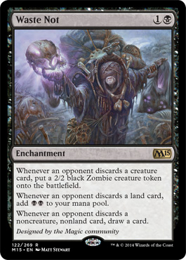
I don’t like how hard it is to read the artist’s name on the new card frames in the preview set. I was afraid of this when I first saw the reduced space for the artist credit it makes it very difficult for people who are not motivated to find the artist and feels like a disservice to them.  The official Wizards card Gallery also does not let you click for a larger view of the card. This has always been a problem for me visually but now it’s worse. The black of the card frame plus the black of the background on the new website makes the credits and numbering virtually unreadable even without any visual ability differences – really uncool.

This is not a critique of the card frame- the frame itself is probably much more functional in live meatworld format – this is a combination of the choices made for the card frame AND the choices made for the interface template interacting with each other.

Also I can’t see the card numbers – disappointing. That is a lot of information that we use to navigate and interpret the cards during spoiler season that are now inaccessible from the card gallery where I know I’ve used the gallery for those things in the past.


Navigation Bar on the Gallery:


The horizontal navigation that allows you to select how much of the preview that you see doesn’t let the user know which view they are in by color – this may have been true in the previous version of the site but I never noticed because I wasn’t trying to navigate out of my chosen view because I couldn’t read bits of the cards I was looking at.


 The Navigation of the Page and Content Itself:

The text based “cards added” takes up a ridiculously large amount of interface real estate for a visual gallery – I have to scroll down to get to the navigation for the Gallery and the cards themselves.

Clicking on any of the selected galleries still puts all of those things at the top. This is my desktop space when I link to it my first instinct if linked it to click assuming that I got the incorrect link because of a problem. Scanning the navigation doesn’t even tell me there is a gallery. I do not understand where the User Experience Design team is on this. Is there a Usability position on the team at all?

For instance when I click on the link to the site I see this first:


I went to see the Gallery or Visual spoilers – I’m showing the screen cap for my entire screen here – I don’t see a gallery or mention of either.

I have to scroll down because I didn’t find navigation to the gallery – I know it’s a new site. Maybe it’s lower. Scrolling down one full screen I see this:


OK fine that’s nice- I came here for the Gallery- none of these things are the Gallery. I did actually follow a link here but maybe it’s the wrong link – I clicked on Pre-Release but that didn’t help. At least when I hit my back button it took me back to my position on this screen. I scroll down another screen’s worth.


Uhh – hey this is a whole screen about booster packs? A whole screen? Where’s the Gallery? Is it the M15 Button in the big circle? Oh no that’s just a big full screen description of the difference between a booster pack and a fat pack. You don’t leave the page- where is the gallery – why does this need to be so incredibly big? What function does this serve for people looking for the gallery – or events? Or new people to the game – I don’t get this, the brand Identity has already been prominently positioned on the top this feels not just excessive but if it doesn't provide a functionality it's also creating extra calls to action for 2 definitions that could easily have been put on the same area instead of with a navigating animation that has to load. And I'm wandering all my thoughts away from the Gallery . Maybe if I scroll down.

The next screen’s worth of scrolling:


Oh wait – there's something! I see the top of "Card Image Gallery"!


It’s More TEXT? Huh?

I see card tops…

Scrolling…


Ahhhh... Finally.


If there is a usability position, and I mean this kindly – is it user flow focused and does it have any veto power ?– Because without veto power that position will be shouted down by any number of competing actors and team/tech needs. I would like to believe that’s what’s happening here.

Possible Solution – Highlight and underline the segment of the Gallery you are in right now there is only a white rollover and the navigation bar is text only. There is a LOT of text on the page and a lot of things that text-based bar is competing with. This would only be a minimalist clean choice for a nav bar if it were at the top of the page, but it’s situated in the middle. It might benefit from more attention since supposedly it’s the function that the content page is for. I’m assuming that this IS the function of the page because I cannot navigate to the gallery in any other way that I found quickly while writing this review.

*Please note I am literally writing this review in live time as I experience the issues.

Readability:  Title Edition


Titles are now under the cards – this means that you look at them as if they are the titles for the visual cards below them instead of above them because of Western culture visual conventions and perception. The black card bases on the black background field blur the spacing so the titles look like they are floating between the cards more than they would otherwise. Instead of being perceived as directly underneath their associated cards and reading like captions the eye passes over it and it looks like it’s the title for the card below it. In user terms, because the white glowing thing in black over the card looks like the title it is a stronger impression than the printed title on the graphic of the card. The dissonance between the card title on the graphic and the art is going to be reduced (basically for most casual viewers or people actually scrolling), they will think they have read the title and pay less cognitive attention depending on their personal focal and processing points, they will concentrate on either the card text or the art.

At least on the white cards I am starting with, the art makes some cognitive sense with the graphic on the lower line. It took a minute to realize there was something off. For instance the similarity between the floating names and the card art made Battle Mastery look like a Leonin.


Possible solutions – Move the titles to the top of the card – or add the bottom of the card data that is unreadable to the titles at the bottom of the card and move the spacing even closer to the card base treating that information as caption information using a clearer convention and metaphor.

Navigation – when I reach the bottom


The “Top” navigation indicator is kind of floating and lost in a bunch of visual noise at the bottom of the gallery – I am done in this picture with White and would like to move to Blue because the reason I am separating by color is to be able to absorb the information I just looked at in manageable chunk. Now if I weren’t doing this review I would have missed it and just scrolled back up creating additional cognitive symbol processing load – looking for navigation or making decisions about navigation distracts from the brain-work of moving the information on the page from short term to long term processing. 


Oh the “Top” button doesn’t take you to the top of the Gallery Navigation – it takes you to the top of the page up where the M15 and 4 screens of non-gallery information are.

Practical solution: Please repeat the horizontal navigation for the base of the scrollable gallery so that users don’t have to take an extra step or three to get to the next page. The Gallery is supposed to be informational and every single thing on the page distracts from the purpose of the page giving more attention, time, real estate and cognitive load to the things that are incidental or opportunistic to the content itself.

This is the opposite of what a content site is supposed to do. The product placement and redirects and branding are supposed to be attractive because of the content – not a barrier to the content itself.

Also having the navigation to the other galleries repeated in the horizontal navbar would clearly signal a separation between the gallery and the “Where to Play” functionality. Remember the purpose of the a gallery site it the content of the gallery, if you make a user stop thinking about the content itself to think about "what is this thing at the bottom' you blur the usefulness of both the content and the thing because you’ve added to cognitive load.

There is a lot of potential in this redesign and I recognized that part of the mission is making it a responsive website, but the application of minimalism for responsiveness should still follow some conventional standards or each item becomes a floating object without skimmable context and must command attention equally. Equality is great for people but less so for design and functional elements.

Desperate Plea:


Right at this point in time, I would assign every single person who works with the Wizards Digital properties the classic usability book that even CEO’s can read on one overseas flight. It’s called “Don’t Make Me Think” by Steven Krug.

It’s in its 3rd Edition. Really this is for all developers of all interfaces.  Please read it if you make things humans have to interact with on the Internet.


Or call me – I’m kind of busy with an ethnographic study of Cultural Actors in Magic but I didn’t stop being a user or a person with 15 years of usability experience and I love you guys. I’ll make time to help. It’s purely selfish really; I want to be able to use the mothership first.

**********

*NOTE - I use this blogger tool because I don't really have time to make something functional - it's ease of use makes it more accessible for me to put things up spur of the moment and the reality is that it's not the best interface, but it's not horrible. There are problems like autospacing on images not hitting the boundaries of the embedded content window. I haven't fixed those myself.  I understand compromises on usability my use of blogger without fixing the negs is an example - the perfect should not be the enemy of the good or complete. Some of these suggestions are really quick fixes that shouldn't take the WotC digital team much time to implement - ideally the real solution would be to separate the gallery from all of this additional product information to it's own navigable area. Depending on their site design that might be more difficult and time consuming.

Tuesday, March 11, 2014

Relevant Infractions for Unsportsmanlike Behavior

5.1. Unsporting Conduct — Minor
Definition
Unsporting Conduct — Minor is action taken by an individual that is disruptive to the tournament or its participants. It may affect the comfort level of those around the individual, but determining whether this is the case is not required.
Examples
A. A player uses excessively vulgar and profane language.
B. A player inappropriately demands to a judge that her opponent receive a penalty.
C. A player appeals to the Head Judge before waiting for the floor judge to issue a ruling.
D. A player taunts his opponent for making a bad play.
E. A player leaves excessive trash in the play area after leaving the table.
Philosophy
All participants should expect a safe and enjoyable environment at a tournament, and a participant needs to be made aware if his or her behavior is unacceptable so that this environment may be maintained
Penalty
All Levels
Warning

In addition to the Warning, the player must correct the problem immediately or face upgraded penalties for repeated infractions. A judge may upgrade repeated Unsporting Conduct — Minor infractions for different offenses. 

If a Game Loss is issued for repeated or upgraded infractions, and it occurs at the end of a game, it is acceptable for the judge to apply the penalty to the next game instead. Game Losses (in the case of an upgrade) are never replaced by Match Point penalties for Unsporting Conduct — Minor.

5.2. Unsporting Conduct — Major
Definition
Unsporting Conduct — Major infractions fall into three categories:

• Failing to follow a direct instruction from a tournament official.
• Insulting another person based on his or her race, color, religion, national origin, age, gender, disability, or sexual orientation.
• Aggressive or violent behavior that is not directed at another person or another person’s property.
Examples
A. A player is asked to leave the play area and is still watching a match a few minutes later.
B. A player continues to argue with the Head Judge about a ruling after being asked to stop doing so.
C. A player uses a racial slur against his opponent.
D. After losing a match, a player throws his cards onto the table and knocks his chair over in anger.
E. A player picks up one of his tokens that has been exiled and tosses it across the room.
Philosophy
Officials should expect their instructions to be followed without needing to issue an interim warning. This only applies to specific and directed instructions. Failure to follow general announcements is handled through specific infractions or in Tournament Error — Failure to Follow Official Instructions.

Hate speech and other insults targeted at a protected class indicate a deeper issue and must be dealt with swiftly. Even if unfounded, they may be offensive to spectators or other nearby individuals. Local areas may have additional protected classes that fall under this category.

Undirected aggressive behavior needs to be curtailed. It is disruptive, can leave a lasting negative impression on those around, and may turn to directed aggressive behavior if not dealt with swiftly. Care should be taken not to escalate the situation if at all possible. The player may need to be removed from the area to receive the penalty and may need a few moments to cool down, in which case a time extension should be granted.
Penalty
All Levels
Game

The player must correct the behavior immediately, and be expected to refrain from similar behavior or face more severe penalties. As with Unsporting Conduct — Minor infractions that have been upgraded due to repetition, if the offense occurs at the end of a game, it is acceptable for the judge to apply the penalty to the next game instead. In single-game matches, Match Point penalties are not issued for Unsporting Conduct — Major.

Monday, February 10, 2014

PseudoNewb at PreRelease

I couldn't play at the pre-release Two Headed Giant event this time around but I was able to watch pre-release happening.  With permission I'll share some things I noticed:


 Cracking the packs and piling up the wrappers


Compared to the sorting techniques of our local ringers


Sharing a playmat to protect unsleeved cards. ( I have that playmat - excellent choic!)


 This is where I sat to watch things until the wargamers needed the mini table to play on.


Things played at the store that weren't Magic

People playing Go.

Homework being done after participating in the 9:00 am event
The Legend of Five Ring Players have some serious;y cool lifecounters . That Dragon disk is a lifefcounter 
Legend of Five Ring Player using beautiful old coins
There is a My Little Pony Card Game community building up at 7D. The game looks like it has some really good play value.
It's much easier to buy a boardgame once the Pre-release Players are seated!
Back to the Pre-Release

Pick up game between rounds


The end of the Third Round - last 2HG team playing until time gathers a crowd

Born of the Gods Pre-Release Pack at the Sealed Event after 2HG - I chose Black 
Players at the long table head to head

6PM Sealed - Just because I'm playing Black doesn't mean leaving the accessories in the same color! 
We take our game accessories seriously - Legend of the Five Rings players aren't the only ones 

Wednesday, January 8, 2014

Don't Call it a Comeback ... Naw Go Ahead - PseudoNewb and the New CardFrame

There is a change afoot. At first it's subtle and looks all upside


But then the change seems more obvious - not sinister, just "less than".


So very quickly; let me be clear - this is NOT a horrible situation where we all must weep because our beloved game has crossed the Rubicon and nothing will ever be pretty again.

This is however, quite clearly the solution that the most people in a committee who all had different concerns agreed upon, and the art department did its best to meet the specifications and constraints.

Just because everyone did a nice job and the end result is livable doesn't preclude critique and Vorthosian concerns. And because I didn't stop being me over the last year I have some readability and instructional concerns.

Lets look at the stated reasons why the changes are there - Here's the original article by Aaron Forsythe
http://www.wizards.com/Magic/Magazine/Article.aspx?x=mtg/daily/feature/281


There are five changes - A proprietary font, a holofoil stamp for rares and mythics, collector info at the bottom with the additional data for for rarity, set and language, decreased border size, and in some cases they will be adding designer credit.

Two of those are specifically anti-counterfeit measures.


A proprietary font after 20 years for a basically readable typeface means that somewhere there was a requirement to have control over being able to tell whether title text was generated in house or someone used a "close enough" font. There's not really an ego-boo reason for a proprietary font and the time/cost of developing one at this stage, for this business without a need. This is all conjecture on my part ; When I looked closely at the new font though I noticed it was more angular and had reduced serifs, so it's possible that it might have been developed for typographic consistency with the new computer-readable card data on the black background.

The other one is the holofoil stamp. The fact that it's only on the rares and mythics is the thing that leads me to the conclusion that counterfeiting to take advantage of the speculation market in standard season is a large enough problem that it required action at the production level.

On Twitter there were already some comments about the eternal format relevance:


The best thing about the new holofoil is that it will authenticate the most expensive and highly counterfeited cards, like Beta Power.


However, I submit that eternal format players have known and been dealing with counterfeiting issues from the point that the reserved list started spiking prices. Also, anyone who has a significant number of eternal staples for sale off the reserved list that isn't already known in the community for buying them up will be looked at with suspicion.

Additionally - the eternal proxy community is extremely vigilant about making sure "not for sale" is printed on the proxies and crediting the artists and denying WotC affiliation. Most of the alerts I've become aware of in counterfeiting sales on ebay have come through the proxy community.

Here's the thing, I think that the prices on popular standard cards are incredibly fashion driven, if it got played in a tournament deck that did well, or if a "celebrity" touts it publically in Standard the price shoots up.

I remember three weeks where Craterhoof Behomoth was a $16.00 card. Lets say it costs a good counterfeiter about a dollar in materials to create a good fake. Lets go further and say a smart organized counterfeiter would, at spoilers start working on computer printing files for all the uncommons/rares/mythics in a set. That's maybe a weekend to a week of startup time and you're set for capitalizing on the fashion of popular standard cards for the next two years. Fire up your 1$ per Craterhoof fakes - sell 300 of them in various international eBays - profit.

Not a lot of profit, but one thing people forget is that if you aren't US based $4,500 in profit is a LOT of money and even if you're here it pays for an entire semester of community college.

Now - understand - I'm not saying that is happening, but its an example of how incredibly easy and with incredibly low start up risk it is to do this as an individual ( and I guess I've pretty much prevented myself from ever selling non-holographic marked cards on eBay!) But there are many things that people who play the game are unaware of as economic realities involving the game elsewhere. Some of the kind of economies around the game are similar to the impact of shutting down MTGO for players who were able to make money in areas like Brazil by selling tickets

(If I have that right - I know way more about printing than I do about MtGO).

This means there might be a real incentive to be organized about counterfeit. * Usually when a company is having this sort of problem and are aware of it they fight it at the individual "pressing charges" level but they don't really advertise it if it's having impact. Suffice it to say that I think on demand counterfeiting would make more profit and risk less discovery in the Standard environment - Mint condition graded Power Nine are rare - the profit margin is to low and the discovery for producing any number of them is too high for them to be the primary target.

I support these changes to protect the game from counterfeiting since the speculation market has become akin to day-trading and Financial/Value magic is touted by the leading websites in the community.

* NOTE - this morning while I was working on this post Polish Tamales warned us all about this: http://polishtamales.tumblr.com/post/72642482887 - please specifically note the font as the tell.

The scannabilty and computer readability of the font may also create a quick check for counterfeiting. for Local Game Stores, sort of like the pen they use to check money. The fact that it has to be squinched up at the bottom of the black bottom will not give counterfeiters a lot of room for error. But there may be additional reasons besides counterfeiting for computer readable verification of collector information.

Computer Interactivity Wishlist


Wouldn't it be cool if you could scan your rares and mythics into Magic the Gathering Online? One of the biggest reasons people like me who play the paper game avoid the online game is the fact that I'm not really interested in paying for the same cards twice. I might pay for access ( and commons and uncommons) if I didn't also have to buy enough cards for whole decks that I can't play with outside the computer.

Collection management - there are already apps that let you scan you cards and it uses recognition software to let you add it to your collection management tool - this would speed things along - you might be able to just use your phone.

Computerize Deck Registration and Deck checks at large events.

A girl can dream.

OK - enough about the Why, lets talk design:


Wizards helped us out here by showing us a pre-existing common in the new frame that exists in the recent modern frame with the same art and everything:

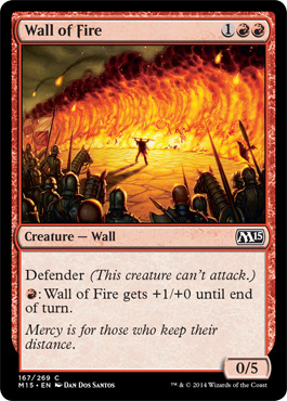


When you look at them next to each other its easy see why there isn't a lot of outrage about the change. Other than gaining a pica or two of window space the top of the card is functionally the same.

The increase in the usable card real estate didn't improve the textbox typography - where the flavor text is better in the M13 version and it reduces the prominence of the artist in the credits on the collector section. I don't feel that is a net positive.

On Twitter I said this:


and it was interpreted as a slam against the design team - but I'm a grown woman who works on those kind of teams and I meant it. I don't for a minute think it's the best design, but I'm willing to bet at least two other designs were submitted to a committee that included a rep from game design, a rep from Organized Play, a corporate/operations rep, whoever is in charge of print production, whoever their current rules/savant historian is and people who are working with the anti-counterfeiting and people working on the future computer compatibility expansion plans that went into having the change made in the first place. That won't even count actual playtesters or focus groups who had the new cards mixed in with the old cards who gave in their two cents.

That's only if they were following standard corporate best practices for such a significant change to the core product and were careful about following a lot of their own design practices that they've made public.

So what do you notice about that list of committee sign offs or inputs?

Did you guess?

There are funtionally no artists/graphic designers on the sign off committe.

The artists won't be the ones with the sign off, they're the ones presenting the options based on the specifications developed by all those stakeholders. They are a part of the committee but if they are producing the product, they aren't the ones who are really "on" the committee. They can propose, guide and react but they aren't going to have any kind of veto authority.

I'm sure there is a super stakeholder that is bigger in authority than the committee -  or a smaller team of super stakeholders that get final sign off and probably also have the power to say - "decide by x time or we will" because there are printing to market constraints - they have to get out as soon as possible. Marketing has to deal with prepping it's very vocal user base for the change. OP has to be prepared for the massive amount of questions they are going to field when card frames literally became the delineator for a format and they are changing card frames within two years of the format happening, just when the format is becoming popular.

You can see those concerns being addressed by the prominent pez-box tablet that holds power and toughness, you can see Melvin types wanting to keep the upper card as close to the old (modern)  frame as possible. The end result is a little like a 3-d alter - where you cut out the old frame and set it on top of a different border - it's not bad, but it is darker. and you can tell that it was a compromise not because it's bad, but because it is inelegant. To keep the familiar, you compromised the visual balance of the card.

Additionally, even though the amount of black is reduced by narrowing the side borders the heavy black on the bottom makes the whole card seem darker - and given how little light is in in current art direction that's going to add to the grimdark depressing nature of a lot of the current look/feel. I hope new art direction takes that into account.


I''m also worried that by reducing the color that is a card's color identity in the border there will be an impulse to counteract that by being more monochromatic in the art for the cards themselves which is already a big problem creating a sameness in red and green card art.

Aaron Forsythe confronted the limitations of the heavy black bottom himself in the introduction of the new frame

"Making the bottom of each card black to accommodate this information was not an easy decision, and may be the most disconcerting part of this frame update, but it was done with the best of intentions. "

Because he is not an artist ( to my knowledge for all I know he's got a secret stash of masterwork oil paintings he works on between sets) he's identifying something that he knows is a bit "off" but not "bad" and it's the lack of symmetry of the curve.

When I started working on this post I thought that what I really would have preferred was a pattern change fade to a solid black, but studying the card frames I realized that what I really wanted was a more consistent design symmetry that would allow for the greatest flexibility in card art, because with this new frame being asymmetric some art might not work well as a "whole card". Once again it won't look bad, because this isn't a bad design, it's just not necessarily the best solution, it's the best agreed upon one.

If I dealt with the typography on the bottom for visual balance I'd probably waste another day - there are lots of options and I'm also sure that the designers and art director tried a bunch - but for now I'll just share a version of something I'm sure was looked at - which is having the curve be consistent on the top and the bottom.


If I were doing this for real instead of a quick point, I would probably increase the Card Title Box. By having the curve at the top and the bottom and actually reducing the red in the border, it makes the red for the border pop and in my personal opinion makes the color identity more clearly red. The symmetry will also make the hologram when it comes in feel less like another "bottom heavy"add on and balances the newly decreased font on the credits line. 

Now while I like this better - if I were a betting person, I'll bet some version of this, and one with a fade down the side to black were three simultaneous submissions for the committee to choose from. And I'd bet that the reason the bottom-only curve was developed was at committee request, because they wanted to keep the tops the same and they were worried about acceptance by the community. Because we're not quiet when they do something too far from head-canon. I would even go so far as to say someone made the argument that changing the top would be too hard to explain when looking at the Modern Format. 

And I'm willing to bet that people who work on the design team had something that was a real change - that I can't imagine, that they liked waay better and it got shot down.  None of the sign-offs was thinking about long term impact on the art direction or the basics of design. They would just keep adding constraints and making changes and the design team would be trying to keep the changes in specification scope.

That's really hard. They did a good job, they know it's less than elegant. and we'll never see the alternate designs submitted. 

I respect the work - I'll miss symmetry though and hope I'm wrong about the unconscious push that will affect readability and originality.