Ok, I admit it, I have a problem.
I haven't played Magic Since mid January. I costumed a show that ate all my time. I found out I was qualified for a school I could literally only have dreamed about and then cried bitter tears when I woke up because that's how far out of my league it was, but it required me to pretty much obsess about the application process and find about 30 years worth of documents for the remaining weeks. It also made me rip out my soul, eviscerate my past and generally feel that the transfer essay requirements ought to come with a trigger warning.
Plus I'm actually IN school right now. So my entire Magic plan; play all the pre-releases, booster smash a whole box play at least every other day . . . dust in the wind. I used to read my morning wakeup routine this way; Daily MtG first, check Star City for hot button issues, read my twitter feed, check for LegitMtG updates because @revisedangel, read my FB feed end with Gathering Magic because that's usually my happy place.
I managed to keep the twitter feed part going, but everything else was starting to make me anxious because I didn't know any of the cards, what they did, what they looked like and all of the names of the decks in play are from three sets ago and I can't keep Naya,Jund,Junk, Grixis and whatever Oh I think it's Bant straight. So the articles keep referring to old things I never played and new things I hadn't seen.
It's off putting - and especially so after my really dismal performance for GPAC. HOWEVER: the application is in - now I'm just waiting to see if they send me an Owl. And I miss the cards but I'm afraid of playing with a whole set I don't know and taking things too seriously . . . . what to do about that ? I know! ART REVIEW!
Here are the rules: I post the card art- I literally give my first reaction to the card art then I come back to it and think about it a little bit and sometimes you'll get a real art critque from me or I'll explain something.
I do not represent the opinions of any woman other than myself
There are more women's voices writing about Magic than when I did the One Woman's Reaction to the Avacyn Art. I don't know any other than MJ Scott on Gathering Magic who are writing regularly about Vorthos artsy things but just like all sorts of male people have all sorts of opinions and backgrounds so do all sorts of women.
Here is where you can read ALL the Warnings
But they boil down to
Warning I am Not Politically Correct - exactly how incorrect is described in the link
Warning I am Sex Positive - please click the above link to see what that entails
Warning I am of Extremely Average Attractiveness - because I know that matters a lot for having an opinion on the internet - click the above link if you need to see exactly how average so you can decide how much my opinion matters.
Final Warning - I have worn ALL thing things. - remember the reason that I couldn't play was costuming a show. I'm in some too. Just because I haven't cosplayed yet doesn't mean I won't - but actors of average attractiveness end up playing a lot of weird costumey period roles.
The review will now begin in the order of representation of the color pie on the back of the card:
White first
Blue next entry
Black
Red
Green
Other
As they are finished each one of those will be a link and they'll each be separate entries. I wish I'd seen more of the cards but the reality is that as I post them to comment on them the reactions are gonna be real time, I didn't even have a real chance to read through previews back in January.
Ok what's the first card that Wizards gets to show us using their own sorting system?
Gatecrash White
Ok last time I did this I tried to save space and put all the text to the right, but for sanity and speed's sake we'll center things.
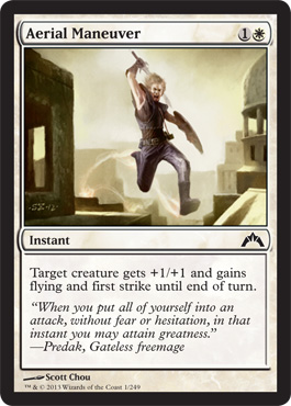
 Ariel Maneuver
First reaction: Are those really little motion lines? Like when Snoopy dances?
Well that's kind of adorable then.
Second Impression: Solid form geometrics are nice but all the beige is kind of visually boring. Also Aerial Maneuver would seem to mean flying, not roof jumping like a street rat and sort of looking like you might fall. Flavor text fail - I'm curious about the idea of a freemage because I've been curious about being outside of a guild from the beginning of learning about the guilds, but the quote is all military theory text, the picture looks like a hapless jock with spell having been cast on him and where is the mage? Maybe rather than Gateless it should have been a Boros Mage quote?Now I will remember that this card is +1/+1 flying and first strike because of Snoopy casting a spell on him.AngelicEdict
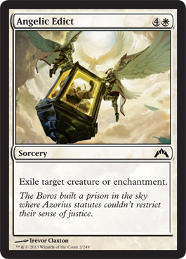
First Impression: Don't look down. Somebody pissed of Willie Wonka.

This is what happens when you try to take upskirt pics of Boros Angels.
Second Impression- I do like the composition of the piece and the use of the angels, I do wonder why the angels are always losing feathers in their Magic the Gathering depictions though. It's like it's always molting season for angels
Its expensive for constructed play. I assume it exists for limited. I do like the callout that Boros and Azorious do not agree on means or methods in the flavor text.
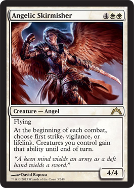
Angelic Skirmisher
First Impression - Why does this angel have extra ribcage?
Ok I totally appreciate the lack of giant tits but at least on the small scale of the card it sort of looks like maybe the reason that other artists draw giant tits is so they can avoid all that messy middle of the body draping shadow and anatomy.
If she's twisted at her central core why does her armor still have a straight line from her breastbone to her belly. And where is the hip attached to the knee coming forward?
Second Impression: I feel like I'm picking on an artist who made other good choices in costume, color, expression, agency but I like the execution of the face and wings more than the final choices on the body. Maybe if he had put the foreground leg to the back of her it would have worked better.
Now that the art is done Angelic Skirmisher looks like it could be good in some things but probably casual or commander. I do like that the flavor text relates to the strategic decisions to be made at the beginning of each combat phase. I'm not a good enough strategy player to know if she's playable.
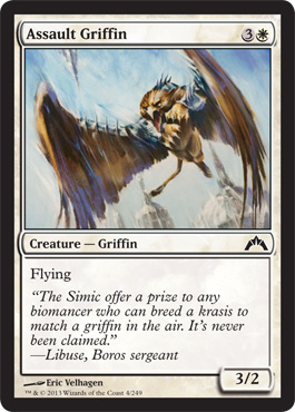
Assault Griffin
First Impression - spikey.
No really, that's it. I don't mean the Johnny, Timmy, Spike kinda spikey.
It's a reprint of a card that was introduced in the 2011 and continued in the 2012 Core Sets. So it's not in 2013 and probably serves an important slot in limited so that it's in and still standard Legal for the Return to Ravnica block. My question is what about a card that's onlt 3 years old and generically white needed a full art reprint?
This is the original card. Now since I'm seeing these cards in real time as I'm writing, right now the only problem I'm seeing s the flavor text quote is referencing Thune. But I like the art a lot better on the original possibly because the washed out palette of the three cards seen so far and the painterly brushtroke quality of the Gatecrash cards do make them all look like they belong together art direction wise but are also making them kind of boring and hard to remember. The original art is more phsycially engaged and interactive and the reddened tones in the background give the peice more energy and frankly feel more Boros the the distancing blued whites of the new one.
The art is good, but it feels like filler. I'm hoping White starts getting better.
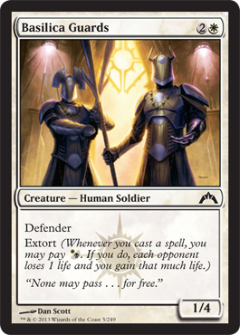
Basilica Guards
First Impressions: Ok this is much better. Look color! And architecture - I'm a sucker for architecture!
And symbolism - I can see the Orzohv symbold in the architecture and facelessness so those helmets are like Raybans but for the whole head!
They're so cool they need shades over their whole visages. Mediaeval Mob style.
Second impression: The lighting is consistient, the character design and composition of the full piece is balanced, I'll be able to recognize the art when it's on the table as different from the other cards.
I like the hand out on the extort and the specific reference to Gandalf the White.
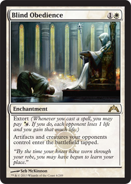
 Blind Obedience
First Impression: My Goodness we're not shying away from any kind of controversy here now are we . . .
It was hard to find a public domain pic that makes the implicit more explicit but yeah, whoa.
On the other hand I like enchantments and I'm attracted to Orzohv and the Black and White combo decks anyway.
Do I love the flavor text, yes, yes I do.
Second Impression: So this is the first peice of art that I like in the set and the first card that sort of feels like it hit all three things a Magic card needs - it carries the mood. I like the inversion of the usual triangular composition so that the people form the dynamic shape, it conveys the sense of menace by leaving the interaction at the edges, I love the color and mood. So card, art and flavor text all match up.
And they do it creatively. Good. I was beginning to worry that about a kind of genericness.
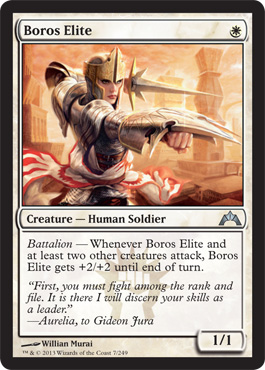
First Impression: This is cool.
Love the stance, the swirling skirts ( even though they look like liabilities in a fight) the determined look on the face.
The helmet makes sense, the peachy lipstick brings out the coral in the Boros Heraldry. It's got the dynamic movement and kickass but feminine vibe that I think that angelic skirmisher was trying for but with better execution.
Things are beginning to look up here in white.
On the Adrienne-is-learning-the-Gatecrash cards note though you need two other creatures to also be attacking for this 1/1 to get her boost. Is that a good Battalion effect or one that was specifically made "less good" to keep draft balance?
Flavor text is only interesting as far as it tells me that for some reason Gideon Jura needed to prove himeself to Aurelia. Does that mean the pic is Aurelia?
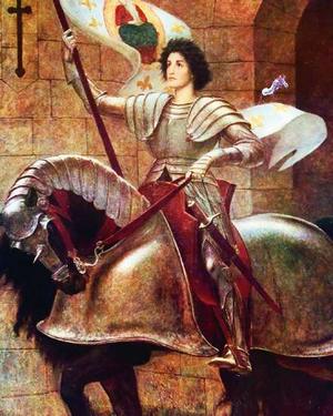
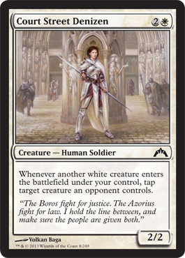 Court Street Denizen
First Imperssion: Very Joan of Arc.
More stupid moulded breastplates though. Really guys, that makes it EASIER to kill the wearer. We'll be able to tell she's a girl even if you don't outline each of her breasts with a plate metal 18 hour bra.
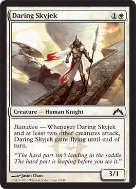 Daring Skyjek
First Impression: I read it as SkyJerk
"Look at me. Look at Me stand."
"I'm on a floating road."
"I'm probably standing this way because I landed in the saddle wrong which is why you got such a lame quote and my complete lack of looking daring at all."
Second Impression: Oh SkyJEK.
Never mind.
Love the stance, the swirling skirts ( even though they look like liabilities in a fight) the determined look on the face.
The helmet makes sense, the peachy lipstick brings out the coral in the Boros Heraldry. It's got the dynamic movement and kickass but feminine vibe that I think that angelic skirmisher was trying for but with better execution.
Things are beginning to look up here in white.
On the Adrienne-is-learning-the-Gatecrash cards note though you need two other creatures to also be attacking for this 1/1 to get her boost. Is that a good Battalion effect or one that was specifically made "less good" to keep draft balance?
Flavor text is only interesting as far as it tells me that for some reason Gideon Jura needed to prove himeself to Aurelia. Does that mean the pic is Aurelia?
First Imperssion: Very Joan of Arc.
More stupid moulded breastplates though. Really guys, that makes it EASIER to kill the wearer. We'll be able to tell she's a girl even if you don't outline each of her breasts with a plate metal 18 hour bra.
First Impression: I read it as SkyJerk
"Look at me. Look at Me stand."
"I'm on a floating road."
"I'm probably standing this way because I landed in the saddle wrong which is why you got such a lame quote and my complete lack of looking daring at all."
Second Impression: Oh SkyJEK.
Never mind.