Pseudo Newb- One Female’s Reaction to Avacyn Card Art
OK I promised it and I meant it – it does seem like when the
card art comes around and people react to things in the art the fact that women
are less than 12% of the online presence and the Pro Tour mean that when the
art or the marketing or anything else about it is discussed ( including some
really asinine interpretations of what “empowering” means) there is no goto
place to find out what woman’s reaction to the art is without asking your
female buddies who either don’t play magic, or aren’t interested in umpteenth
discussion about women in magic because they happen to have a uterus. (Also you don't need to have a uterus to be a woman.) Then said
buddy gets to go on the internet and say “ well my female friends don’t care”
Because Anecdote == data they can then assume NO ONE cares about any of the art
– please continue to have Glissa moon us."
So I have decided that there should be at least one other
point of data – I happen to have a uterus.(even though you don't need one to be a woman, but it does get regulated by men like that) I have a degree that had a fine arts
requirement even though it was tech. I’m not playing magic because my
boyfriend/husband/father played it.
And I’m gonna tell you all the first thing that enters my
mind and then how I feel about it afterwards for EACH card.
WARNING I AM NOT POLITICALLY CORRECT.
If you’re here hoping for super feminist outrage – I’m not
gonna lie and tell you I have none, I’m going to tell you it’s probably not
going to be whatever you think “feminist is”.
Feminist is a word that I’ve had used to silence me, co-opt
me, pre-judge me, identify with me, distance one’s self from me, blame me for
whatever, bond with me, recruit me.
I don’t like the way many women use “feminist” as another way to
compete with each other. 1st wave, 2nd wave and 3rd
wave feminism fails to unify anyone and creates other issues.
So I’m not sure what I am but I’m pretty sure that other than believing women are full citizens and have lives of their own ( and a thousand different opinions) I’m not IT – IT being specifically whatever YOU think it is.
So I’m not sure what I am but I’m pretty sure that other than believing women are full citizens and have lives of their own ( and a thousand different opinions) I’m not IT – IT being specifically whatever YOU think it is.
WARNING – I AM SEX-POSITIVE.
Sex is a good thing, sexy is a good thing, sexy is defined
by the person feeling it and the person benefiting it. What sexy ISN’t is anyone not having
fun. Sexy pouts are not the look
of someone having fun. Predatory unattainable stares are a media version of
sexy.
If the woman is looking like she’s doing anything just to
make someone stare at her that can be sex positive but only if she looks
comfortable, pleased, relaxed or orgasmic.
This is Orgasmic –
Saint Theresa is having a really good time ( and it's in theme - cause St Theresa is experiencing physical ecstasy due to a visit by an angel)
Because that demonic-thong-wearer is totally enjoying the
sexual come on and eventual snack that you might be. See the smile – that’s for
her ,not for the male gaze.
And its by actual former Magic Artist – (incidentally XXXENOPHILE is the
happiest porn on the planet. If all porn were like it the world would be both
kinkier AND have sex while actually liking their partner or at least their
giant ruby or midday snack)
WARNING I AM OF EXTREMELY AVERAGE ATTRACTIVENESS
No one will cross the street to avoid me – but I’ve been on
the internet a while so while I’m not sure why it’s so important when I express
my opinion, but apparently it's VERY important as to whether or not I'm entitled to have an opinion on said internet. I’m sure it will come up.
My mother told me I was “Pretty enough for
normal people” and when I work in theater I get cast as the witch or the evil
queen because I’m not pretty enough to be anything else.
Here I am -
You may now judge my opinion accordingly
(No lie that’s
really me and I enjoy the hell out of threatening small dogs and whiny
children)
FINAL WARNING – I’VE WORN ALL THE THINGS.
I’ve
been in theater and costuming my whole life, I was a demonstration swordfighter
(not SCA) and friends with lots of people who make fetish gear. Because that’s how people who love
costumes and fashion make enough money to support themselves. Good fetish gear, like comfortable
chainmail or plate takes time. craftsmanship and patience. When you costume for
film you can’t just let things slide all the detail work will be caught on film
(X1000 for HD).
Ok – now you know enough about me to pre-judge my opinions
but you can now also refer to an actual female who plays magic looking at the
art – Ready?
Unfortunately I’m gonna do it in the same order that WotC
does ( and if it gets to long I’m going to do jump pages)
White is this page
Blue is currently Live Black is Currently Live Red is currently live
Green is now live Other due soon
Blue is currently Live Black is Currently Live Red is currently live
Green is now live Other due soon
White First:
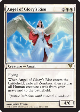
Angel of Glory's Rise - The other comments are short but she's special:
First Impressions:
Our Lady of Breastfeeding
Red Cross Angel with a Chest Window
Patron Saint of Emma Frost and Power Girl!!!
Our Lady of Breastfeeding
Red Cross Angel with a Chest Window
Patron Saint of Emma Frost and Power Girl!!!
Angelic robes designed by Gianna Versace!
Now I wrote at length about the controversy with Triumph of Ferocity. And other than the fact that I just want "defenders" of the art to defend the art without denying that it is indeed rapey, I was not actually offended by the art other than the fact that it was mediocre. But this one actually did offend me.
Look at the skinny wings and the ridiculously heavy skirt, The fabric is just hanging there like a latke (a heavy potato pancake for those who don't know) The face is actually pretty and normal, the color composition is excellent and bright I do like the Clara Barton Red Cross allusions and the slight design of wings on her cloak, but WTF with the Avacyn Symbol outline or pointing to her crotch (depending on how long waisted her body is) instead of being a belt buckle or is that supposed to be a necklace that happens to fall over her crotch?
And the most ridiculous open chest outfit for a flying creature with giant natural boobs in creation. The mondo boobs with faint outline of nipple distract from every friggin thing in the picture - you can't not look, they're right in the center of the frame.
So the artist gets extra points for actually knowing what real boobs look like and minus a thousand points for a chest window on a flying individual whose breasts are going to pop out the second she extends her arms -
This is absolutely the milk fairy - she needs those knockers at the ready to suckle the newly raised humans with vital angelic nutrients. She's very maternal that way. Also she apparently has no legs and is molting.
I'm pissed because I would have liked this card if it weren't for unnecessary boobage. He could have done what Trusted Forcemage and Natural End did and had the boobs still be booby but covered in the actual cloth .
Why yes when she comes into play I do say "Oh look it's the Patron Saint of Breastfeeding." And I don't like her when I'm playing blue/black.
Oh look there's a picture.
( I noticed the text first because the composition draws the eye down to it - fantastic readability feature)
Ooops that's kind of expensive - but I just got an EDH deck for just such occasions.
I like the blues and sunrise just at dawn colors - the sword and sheild look a little wonky but hey the wings look like they'll support her.
I couldn't find full art so it just looks like a tiny dark haired angel. Still haven't opened one.
First Impression :
Oooh pretty. She reminds me of the way I always thought of Buttercup in the Princess Bride. Like a horribly tragic version where she dies, becomes an angel and she's coming back to save Wesley when he's mostly dead.
First Impression : Hello Van Gogh!
Trippy.
I like walls. Are they making an angel out of stewpots?
First Impression
Kill the Wabbit! KIIILLLL THE WABBIT!!!!
Ok I think I get it now - the leather garters are an Avacyn thing. If Liliana hates angels so much why is she dressing like them? The other thing that is obviously part of the Innistrad stylebook is the low cut square neckline.
I completely understand the boobaliciousness of the Innistrad block because it's based on horror tropes and Hammer Films.
Also I've worn outfits pretty much like that - they're relatively comfortable. I don't know why Avacyn's so into the emo eyeliner though - she doesn't have pupils ( which by the way is freaky in the angels)
I do wish her costume had more color balance though, she looks like Elric. You know . . . Elric the Michael Moorcock character?
Never mind . . .
First Impression - forgettable art is forgettable and just an impression of light and color.
Oh look it's a miracle card
That could be useful.
Second impression : Oh I get it it's a holy banishing of some vampire dude or emo human with explody bits. I do like that I'll be able to identify this card based on the art when it's across the table from me. It doesn't look exactly like other cards in the set and the art is complementary to the text and the set. Good design I'll figure out if it's good art later
Second Impression - ended up way more useful in sealed than I would have thought. And I do like the use of light and the rule of thirds.
First Impression - Awesome art for white is awesome. It's got duty, justice, the light coming in the hint of humans or an angelic host in the sanctuary and the slight hint of statuary from the commanding angel.
I'm also a big pre-raphaelite fan so this is sort of evocative of a whole bunch of art that I like anyway but with cleaner and smoother lines to be mini card art.
So this is the art wonky part. Le Academie in France for a long time declared that the only real art was historic events or portraits of great men. It was called historic painting as opposed to pastoral. This art references that art, which was the kind that leads to getting a patron or approval from the crown or the church so you could be a working artist. I like the carry through of the blue, pink and lavenders in the sky to tie it back to a lot of the rest of the set and I think its appropriate for both the card and the content, but meh. However in fairness I feel that way about that entire part of art history so it's no slight on the artist or the card.

This is absolutely the milk fairy - she needs those knockers at the ready to suckle the newly raised humans with vital angelic nutrients. She's very maternal that way. Also she apparently has no legs and is molting.
I'm pissed because I would have liked this card if it weren't for unnecessary boobage. He could have done what Trusted Forcemage and Natural End did and had the boobs still be booby but covered in the actual cloth .
Why yes when she comes into play I do say "Oh look it's the Patron Saint of Breastfeeding." And I don't like her when I'm playing blue/black.
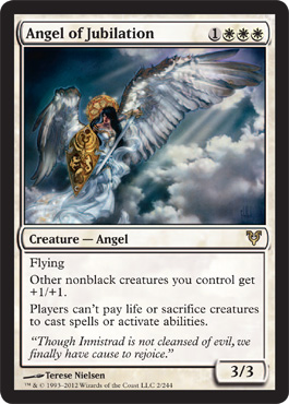
Angel of Jubilation
First Impression : Love this card.
Oh look there's a picture.
( I noticed the text first because the composition draws the eye down to it - fantastic readability feature)
Ooops that's kind of expensive - but I just got an EDH deck for just such occasions.
I like the blues and sunrise just at dawn colors - the sword and sheild look a little wonky but hey the wings look like they'll support her.
I couldn't find full art so it just looks like a tiny dark haired angel. Still haven't opened one.
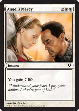
Angel's Mercy
First Impression :
Oooh pretty. She reminds me of the way I always thought of Buttercup in the Princess Bride. Like a horribly tragic version where she dies, becomes an angel and she's coming back to save Wesley when he's mostly dead.
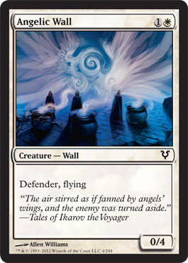
Angelic Wall
First Impression : Hello Van Gogh!
Trippy.
I like walls. Are they making an angel out of stewpots?
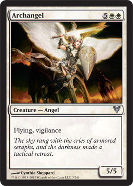
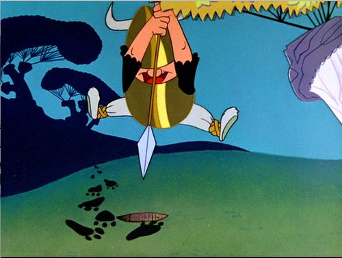
Archangel
First Impression
Kill the Wabbit! KIIILLLL THE WABBIT!!!!
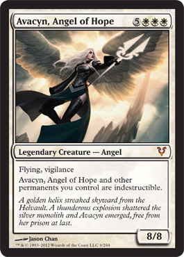
Avacyn Angel of Hope
Ok I think I get it now - the leather garters are an Avacyn thing. If Liliana hates angels so much why is she dressing like them? The other thing that is obviously part of the Innistrad stylebook is the low cut square neckline.
I completely understand the boobaliciousness of the Innistrad block because it's based on horror tropes and Hammer Films.
Also I've worn outfits pretty much like that - they're relatively comfortable. I don't know why Avacyn's so into the emo eyeliner though - she doesn't have pupils ( which by the way is freaky in the angels)
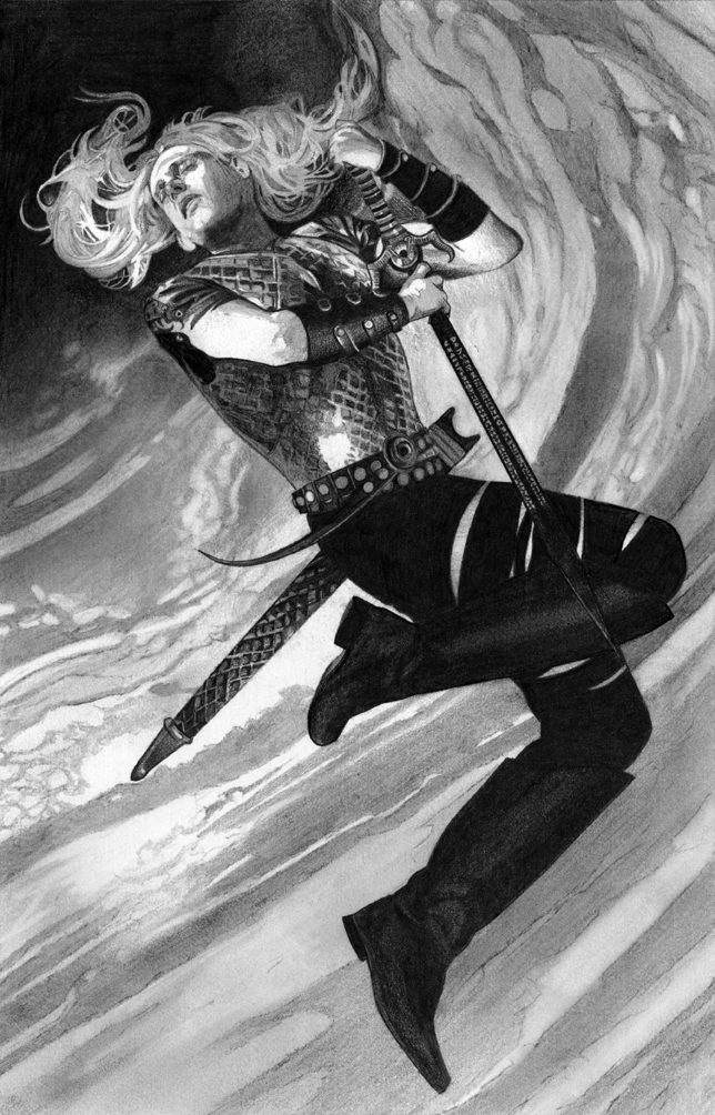
I do wish her costume had more color balance though, she looks like Elric. You know . . . Elric the Michael Moorcock character?
Never mind . . .
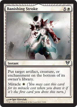
Banishing Stroke
First Impression - forgettable art is forgettable and just an impression of light and color.
Oh look it's a miracle card
That could be useful.
Second impression : Oh I get it it's a holy banishing of some vampire dude or emo human with explody bits. I do like that I'll be able to identify this card based on the art when it's across the table from me. It doesn't look exactly like other cards in the set and the art is complementary to the text and the set. Good design I'll figure out if it's good art later
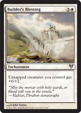
Builder's Blessing
First Impression: It's pretty and peaceful.
Second Impression - ended up way more useful in sealed than I would have thought. And I do like the use of light and the rule of thirds.
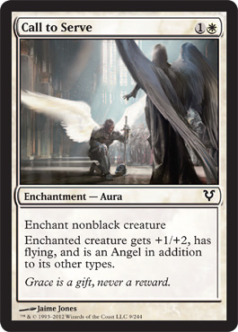
Call to Serve
First Impression - Awesome art for white is awesome. It's got duty, justice, the light coming in the hint of humans or an angelic host in the sanctuary and the slight hint of statuary from the commanding angel.
I'm also a big pre-raphaelite fan so this is sort of evocative of a whole bunch of art that I like anyway but with cleaner and smoother lines to be mini card art.
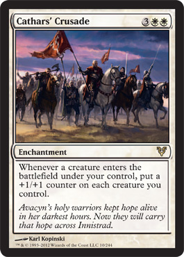
Cathar's Crusade
So this is the art wonky part. Le Academie in France for a long time declared that the only real art was historic events or portraits of great men. It was called historic painting as opposed to pastoral. This art references that art, which was the kind that leads to getting a patron or approval from the crown or the church so you could be a working artist. I like the carry through of the blue, pink and lavenders in the sky to tie it back to a lot of the rest of the set and I think its appropriate for both the card and the content, but meh. However in fairness I feel that way about that entire part of art history so it's no slight on the artist or the card.
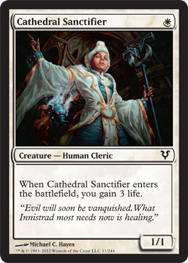
Cathedral Sanctifier
First Impression - OMIGAWD can I say how much I love this art.
I love this art.
I love the colors, the angle, the composition, the action, the costume design, the small but accentuated breasts. This is one of the pieces of art that made me excited for the set ( thus making Our Lady of the Chest Window particularly disappointing).
I love the fact that she looks like a real person, that her ethnicity has real life historic resonance with the mildly Moorish design while participating in something that evokes the various catholic sanctification rites.
I find her sexy as hell too.
So this is the first way I saw the art when they spoiled it without showing the card.

Very much in the tradition of the Ecstasy of St Theresa
Now here's the dirty little secret of women when they look at art like this ( or at least the dirty little secret for me when I look at art like this) :
I understand that some men look at things with women depicted on them and think - "would I sleep with that?" I understand this because they say it out loud when they are looking at cards and magazines even though sometimes they use different words. They do not say it on first dates, or in front of hyper jealous girlfriends. Not every guy; the same way not every girl will say what I'm about to say.
Here's the dirty secret part: The first thing I think of when I see a woman in a magazine or a card is "Would I wear that" followed by "Could I wear that" if the answer is yes.
I would wear the shit out of this.
And look see how her breasts are still per and prominent and the middle crotch area is part of the eye sliding up to her face with the ecstatic (spiritually of course) closed eyes and parted lips.
If I got to wear that outfit and feel what she's feeling while performing my sanctification duties I'd worship Avacyn too.
Second thoughts: At first I was really excited that the card was a useful one drop and that life gain was a thing so I'd get to use her on a card. But I've opened 38 packs and have 9 of her now. I still have half a box to go. I love the art, but I'm getting sick of the card.
Maybe she'll be a playmat.
Third note: when I was reading reviews I was surprised to find out that magic players referred to the card as "He" but then I found out they also referred to Our Lady of the Flashing Mammaries from the beginning of this review as "He" when they are reviewing the card too. Talk about making a group of people invisible in a game!!
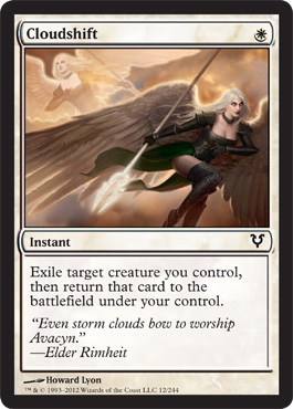
Cloudshift
First Impressions: Why is it that every picture of Avacyn makes me wonder how she flies? Emo eyeliner isn't doing her any favors here.
I do like the way she's depicted pre-shift but I don't get the feeling of flight I get the feeling of running. Also skirts do not work that way.
Nice job on the corset and torso and at least she looks like she's actually holding the spear.
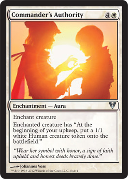
Commander's Authority
Is that successful use of YELLOW? In incredibly beautiful art that isn't made by Van Gogh? Who pulled off this? Johannes Vess? OK must look out for his other art - hope it's up to this standard.
(I would totally wear that silhouetted outfit)
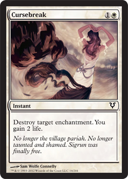
Cursebreak
First Impression - Love it - wish this artist had illustrated Cloudshift. It reminds me of the original Grimm's brothers fairy tales which were super dark and full of spirits looking out for orphan girls.
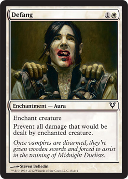
Defang
First Impression - this card looks so much like someone that I know and have costumed ( in an outfit similar to this) that it really just amuses the hell out of me each time I see it. Because if that person ever became a vampire, this would probably happen to him.
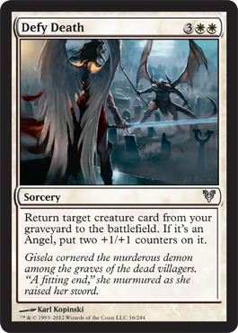
Defy Death
First Impression;
Angels have dark hair and wear red with leather opera gloves while they are kicking ass - I want to be this angel.
Demons have dancer thighs and wear loincloths. Meh. Not sexy. 4/5ths naked demons do not count as equal opportunity objectification.
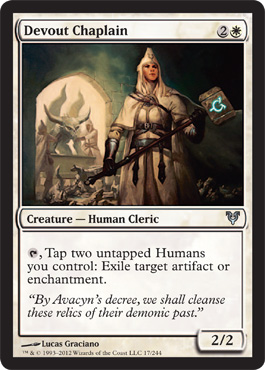
Devout Chaplain
First Impression: Ooh look it's the ministry of funny hats
Magic is Blue - is that the same stuff the Snapcaster Mage uses?
Avacyn's priesthood has a lot of women, I wonder if that's because the monsters kept killing the guys and left the women for breeding stock but they still sort of overdid the resource consumption which led to pissing off Sorin.
Second impression: I might be wrong it might be a male chaplain.
( Would not wear that outfit - too bulky and the hat might fall down while I'm fighting)
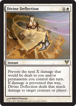
Divine Defection
First Impression - funny hat - AWESOME AXE.
But I hope it's all magical or counter weighted or something.
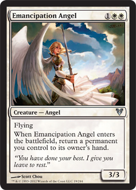
Emancipation Angel
This is my favorite of the "girly" angels. What she's wearing seems practical for and angel, it kind of reminds me of CardCaptor Sakura art and she's a 3 drop for a three three flyer.
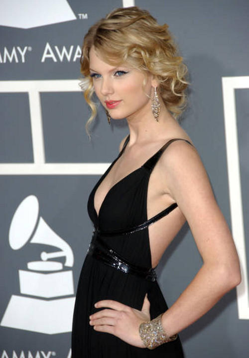
Second thoughts: The Defy Death angel exists so I'm OK with the fact that she looks like Taylor Swift with a blowout.
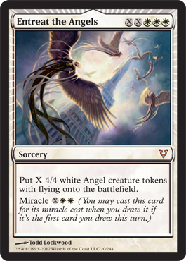
Entreat the Angels
First Impression - Pretty - it's like flying ribbon dancers
Second Impression - Am I ever going to get enough mana to play that in constructed?
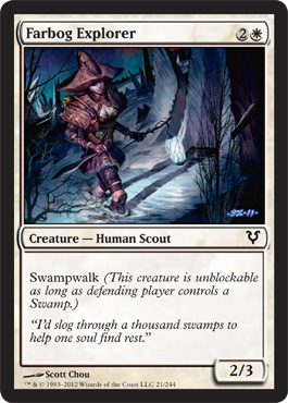
Farbog Explorer
First Impression - "So I'm going to wander through the cold dark swamps full of pestilence and undead and vampires and carefully protect everything but my actual beating heart because I MUST EXPOSE MY CLEAVAGE!!!"
It's empowering.
Reasons she might be wearing this:
I directly worship the The Angel of Breastfeeding so it's a religious requirement
By exposing my breasts this way I will
- a. attract Garruk the Homicidal Beast Boy, I can totally make him forget that Liliana twit. I'm sure he'll change for the better with me
- b. trap a vampire by creating extra resonance around my heartbeat and I don't want to mess with how far the sound might carry
- c. admit I am a total fashion victim but all the hot vamps in Stensia are wearing this. I don't agree with their lifestyles but I LOVE their fashions sense.
If I don't expose my chest how will the card reviewers know I'm a girl?
Bonus - leather tutus are hawt.
( No I would not wear this outfit. I would totally wear the leather tutu part though. )
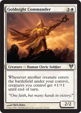
Goldnight Commander
First Impression: For England And St George!! I mean Avacyn
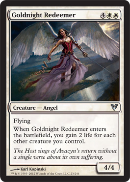
Goldnight Redeemer
She actually looks like someone who might use a sword on the regular. The skirt does not match that top.
Love the angle of the landscape underneath and the river. Are those firecrackers she's trailing behind her?
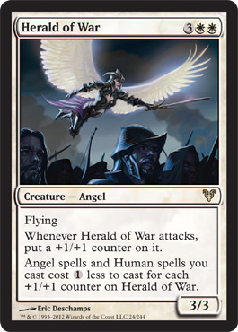
Herald of War
First Impression - YAY fighting angel with plate armor!!
YAY skirt that doesn't look like a tripping hazard or like it could disarm you or be a way for the enemy to get an extra grip.
She's totally ripping off Maleficent's look though. Maleficent approves.
( I intend to wear Malificent's outfit - even though Angelina Jolie is going to play her I can still look like the original)
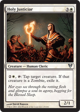
Holy Justicar
First Impressions: This totally looks like someone I know named Kelly. I would like her to exile the zombies around her.
Practical outfit is practical. Storytelling illustration is illustrative. I like this card. I'm probably overly sentimental about it.
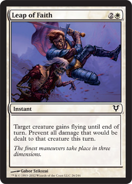
Leap of Faith
First Impression - style and color saturation remind me of every single 80"s era fantasy novel cover.
It doesn't look like a leap that gains you flying, it doesn't show anyone attacking a flyer, it looks like stock art they had left over that they paid for and applied because they had a problem with whatever it was they had originally commissioned for this set.
Also - why do zombies still have blood?
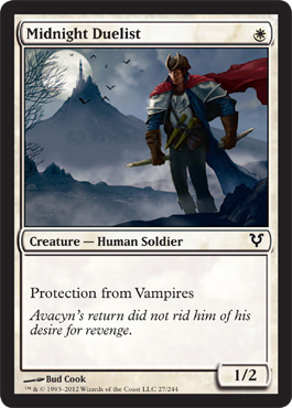
Midnight Duelist
First Impression: Oh dear that musketeer from the French revolution is suffering from Johnny Bravo syndrome . . .
His poor skinny little legs . . . Also does the giant inflated elephant chest make him colder because of poor circulation because dude is wearing a shirt, a military coat superfluous shoulder plate ( with a casual open necked dress shirt and a flowy silk cape.
How do I know it's silk the readers who are not interested in fabric might ask? Well see his heavy wool blue coat is being blown by the same wind that his cloak is but the red stuff is sailing behind him and the wool is hardly moving at a 35 degree angle but is so windy that instead of flaring it's folding into itself. Thus the cape has to weigh next to nothing because his skinny little legs aren't really striding here.
Second Impression - useful one drop is useful. Card art is fine for playing, Hope dudes don't think chicks dig elephantitis of the chest. Plus his head looks tiny.
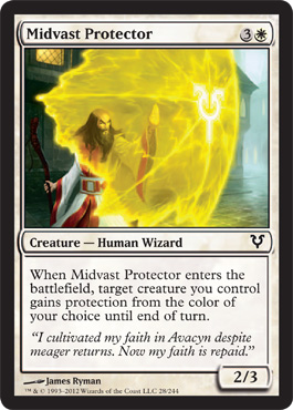
Midvast Protector
I will tell a story about this card at the end. After all of the other cards.
I think the oriental influence on the robes is interesting and I wonder if Tamiyo has something to do with that.
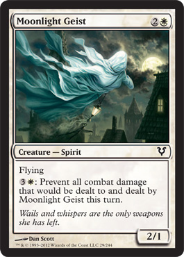
Moonlight Geist
First Impressions - Oh cool we get to remember we' in Innistrad
This art is one of my favorite spirits I'm not sure if she's good in constructed but I'm sure I'll draft her if she shows up.
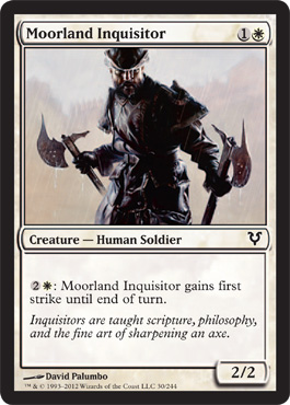
Moorland Inquisitor
First Impression - Cool, he looks like the guys I used to do stage combat with. Good proportion, realistic clothing, nice axes.
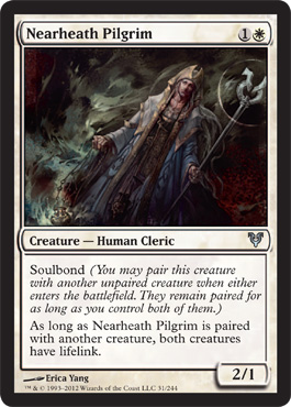
Nearheath Pilgrim
So the guys in Nearheath are either stalkers or Pilgrims? They seem very other focused and maybe a little needy. Very into fads and fraternities I bet.
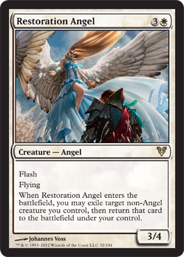
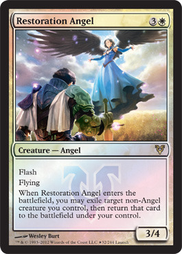
Restoration Angel
Our Lady of Quincerana
Angelic Upskirt Powers: ACTIVATE
Patron Saint of Britney Spears the Early Years
Long Angel is Long
WTF is she wearing? Surely and actual angel can do better than a lower rent version of this:
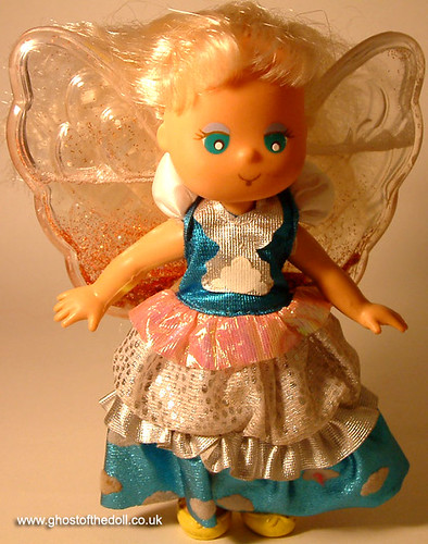
No - this art is impossible. I was so happy when I found out there was alternative art. This looks like every stupid Angel Toy marketed in the early 90's
Note to illustrators - this toyline flopped because it was designed by a group of men trying to guess what little girls wanted and they came up with the most insipid, stupid, gender conforming, no imagination or play value toy ever that year. Please don't design "feminine" magic cards if you think this is some little girl's fantasy.
This one is Mistie " Mistie - The Cloud Chaser Angel - How did the clouds get those funny shapes? They look like bunnies, chicks, puppies, and kittens. Well, it's Mistie who fluffs and puffs every cloud until it has it's own wonderful shape. Mistie's most important job is to check each and every cloud, to see they all have a silver lining. Includes a pink comb and gold cloud charm. #7851"
Ok? We clear? Good.
I'm going for the Dora The Explorer Angel art , at least she's not wearing a Barbie Doll cast off while blessing a Christmas Elf.
I would totally wear the Alt Art dress.
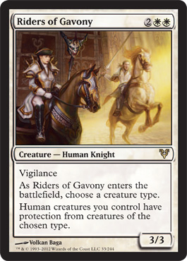
Riders of Gavony
I like this card. Especially when I acquire it with Stolen Goods
First Impressions - it sort of looks like two different cards that had their art smooshed together. Or maybe one's a flashback and I see that the one rider managed to avoid the tragic boob window that the Farbog explorer thought was THE STATEMENT of the season but might be trying to raise awareness to help the poor Midnight Duelist be accepted despite his Johnny Bravo syndrome.
Also maybe the giant heavy shoulder plate pads are keeping her horse from reaction to the fiery light that's freaking out the other more practically attired guy's horse by their sheer weight.
(Would completely wear what she's wearing sans shoulder pads. )
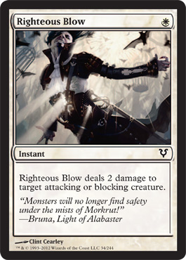
Righteous Blow
OH NO!! THEY GOT PRINCE!
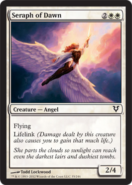
Seraph of the Dawn
I think I have already worn this outfit.
I wish all the angels flying around the entreat the angles card sort of looked like this - at least I believe she's flying.
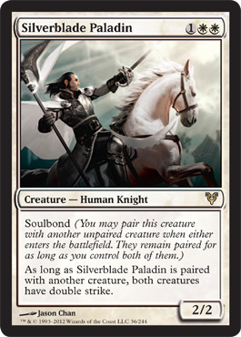
Silverblade Paladin
I like the texture on this art and the contrast with the light and the Asian art references in composition.
I also like the realistic proportions even if I don't like the unrealistic weaponry, plus I need four of these cards.
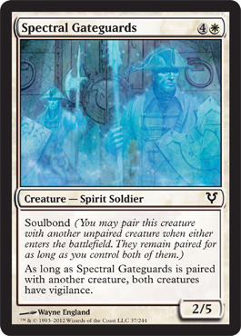
Spectral Gateguards
Pretty, I like the stained glass layered effect the sense of depth and the textures. I also really like that the humans look like humans that might be real people.
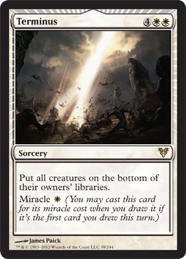
Terminous
I get the feeling that this card might be much more interesting art wise at it's original scale. As it is, it's one of the more recognizable miracle cards so I'm glad the visual doesn't overwhelm it.
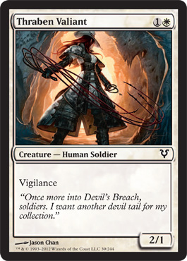
Thraben Valiant
Yeah baby, I want all the things she's got. Every last stitch and whip of them.
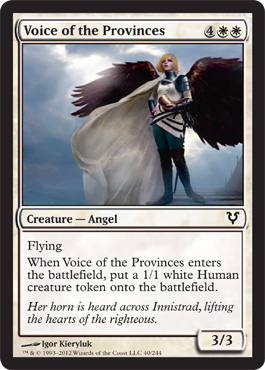
Voice of the Provinces
Awesome, it's a blue jeans angel. She looks like about half of the women at the local colleges and three women that I've done theater with.
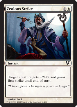
Zealous Strike
This is cool, I like the depth and the color choices and the contrast between the red and the blues and purples looking ominous.
If you'd like to continue on to the Blue Cards They're Over Here : )








This comment has been removed by the author.
ReplyDeleteI know this is old, but... any comments on the art of Iona, Shield of Emeria?
ReplyDelete