Pseudo Newb- One Female’s Reaction to Avacyn Card Art: Black
It's Time for the Black Cards
When I'm done I will put a full Table of Contents with the intro and link but for right now the review with all of the appropriate warnings and an explanation of who I am and the data for you to pre-judge me is here in the Review for White. and if you read that but missed Blue Blue is here.
Lessons Being Learned -
One of the things that's been interesting about taking this on is the fact that I'm using Blogger to be a kind of no-fuss thing so I can keep my competitive journal without worrying about things like design or spelling or that sort of thing. The most important part of a competitive journal is getting it out and getting it honest, the more barriers you put up to doing it the less likely you are to keep up with it. But I've got to tell you trying to do real content with Blogger is really frustrating format wise so if you're keeping up with this (I'm up to Black Today!) I apologize for the inconsistency - yesterday I tried to short cut and instead spent half the day looking a someone else's code ( the other half was finals and getting ready for Balticon.)
Here's the Big Honesty Bit about me and Magic Cards -
I have a problem. Consider this Dirty Secret Revealed #2 I avoid playing cards where I really dislike the art. This happens to me more in Black than in other colors ( although it made ALL of the Scars Block difficult for me) .
The pseudo-newb title is because I'm a "returning player". Although it was long enough ago and the game is different enough that I'm pretty much at the beginning of the learning curve, it's allowed me to be more organized and perhaps vocal than other beginning or mid range players. My approach to the game is completely different than it was when I was playing the first time. But when I was playing the first time, I played black alot. I might have been the only person who liked the Fallen Empires expansion because I loved Thallids and Breeding Pits. I liked playing Black and Green. I notice that at the moment I play everything besides Black and Green and that's mostly because I can't stand the gross-out art.
(Dirty Secret Revealed #1 is somewhere in the White review)
A Trip Down Magic Memory Lane
Allow me to share with you a montage of the Black cards I used to like a lot.

I adore Demonic Hordes - and Tourach's Chant. When I liked the Phyrexians Best they made things that looked like this:

Not things that looked like this:

Honestly in a lot of the art that was the thing that looked like a big "No Girls Allowed" sign. It's like by taking away the charm, humor or rounded edges magic could tell itself it was "more serious" but instead really created something more generic or more commercial.
I would have rooted for the Phyrexians if they still looked like this:
 I also notice that a lot of the more unpleasant aspects of Magic Culture are from when it tries to take itself too seriously and appropriates language or culture from things that are generally believed to be more "hardcore" like competitive video gaming, sports with trash talking or more serious like poker ( why never chess? ). It also does not escape my notice that there were a lot more exploitative looking portrayals of female characters after they decided that the art had to be more " serious."
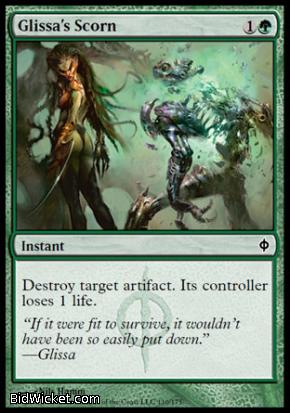
Glissa here for instance has so much scorn for you that she's not even gonna bother getting dressed and her mostly bare ass is gonna fart in your general direction.
And that fart is gonna be so devastating that it's gonna blow your shit up AND damage you too.
It can't be her withering stare since she is obviously focused on that cancerous skin tab on her shoulder.
And she was totally right to be concerned about that, because look what happened, she zombified and become one with the tentacle furniture :

Once again it's not like I wouldn't play either of these cards ( on these two the art isn't bad it's just "serious" and full of tits and ass because NOTHING says "serious" like butt cheeks.) I'm just saying; I miss Black art that had some complexity to it's presentation because it wasn't obviously hitting you over the head with
A : I AM ABLE TO DO PHOTOREALISIM IN HYPER SATURATION
or
B: Look at how evil or gross I am.
This is and was my favorite card in black ever. Redoing this art into the half assed thing they did was an absolute crime

If I were a tattoo getting type I would get this.
Every point of this illustration serves the fact that there was corruption, pain and loss. Every part of the body position and expression shows her anger and indeed her scorn. The aspects of her body accent her physicality, the opposite of spirituality and the utter, utter contempt she has for you for even thinking to summon her.
WotC would do well to remember that sometimes line art and watercolor illustrations can be better storytelling tools than things deemed to be more serious. That one white feather in the background mocks both her former standing and us for thinking we're using her since that's probably something she just knocked off the Angel of Breastfeeding after sacrificing the zombies on her side to boost her to an 9/6.
It's not the "best art" in the world but it's visceral and emotionally evocative in a way that WotC's current stuff really isn't.
Oh and I would totally wear what she's wearing and wouldn't touch the metal bikini and yeast-infection inducing metal and leather pants Glissa the Zombie Elf is wearing. But in fairness to her she's a Zombie Elf so she probably doesn't have to worry about yeast infections anymore.
OK so now you know what I used to like and it gives some context to what's going to happen when we go through Avacyn Restored's black because honestly New Phyrexia was so gross I've pretty much avoided playing black and I'm down with the horror tropes but like so many things it sort of felt like ALL TROPE very little art.
I would just like a little more creepy cute please. I love Typhoid Rats BTW:
Appetite for Brains
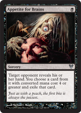 |
| I'm Eatin' Your Brain! Why you look so confused? |
I like the sense of humor is back even though we're still stuck with the incessant photo realism, the artist avoided the torture porn movie influenced gore. Please don't think I'm squeamish, I've worked with continuing medical education materials, been on grand rounds, edited surgery video for computer based training modules. Nothing is really as scary to me as a scan of an atrophied living brain.
However the art on this card does lead me to wonder how the Zombies actually get the brains without breaking their teeth, its not like they have the fine motor skills to saw in and they don't seem to have the patience to wait until the victim is dead. All that Zombie is really getting is bloody follicles and frankly that guy looks bald so the follicles are already dead too.
Poor Zombie.
Barter in Blood
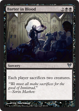 |
| Man these currency exchanges are brutal |
First Impression This has a bit more of an epic fantasy feel. I think that might be Sorin in there. So this is sort of Sorin as the Gray side of the force? Because it looks like he's using the time honored tactical negotiation technique of Force Choking people who don't agree with him at diplomatic strategy sessions.
Second Impression - Frame, composition and lighting are all good, so is the proportion of the various bodies, but this is an example of the card art being too large and complex to carry the illustrative storytelling out as well as it would if it were a larger size. If I weren't doing this blog exercise it might have taken me quite a while to see that it was actually telling us what Sorin was doing while Avacyn was restoring things (which appears to be culling the populations of everything back down to sustainable levels)
Third Impression - He sort of looks like a Gothic Horror George Washington.
Blood Artist
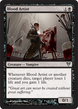 |
| This is the only Vampire looking for good light. |
First Impression - Wow this is good and full of juicy art history references and really, really creepy in a subtle way and OH it's that artist who did the cool Commander's Authority card . . . how was he also responsible for Long Angel is Long?
Second Impression, the close up of the glasses of blood and the contrast of the red to the shades of bones in whites, beiges and grays plus the amount of blood that would be needed to accomplish the portrait piece he's got done so far is the best kind of horror where I'm imagining all of the parts I don't see, like how he tests victims for color and viscosity, and what he does to prevent oxidation since he's keeping the reds with very few of the rust browns.
Is it transient art meant to be perishable?
Does the one life the target player loses for you to gain represent the fact that he traps life essence in his paintings to keep the reds red?
Will you haunt the painting if you die from being bled for it?
You really don't want to know what the rest of my brain is picturing - I'm just as happy it's not on a card.
Bloodflow Connoissuer
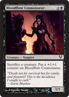 |
| Might be a Predator but also total fashion victim |
And are those triangular ruffles around her hips? Somebody call that woman from the Belgariad on "What Not to Wear!"
Second Impression - OOFH this outfit did not get any better on a second look - although it does look like she's got some kind of bedraggled feather on her Ming the Merciless TM headgear so it's not really mismatched ponytails.
She looks like the Miss Havisham of the vampire set - or some vamp with a good family name but no taste whatsoever trying to prove that she's as classy and snobby and fun to hang around with as Olivia Voldaren but no one ever invites her to any of the good parties because frankly she has no taste whatsoever. Sorin should take her out for that skirt alone. I bet she writes for the Quarterly Review of Blood and they at least have to invite her to the important award parties and restaurant openings.
Bone Splinters
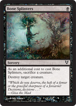 |
| Ooh Pretty. |
This is an example of the art changing for the better since this is apparently a reprint from Shards of Alara.
This also reminds me of the color play in Tourach's Chant. I like the interplay of the splinters and the destruction to create them and the interplay of life and death symbolism. It's much better than it's original card art which I find icky.
| Also does not count as equal opportunity exploitation |
Butcher Ghoul
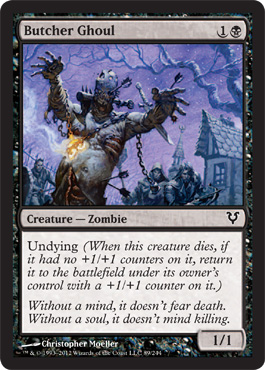 |
| Boring Flavor Text Is Boring |
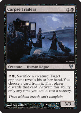
Corpse Traders
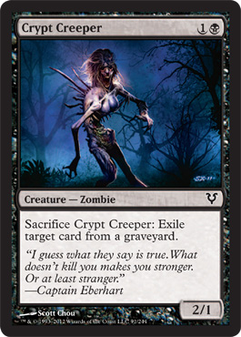
Crypt Creeper
 |
| Is that what happens with silicone? |
Second Impression - Maybe they aren't boobs, maybe they are lungs or something that happen to be the ONLY things that didn't atrophy or desiccate
Third Impression - it doesn't matter whether or not they are something besides boobs, given the boobcentric nature of Innistrad they are going to read as boobs anyway.
Final verdict = Boob Zombie
By the way this is a reprint too where somehow they didn't come up with a boob zombie
 |
| He's got them moves like Jagger |
Dark Impostor
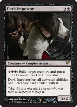
Fourth or fifth time seeing it - Hmmn maybe it's not a she.
Never mind I like this card and if they get to refer to the Angel of Breastfeeding as "he" in reviews Dark Impostor can be "she" when I review it.
It does show something though doesn't it? That we do try to see ourselves or what we know in the art first.
And of course the real reason that I want it to be a she is because that jacket looks SHARP and I need a good white jacket.
Death Wind
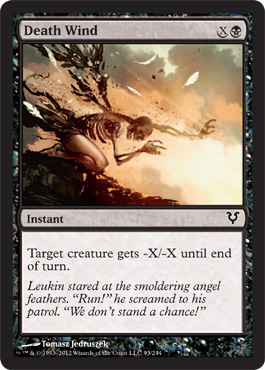
First Impression - Whoa.
This card is like a payoff for all the pulchritudinous angels we've had over the years.
The rich golden fleshiness of the leg which would just be a generally hot angel leg if the upper half of the angel wasn't being blasted away underscores the level of violence and the intense suddenness of the Death Wind in a way a gorier picture wouldn't be able to do.
This is a powerful image. It feels like a black card.
It's scary if you think about it.
It's consistent with it's world.
Demonic Rising
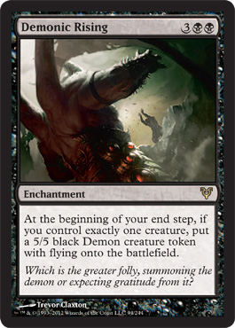 |
First Impression - Honestly I don't get it. Maybe it needs to be bigger.
My first impression is Kind of like Lumberknot at a rave.
I like the flavor text though.
Demonic Taskmaster
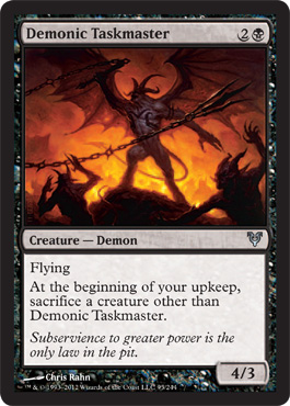

Nicely done but predicable and boring.
Descent Into Madness
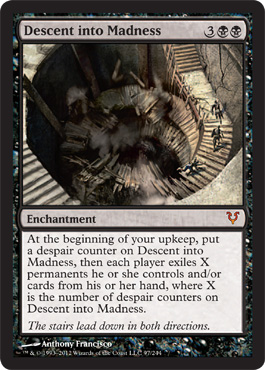 |
| Very Hitchcock |
That is all.

Demonlord of Ashmouth
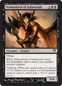 |
| You. You're What's for Dinner |
First Impression - "I'm a Dustbowl Refugee . . . ."
Part of it's the sandy colors.
Other thoughts "The Phantom of the Rodeo is there . . . Inside My Mind"
'I'm part of the special Hell for Innistrad Cattle"
"Now you know why you shouldn't eat cows in India Muthaf*cker. Have some instant karma.
Second Impression - all that said at least this demon has some personality, even if that personality seems to a confused evil shaman from Texas.
Don't know why I thought all that - here you go :

Dread Slaver
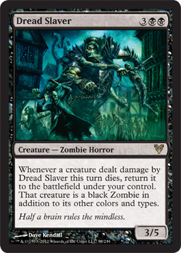
First Impression - This looks like one of Blue's steampunk zombies wanted off the ranch but frankly I'm confused.
The mechanic lets you steal stuff but I'm not sure why this particular zombie is relevant to that mechanic.
I also note that it's in the thickly settled part of town and if you know much about the distance of "roads" in medieval towns you 'll understand why I'm concerned that the poor zombie is going to get stuck.
But it's a zombie so it probably doesn't mind
Driver of the Dead
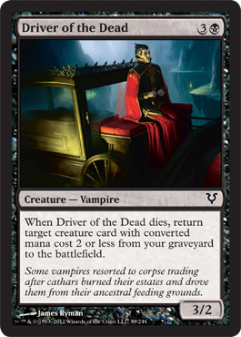
First Impression - "He's a born Undertaker's Mute"
I think given the inability of things to stay dead on Innistrad the glass surrounding the coffin is a very brave choice.
Second Impression - so I read the flavor text and it seems like vampires got seriously displaced when the economic collapse came and now they have to take menial labor jobs to get anywhere near the blood they used to just be able to take.
It explains the vivid color choices on the Driver.
Essence Harvest
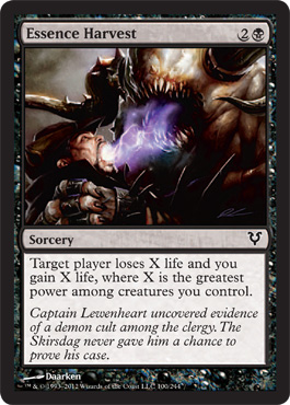
First Impression - What's with the multiple tooth mandibles if it eats souls through sucking the soul out of you transfer system?
I mean I get tusks on either side - that's like a demon thing here.
I like that essence is purple.
Evernight Shade
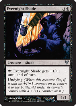
First Impression - I like this card it's creepy-cute. It's like a group of soul eating Jawa's live in Innistrad.
Second Impression - That Evernight Shde is hanging out in town in broad Daylight. Evernight Shade is Badass.
Evernight Shade will not be defined.
Evernight Shade don't care about your diurnal cycle.
Exquisite Blood

First Impression - Messy Eater.
Second Impression - Well look the vampire is wearing the Big Assed Collar look that is so popular around Innistrad and she's apparently so hungry that she can't even eat politely so maybe there is some anti-vampire value to all those neck straining collars.
Ghoulflesh

What'll Daisy do now?

Second Impression - I'm seeing some similarities to the Death of Marat that are probably coincidental but this is all about what one woman thinks of when she sees the art for Avacyn restored and this is what I think of. It's probably the colors of the cloth around both of them.

Gloom Surgeon
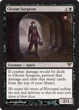 |
| Roger Ebert helped us with Passports to Innistrad |
First Impression - Dark City Immigrants?
Witness Protection Program for The Strangers?

Yes I like this card and I would totally wear that outfit.
Grave Exchange
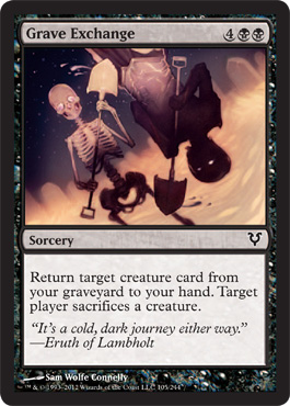 |
| They're Adorable |
Love, Love Love the depth contrast, texture the feeling of mixed media the unexpectedness of it
I like the Day of the Dead holiday feeling too.
I understand that this a new artist for WotC and I hope they use him for lots more stuff.
This is fun. I miss art that's fun.
Thank you Sam for staying true to black without falling into the "this is serious death stuff" trap.
I hope they let you do rats and gremlins!
Griselbrand
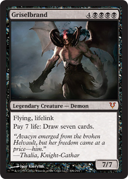
So am I the only one who looks at this card and thinks of Beetlejuice?

Anyone else?
No?
OK then.
Also I think of King Lear
" He that has and a tiny little wit,
sing hey ho the wind and the rain
Must make content with his fortunes fit,
for the rain it raineth every day"
Maybe it's the tiny head but there just doesn't seem to be a lot of Brain Power there, like getting himself caught with Avacyn in the Helvault and just being stupid around Lilliana.
Harvester of Souls
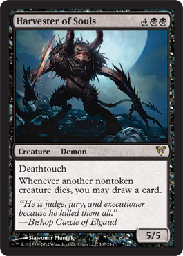
First Impression - that's a euphemism right? because souls are all that delicate niblis kind of thing or insubstantial chesty women in nightgowns like lingering souls and you don't need a magicked up spiky Minotaur to collect them. you might need a spooky child with a net.
This looks like some one's penis thought it up.
Probably not the artist's fault I blame the penis that thought up the flavor text.
Nicely done if boring subject
Homicidal Seclusion
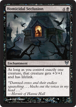
This is an example of using a cliched image but somehow managing to hit resonance instead of trite or boring. It's a really fine line but I think its the action and positioning of the live figures and the dynamic foreground with the treetops.
Second Impression - Hey wait a minute - this is that Cliff Childs guy who also ducked the generic curse with Dreadwaters in Blue.
Well thank you Cliff for making me more secure that my analysis is at least consistent, and so is your style.
Good on you Cliff.
Human Frailty
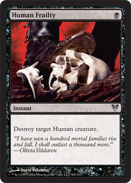
I also think I used to have those boots.
Hunted Ghoul
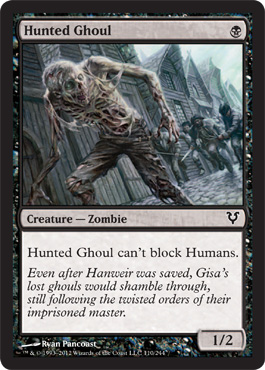
First Impression - I'm sure he's a lovely ghoul. There's nothing wrong with the art or the card I just am not excited about it.
Killing Wave
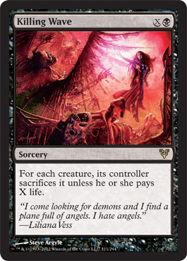
First Impression - Oh look it's Liliana the Artist's Trap.
I imagine it goes this way:
Liliana is supposed to sexy and her character design looks like a stripper. How could I possible show how sexy she is. I KNOW I will ignore all of the laws of physics and everything I learned about draping in art class, and any knowledge I have of the texture of actual cloth ,and just draw her naked and then cover up her naked with color so we can pretend that it's clothing. We'll add a skirt.

So you see what really makes it offensive to me is when I can see that the artist is actually really good at color, texture and anatomy and throws it all to hell to "show" me as a viewer how very, very important Lilly's tits and as are to her magic and that she sold her soul to be able to grace the side of 70's vans throughout the planes.

Not That There's Anything Wrong with That
It's just incredibly unnecessary and she's obviously wearing latex clothing which she was not wearing in the rest of the depictions of that costume.
Now please don't get me wrong. It's not like I've never worn latex, but I sure as hell wouldn't fight demons in it. That stuff will burn your skin off and meld with it if it gets to a melting point. And it does require talcum powder.
Here's a link to a pretty good site for Latex clothing - all sorts of stuff, but the one thing we should be clear on is that this clothing is pretty much meant to say " look at my practically naked body"
http://dawnamatrix.com/ (portions of this link are NSFW)
Once again I will point out that the overt sexualization of Liliana into this type of clothing or art makes her perhaps 3rd wave feminist and owning her sexuality but to a mainstream audience not embedded in women's studies it makes her objectified. On an artistic level it is the world's laziest interpretation of "sexy" which it has been proven Lilly doesn't need. but mostly I'm offended by the fact that if it is latex the skirt wouldn't flow that way and if it isn't latex then the artist just ignored the draping to show off her tits and ass. She did sell her soul for them so I suppose it's where she wants us to look.
Commit to one or the other. Glissa's in a thong after all if you want Lilly to wear paint or latex follow it through.
This will be important later when we get to green - remember I don't object to Liliana being sexy or sexual I object to artists depicting it in a shorthand porny way.
Maalfeld Twins
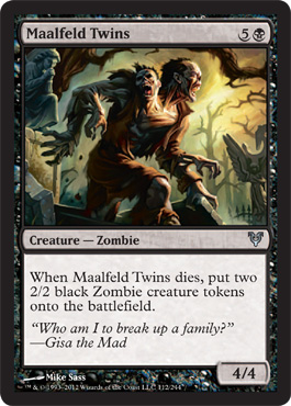 |
| Zaphod? |
First Impression - This does the best thing that this kind of art can do. It makes me curious about the story behind them.
The Grand Guginol grotesquery repels in a fascinating way, as opposed to a gross out way.
I like the detail of all the Angel Statuary around them.
Marrow Bats
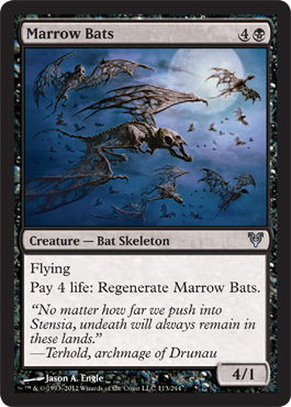
First Impression - nice use of color - bat skulls are not recognizable enough when accurately rendered to do anything other than look like half-eaten fossils
This is a perfect example of a card I would probably avoid using because I don't like the picture - it doesn't just uncomfortable creep me out it also makes me look at the negative incentives and sort of make me not even think about the card strategically because I already don't like it. The high costs plus the disliked art would probably have me avoid it in draft too.
Bat skeletons are icky. Could have been compelling with just a little less realism.
Mental Agony
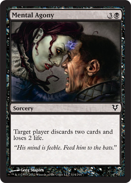
First Impression - "How do you like me NOW TinMan you sanctimonious son of a bitch. "
Elphaba is tired of your sh*t..
Necrobite
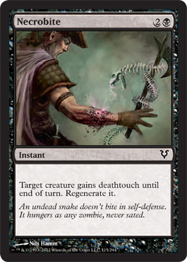
First Impression - It's adorable. I want an animated skeletal snake.
Snake skeletons are not icky
Polluted Dead
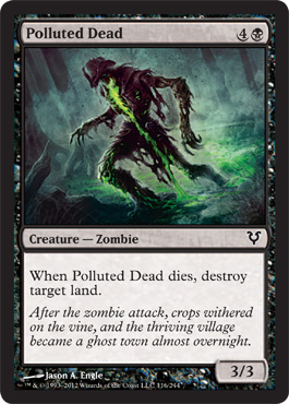
First Impression -
Oh no Zombies Got Ben-10 !

Predator's Gambit
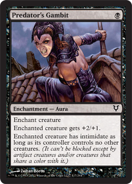
First Impression - Hmmn more Ming the Merciless TM headgear.
I don' think that corset is going to contain those breasts while she's jumping around on rooftops.
Just sayin'
Art's pretty good, cloth appears to be silk and drapes properly for it. Shading and style are consistent with the textures of the rest of the illustration.
At least she's not wearing blue eyeshadow - but maybe that's only a white card thing.
Renegade Demon
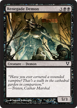
Now I know I've been rough on the demon depictions but I do kind of like this one. It feels other worldly and like it is perhaps something bigger than just the plane it's currently on. It also looks like something that might actually be able to fight without relying on magic to make it's body functional so it's kind of scarier than the other demons.
I also like the interplay of what looks like blue tones against the yellow creating ominous lighting effects.
Searchlight Geist
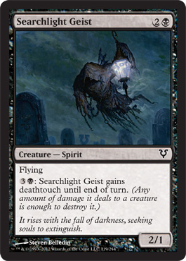
This is a companion piece to Moonlight Geist the same way Mental Agony is a companion piece to Angle's Mercy.
I like the deep blues and the water color like effects
Soulcage Fiend
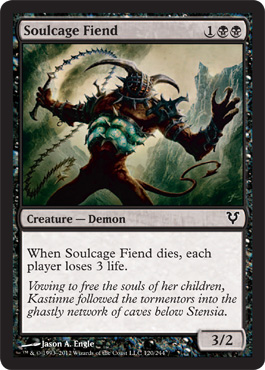
First Impression - Is he wearing like the demonic version of the cone of shame?
"No you can't take it off until you stop licking the glowing blue larvae on your chest."
Treacherous Pit Dweller
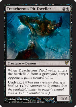
I am sure this is a Johnny card. I think I'm beginning to get it.
First impression - what stupid human wandered into a graveyard in Innistrad at night. Someone is getting a little overconfident with all the Angels flying around.
I do like this card, I like the construction of the fiend and the interplay of the blues
Triumph of Cruelty
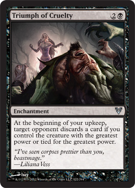
Ok here we have another Liliana card - even though her breasts are hanging all out at least the corset looks like a corset and the skirt looks like it has some actual weight and heft to it.
And frankly I've never seen Garruk look better. Has Izzy ever illustrated him when he wasn't in pain because he looks like he'd portray him as an actual person instead of Power Fantasy #4 with a large dollop of Wild Man/Hulk Trope.
I'd be interested in seeing that, you should also understand I think the Garruk character has been just as abused in design as the Lilliana character.
Undead Executioner
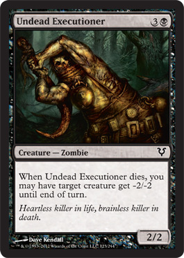
I kind of really like this card art. It's unusual in color choice and method of depicting zombification. It reminds me of the transitional period between Art Noveau and the arts and crafts movement.
It also sort of reminds me of the stuffy doll from the early days of magic so I might have a soft spot for it.
Unhallowed Pact
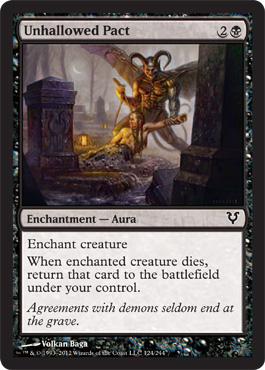
This card is fascinating because of a conversation it started.
It reminds me of a bunch of Norse myths. The Demon seems extremely pleased with itself. It really does seem like people should stay out of the graveyards.
Maybe even if they're already dead.
That's it for Black
No comments:
Post a Comment