I Time for the Blue Cards
When I'm done I will put a full Table of Contents with the intro and link but for right now the review with all of the appropriate warnings and an explanation of who I am and the data for you to pre-judge me is here in the Review for White.
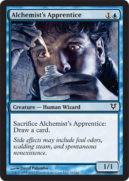
Alchemist's Apprentice
First Impression - Ok I love the framing, the slight glow, the color balance and composition and the full reality of the things beyond the frame, you can see that he's bearded, that he's curly haired, you can almost see the muscle tension in the crossed-eyes so you know he's not normally cross eyed
I would classify this as post-modern Baroque, Dramatic light? check. Dramatic Gesture? Check. Dramatic Moment? Well that would be where the post-modern part comes in. . . . because well you see
We know how he's gonna get sacrificed right?
KABOOM!
or maybe ****POP ******
also I keep thinking of the displaced bearded head as a Holfernes Junior for all you art historians, not sure what I'm talking about - all Blue Mage intellectually curious? Hit me up in the comments. I do a lecture on Judith and Holfernes in art history . . . .
Second thought - This is so going into my mad scientist Innstrad Block Theme deck if I can manage to stop playing competitive Magic long enough to make it . . .
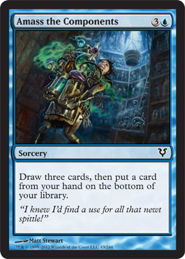
Amass the Components
First Impression: - So this is Wizard's way of saying Adrienne . . . we really, really want you to make a mad scientist Innstrad Block Theme Deck . . .
This is made by Matt Stewart who made my favorite Innistrad Card " Creepy Dolls" I have a playset of signed creepy dolls in my Coutlon's Creepy Doll deck.
I should not have been surprised.
The artist works in oils on paper - so this is an oil painting which makes what he did with color light and transparency fookin'brilliant as my Irish roommate used to say.
Also when I saw it I thought of the sparks from Girl Genius by Phil and Kaja Foglio. Anything that reminds me of Foglio is OK by me.
Lets take a closer look at our component amasser shall we: courtesy of the artist's own website:
Also currently my vote for best flavor text. It gives me hope for my own newt spittle collection.
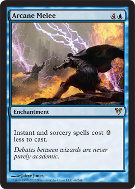
Arcane Melee
First Impression - generic art is generic.
Would have liked it better if they were throwing down in a library or workshop, would have made the flavor text more interesting too.
Also suffers from Generic Fantasy Cover Syndrome.
Did you know that publishing houses used to troll galleries and SF cons for art, buy the rights and then use it for whatever covers they though were appropriate when they didn't want to invest to much into that aspect of the book.
No idea if they still do that sort of thing, but it was SOP back in the 20th century. Tor acquired some amazing art that way.
Second Impression - Still meh, This is a missed opportunity.
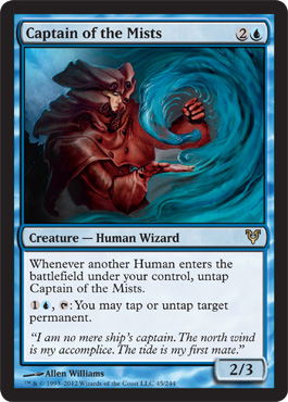
Captain of the Mists
First Impressions: I like the swirling and the echoes of the circles from the mists into the folds of the oiled leather.
It gives a real sense that mist is wet.
The hat is stupid if its going to worn in a wet environment in lots of rain though the water would totally run down her face and into her neck, but maybe that's why she's got the super large bulky hood, to protect the hat. Funny hats are very important in Innistrad.
I do like the way the clothing creates the counterbalance of solid vs insubstantial though.
(I would wear the cloak and hood bit but if the jacket comes with SUPERCOLLAR I'd pass, maybe the collars and shoulderpads are to create last minute barriers for vampires? But I see so many of them feeding off wrists . . . maybe they had to adapt to the local fashions?)
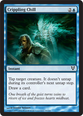
Crippling Chill
First Impressions - OK it's easily identifiable and bears a passing resemblance to David Carradine.
So I guess if nothing else it's got that going for it.

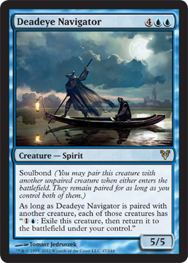
Deadeye Navigator
First Impression: DON'T PAY THE FERRYMAN!
Don't even fix a price.
Second Impression: Especially since he keeps blinking you out you may not make it to the other side _ ( but that works well for me so shine on you crazy blue diamonds) .
Is he useful in sealed - yes, yes he was.
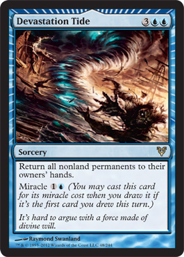
Devastation Tide
First Impression - Is that a Hollowhenge Scavenger getting blown around by a Snapcaster colored twister? It could be a Skaab Ruinator but the mouth and digits say "Hollowhege" to me. It's nice for green creatures to make an appearance in blue art.
I like the composition and I feel like this ties in to the Terminus card too so that the miracles that have global effects seem kind of connected. I also like the way the lines of the art balance and counterbalance the miracle card frame lines.
I could see hard casting this.
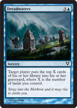
Dreadwaters
First Impression, I like the bait and switch of your eye being dawn to the puddle before you notice the Tsunami.
This is a nice example of seemingly generic art that isn't. The pop of green and the blends of whites and grays give it more depth than some of the other art that just seems like filler and the play of the object composition ( this uses fives) actually tells a story as your eye travels.
Good on you Cliff.
See if you can help your fellow magic artists find a cure for Generic Fantasy Cover Art since you managed to avoid it.
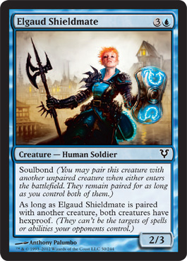
Elgaud Shieldmate
First Impression - Pat Bentar's Daughter is going to kick some ass!!!
Love is a Battlefield for Ginger Headed Soldiers!
This card makes me happy.
She is obviously taunting the enemy with her stance " You wanna piece a me? You can't handle it!"
She's obviously a true battle veteran having ditched the mandatory Innistrad funny hat, kept her plated epaulets anti-vamp spiky, toned down the out of control collars and like a true style iconoclast opted to accessorize in glowing blue kick assery.
I do not look like her. If I did I would dress like her. I would like to have her over for dinner.
One quibble the axe she has looks like it would catch on her enemies innards when she's hacking them apart. Maybe it's magical?
Love the color contrast, the use of light and the use of Red-heads.
Do you not know who Pat Benatar is? Oh let me show you:
OK then. Moving On.
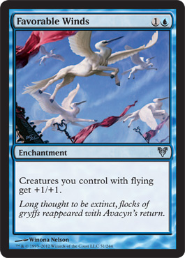
Favorable Winds
First Impression - OK so somebody took the little girl Pegasus fixation, gave them freaky heron heads and designed the card to look like the happy fun time angels in white but supa creepy even though it's broad daylight.
These things don't make any sense.
Libertie, Fraternatie, Creepie!!!
Good and useful card though.
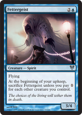
Fettergeist
First Impression - I like this card, I like the glowing chains, I like the Mr. Bumble parade warden but I don't want to see what's under the hood.
And I think instead of asking for more gruel Fettergeist might eat Mr. Bumble/
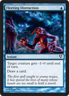
Fleeting Distraction
First Impression. I like the fact that devils were invading blue as a distraction. I wish the devils were a little more adorable. I am also disappointed with the goblins lately they're hyperrealism makes them generic and less amusing.
I demand to be amused by my devils.
Second impression: Oh the devil isn't the distraction? The butterflies are?
I like my story better - those are radioactive Snapcaster butterflies and the Snapcaster Mage sent in the Devil to distract them so he could save his lab.
I still demand to be amused by my devils.
(Fully naked male devils with their junk strategically hidden also do not count as equal opportunity exploitation and are not sexy.)
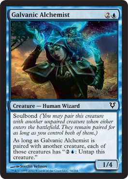
Galvanic Alchemist
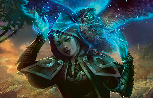
First Impression: Wheee! Everything' better with owls in it!
I like the contrast of the gold and the blue creating the green light wash over the mage, but what the heck is going on with the boiled leather plate attached to the hood?
That looks seriously awkward.
It's either boiled leather plate or cardboard so I'm going to go with the first option.
That said I would totally wear this outfit and I would definitely wear that owl.
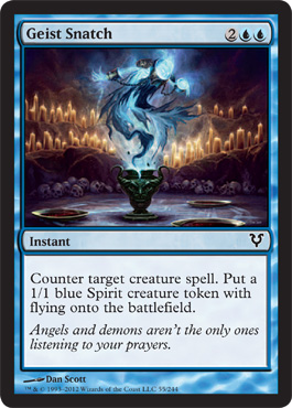
Geist Snatch
First Impression - So this is how the Niblis got into the urn?
This card looks like it would have much more going on in it in it's full size.
I have no problem with the card but honestly in it's current form I have no interest in it either - I'd like to see a full art version.
It is not generic.
This is the kind of card where I notice something about the art about 4 months after I've been playing with it. So I have high hopes
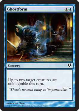
Ghost Form
So this is an example of good generic fantasy style art. It's inoffensive, it tell the story, the art reads clear on the card. It doesn't create much of an emotional response though.
Ghostly Flicker
First Impression - this is kinda cool. Somebody didn't really warn him about side effect huh?
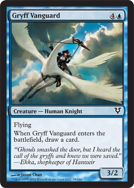
Gryff Vanguard
First Impression - Maybe they should have had Jason Chan do the Favorable Winds card because this looks way more like the little girl fantasy of a bird horse combo while you rock your sexy tricorn hat and corset uniform.
Or maybe that was just my little girl adventure fantasy kind of thing. either way it totally beats the hell out of just being the Upskirt Angel.
I also like the implied 5 points composition and the backlight breaking through the clouds.
Here's a close up of the outfit, not only would I wear it, I think I already own it.
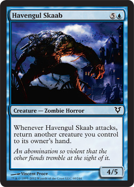
Havengul Skaab
First Impression - Oh look a big hulking monster.
Second Impression - Oh look a big hulking monster..
Reads Flavor text - meh.
The blue in the background is pretty.
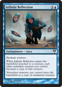
Infinite Reflection
OPPOSITE OF MEH TO 11 !!!!!
Oh color choices, how do I love thee, let me count the ways.
I love thee to the depth of the greens hidden in the blue of the cloaked vest
I love thee to the breadth bottled misty blue grays in the sky and in the shirt
My soul can reach and still feel light in the luminosity of the misted greens rising from the goldbrown earth
I love thee for the levels of light and the integration of color and tint with composition to the level of every cloudy day's quiet need.
I love thee so much I wish a were a better player with Johnny Tendencies so I could find a way to run you as a four -of in a highly competitive deck and I will irrationally keep trying to play you even though I am not a Johnny or a good enough player to use you properly yet.
This might be the only outfit I've ever seen in Magic where I would wear it while playing ( possibly because I already dress this way.)
Subtle cosplay would be subtle, I look a little like her, we both have curly hair, I already have the gloves. Would need the blue contacts as my eyes are averagely brown.
Plan, get outfit, wear to event - see if anyone notices.
Second Impression - ** joy ***
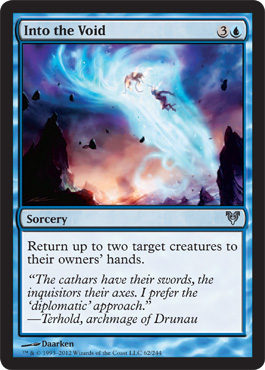
Into the Void
First Impression - I feel bad for this card art because it comes after Infinite Reflection.
Generic whirl and lightshow magic art that could have been really cool interpretive or experimental art instead.
Poor card art. ( should be read in a comforting sympathetic voice not a judgemental one)
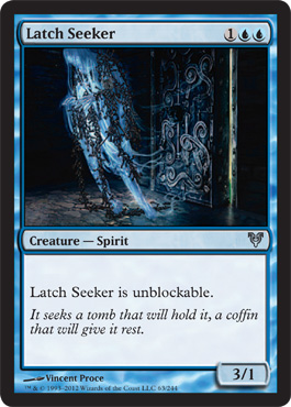
Latch Seeker
First Impression - I like the twirly bits at the back that remind me of early air elementals in magic and give it an art nouveau touch of the possibly horrific form.
I know I like the card in Limited Sealed.
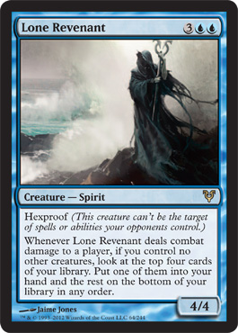
Lone Revenant
First Impression - Unemployed Nazgul

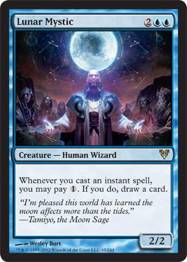
Lunar Mystic
First Impression- Vin Diesel got religion?
If Vin got religion why don't we get him wearing half naked stuff like the girl priests and angels? Oh never mind they'd just puff him up like Garruk and the Midnight Duelist because they think over-inflated chests are what we like - or what they think is powerful. Hey artist guys! just so you know Vin here is actually just a smidge too bulky - we don't like it when it looks borderline steroidy. Please help stop Johnny Bravo Syndrome:
Maybe you should think of it like this artist guys . . . . muscles to women are like breasts to men. Fake ones hold some entertainment value but they are sexier when they're real. Juice is just like silicone.
They look different. We can tell.
Just sayin' . . .
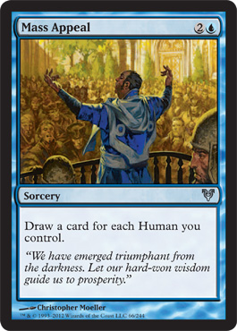
Mass Appeal
First Impression - This looks like an INTERESTING 1980's SF book cover. I'd pick up this book to see what's going on.
Plus blue and gold are some of my favorite oppositional colors.
Second Impression - I wonder if he's supposed to be a good guy or a bad guy.
Third Impression - pretty brave of them to put a non-rugged middle age guy on a card if he's a good guy in a position of Power. Oh NOW I know what this reminds me of - the cover art for the Deryni Series.

Cool - I liked that series.
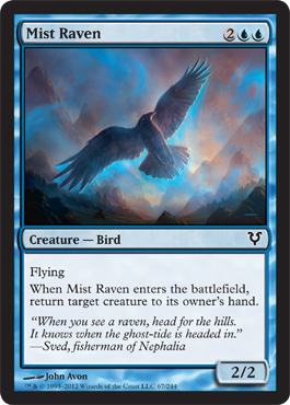
Mist Raven
First Impression - Cool, non offensive, nicely painted.
It's like chamber music, pretty but meant to support the party you're throwing by setting the mood, not to demand attention on it's own.
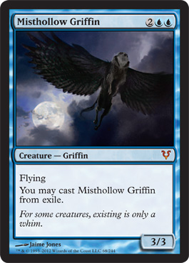
Mist Hollow Griffin
First Impression is cool card is cool.
Second impression - gee lots of weird things either were hot for each other or got stitched together in a way that took over In Innistrad's animal kingdom.
However, everything is better with owls in it. That is an owl head right?
Card art is a little dark for a card.
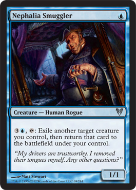
Nephalia Smuggler
First Impression: "The trouble with that boy is Meat Sir. MEAT!"
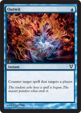
Outwit
Pretty, looks like the artist was inspired by glassblowing.
It's too small to communicate anything other than "Fire Pretty".
Peel from Reality
Much better. You get to stop existing in layers.
Sadistic.
I like it.
Also I do like the use of the blues and purples with the whites. It's hard to use white in color composition.
This is the kind of thing I would like to see with some of the more generic card art - just a little imagination and you can still make the multicolor wash do things.
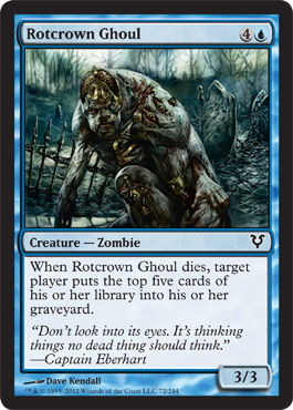
Rotcrown Ghoul
First Impression - oh not bad, a ghoul that has some character and artistic value instead of just " look how much attention I paid in anatomy class"
or "OOOH I love grossing people out"
I do like the fact that the ghoul is moving around in daylight. Even the gloomy places in Avacyn are getting lighter.
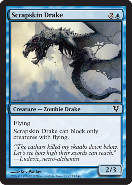
Scrapskin Drake
First Impression - I kinda like it, I kinda don't.I like playing it just fine.
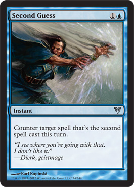
Second Guess
First Impression - Old TSR Art left over from Dragon Magazine?
Not bad but meh
Robes look heavy.
Having your spell countered makes your hands swell instantly.
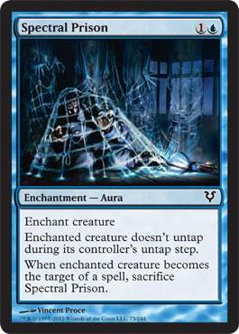
Spectral Prison
First Impression - Oh look its Ice Cage but spidery.
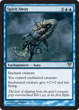
Spirit Away
First Impressiion - Is he being eaten by a giant larvae? How is that Spirit Away?
Second Impression - Oh there's a bunch of chains and that might be a hidden face so maybe it's a Fettergeist spiriting some one away.
Third impression - that dude looks like he's wearing some sort of strange half assed skirt like some of the angels are wearing but even more pointless and it's creating an unfortunate dong and tail effect. Artist would have been better off going for full dance tights.
Fourth impression - the dude being spirited away is kinda hot - good legs.
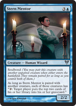
Stern Mentor
First Impression - I do like this card and it's the same artist that did Infinite reflection. The color choices do make me ridiculously happy but I do wonder if either Dolly Parton or Tammy Faye Baker had a huge influence on the makeup industry in Innistrad because there is a hella lot of blue eyeshadow.
My only real complaint is that the mentor looks like a very young woman dressing up as an older woman and it would have been nice to see someone a bit older and a more unique face that was striking instead of so traditionally attractive.
Or someone like Eleanor Audrey who was classically pretty but aged naturally:
But that's kind of nit-picking. It is a little distracting though. Everytime I play the card I still feel like it's a teenager playing dressup.
And I do wish there were more of an age range on the women in the cards, there's at least some for men.
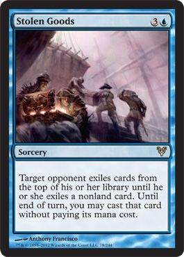
Stolen Goods
We temporarily interrupt this art review to say:THIS CARD IS SO MUCH FUN!!
fun fun fun fun fun . .. well maybe not for the opponent.
OK - It's totally Long John Silver and I'm totally OK with that.
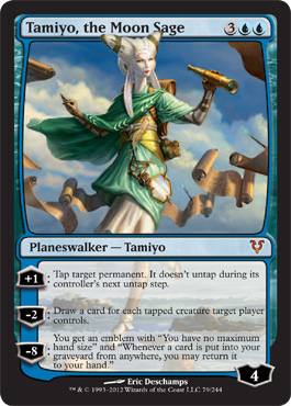
Tamiyo
I have gone on at length about her here.
I've gotten one at the first pre-release.
But here's the one thing I want to leave here - although I've already said it on Twitter:
Tamiyo is the first Planeswalker that actually would represent a power fantasy for me instead of someone's fantasy of what I fantasize as powerful.
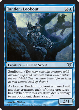
Tandem
First Impression - Guy In a Tree
Second Impression - Two Guys in Trees
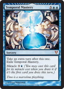
Temporal Mastery
I like this card art, bold, bright very structural almost looks like jewelry it works as graphic design not just art. I wish the artifacts looked like this.
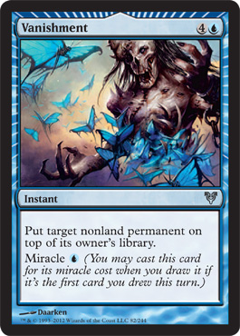
Vanishment
I told you those butterflies from back in Fleeting Distraction were nuclear - look what they did to this guy.
He should have distracted them with a devil.
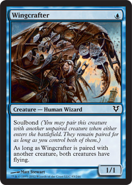
Wingcrafter
Somebody spent WAAAAYYY to much time on his costume for the masquerade
This is the end of Blue










No comments:
Post a Comment