Pseudo Newb- One Female’s Reaction to Avacyn Card Art: Green
When I'm done I will put a full Table of Contents with the intro and link but for right now the review with all of the appropriate warnings and an explanation of who I am and the data for you to pre-judge me is here in the Review for White. and if you read that but missed Blue Blue is here if you read those and missed Black, Black is here and of course red is here.
Green is the dangerous color isn't it? This is the one that holds the card that started the debate that made me think about it in the first place. Good ol' Triumph of Ferocity. But can I be honest? I haven't paid that much attention to Green cards in terms of art- there are pieces I really like in Innistrad, like the Somberwald Dryad (and wish we'd seen more cards from her side of Innistrad)
The Nostalgia Bit
Now I used to love green a whole bunch, back when there was no pseudo in front of my newb, and I used to play a lot of green/black or G/B as the cool expert types like to say. And I did like the werewolves but somehow never managed to put together a werewolf deck. I love the Lamboholt Elder to the point of wishing she were a Planeswalker
(I shall save my ruminations on Old Lady Planeswalkers and what they should be doing for another day) In my head I've been building a "little red riding hood" deck with Scorned Village and direct red burn for ages (held back only by my insecurity and lack of playtime) I mean - WotC pretty much gave us all the characters except a picnic basket artifact:
So in going through the cards from back when I was first playing (in the dark ages) I realize that I was playing green because I liked the art as well as the effects, Even the duds ( like the original Llanowar Elves) were inoffensive and things like carnivorous plant were just kind of pretty and sort of meditative.
There weren't a lot of distractions in the art so it was easier to concentrate on play but yet, for me at least, the art still enhanced the feel and a little bit of the magical part of Magic.
The insistence on such lifelike and literal art is also something that kind of takes a level of mystery out of the subject, and some of the wonder. Thicket Basilisk and Timber wolves are really less interesting than Regeneration or venom or Scryb Sprites.
But when you look at these cards what you really notice is the color and the brightness of light.

I used to adore loading up Scryb Sprites with buffs.
I also think some of my appreciation for Innistrad's Doomed Traveller stems from the fact that it reminds me of Wanderlust. which reminded me of The Fool. Which frequently reminds me of me.

Archetypes - they're not just for Decklists and Planeswalkers . . . .
Honestly. looking at this now out of the three I still like Wanderlust the best.
But green does very little to compel me to spend time in it now.
So as an experiment I did a search on green for the Scars Block and green for Innistrad Block - so these things include Avacyn restored - here's two lines worth of "the color of life" in Scars:

and the "color of life" in Innistrad Block

The Trouble with current Green
Nothing but doom gloom and spiky bits, and lots of things that say "do not touch me" and - there's no light to be seen here unless it's to show off the spiky bits some more.
And the cards that aren't spiky are kind of laced with the sort of color red that goes through poisonous plants.
Look, I think that some of the reason things like Ravinca, Lorwyn and Alara are popular is because you don't have to be an emo or heavy metal fan to feel like the art was made for you.
I'm not saying "no conflict" or "no evil" in the cards. I'm saying at this resolution, if you hadn't played, do you really see a huge aesthetic difference between Scars and Innistrad? No there isn't really. So Triumph of Ferocity aside - I know people who play green feel like they haven't been getting any love other than stompy things, but green - like red - seems to be in an artistic rut that is now two blocks old, six releases long and two years of playtime.
What were those popular yet lethal green decks? Faeries and Elves? Did non-gamer friends seem to be more willing to pick up the cards and try them out when you could give them a good competitive deck to try with cards that didn't look like studies in interpreting the theme of poison sumac?

Heck even this example of toxicodendron-vernix looks more inviting than most of the green cards.
"But wait," you say . . . "lighten up a bit Drinne. Mirrodan is all besieged and being taken over by the spiky Phyrexians and Innistrad is all horror now and everyone knows that all evil plant creatures have to look like the Alien right? And bad ass hominids need to have a strong resemblance to predator . . . "

"Why yes Drinne - we have been dwelling in the Doomy Spiky Darkness and indeed have our very ties to nature itself defined by alien invaders but Avacyn is Restored!!"
"Didn't you see White for Avacyn Restored? It was practically bringing you petite-fours from one of Marie Antoinette's dessert and gambling parties:

Surely Green is gonna be more like that even if it does have Triumph of Ferocity . . Nature's balance is gonna be restored, and werewolves will be saved! Stop being such a grumpy puss . . . "
Allrighty then - let's see what green is doing now
The Actual Review
Abundant Growth
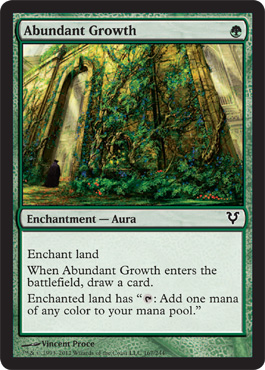
First Impression: I'm getting the general sense that what I like best about Innistrad is the focus on architecture - which is good because otherwise this depiction ( which I'm sure is beautiful in it's original form) is pretty much just a background for something else that is supposed to happen, or a still life skirting around the "still" part.
However, I suppose I should be happy - at least it's pretty.
But I'm not happy once I read the text - if it makes one mana of any color couldn't it at least have had flowers that were all five of the Magic color pie on the overgrowth?
And honestly it doesn't really look all that abundant, it looks more like the castle caretaker was lost in the recent war or had the month off.
I mean actual nature does some pretty incredible things with wild abundant growth like this:

That's from a seashore in New England which is all rocks - and look I even got the red and green that MTG loves - oh wait is that actual daylight with green stuff around . . . guess that disqualifies it.
Blessings of Nature
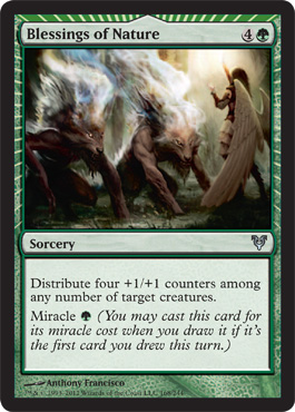
First Impression: MUCH BETTER than the other miracle cards - for one thing a set about angels actually has an angel performing a miracle - How about that.
Admittedly it does look like she's steaming really large puppies clean, but that kind of appeals to me.
Admittedly it does look like she's steaming really large puppies clean, but that kind of appeals to me.
And is she wearing a three tiered mini-skirt?
Whatever, I'll take my art that isn't horrible and actual angels in my blessings and count it a win.
Borderland Ranger
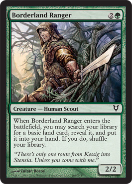
First Impression: OH MY - this guy is sexy. Seriously, seriously sexy -
Later on I will tell you about my conversation with Steve Argyle at GPBalt and the fact that I wouldn't mind the exploitation of the attractiveness of female characters in Magic if there were actually EQUAL OPPORTUNITY EXPLOITATION and why men drawing what they think women want is generally off by several orders of magnitude and the more complicated part of every woman really has different tastes and we actually agree on very little.
So trust me when I say to you that this is the very first magic card I have ever looked at and got a little warm under the collar over.
Am I making you uncomfortable? I'm making me a little uncomfortable too. Lets look at two reasons:
Actually let's not- if you want to read my overly wordy discomfort you can click here.
But here's my 2 cents anyway WotC - first impression is this guy is hot. I believe that if I'm travelling with him we'll get through the forest. I believe that when we are done getting through the forest I'll be sorry he's gone. I'd go Dryad for this guy.
If he's into Dryads.
Bower Passage
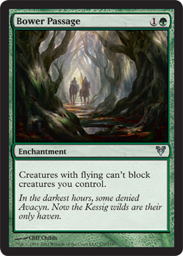
First Impression: I am sad because this is boring (with nice composition and lighting) but could have been greatly improved if the Borderland Ranger were in it.
Champion of Lambholt
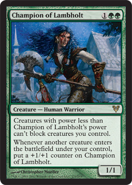
I like this card it reminds me of old Tim and Greg Hildebrant illustrations and Ral Partha Miniatures.
(Remember - being a Magic Newb doesn't mean I'm a gaming Newb)
I would totally wear that outfit.
Q!DgwBmk~$(KGrHqYOKkYEwREU53WDBMMpcnfQiw~~_35.JPG)

Craterhoof
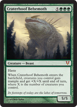
First Impression: I suppose I should just be happy it isn't a dinosaur.
And unlike Red it isn't just a Hominid that's Giant and Green. So I'll be able to recognize it as the giant stompy thing that REALLY wrecks my shit instead of a generic green stompy thing.
Can I ask why so many of the MTG artist commissions are so scared of color though? Why does it have to be oddly shaped, impliedly spiky AND boringly colored.
Descendant's Path
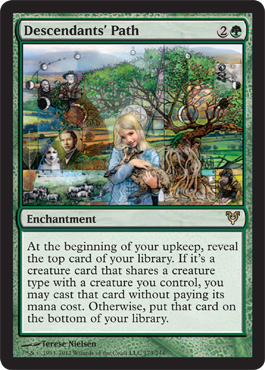
First Impression: Ok so I saw this in the previews on WoTC before I saw i on a card and my first impression was kind of "Finally"
Look ma! it's an illustration with color and meaning and it translates down to scale compositionally while clearly indicating the complexity the larger one would have.
I wasn't playing during the "guru" lands thing and the only reason I even know that the rotational eclipse model is something that is part of Magic's history is because there are scads of alters that are "guruifying" their art. But I like the sense of reaching into Magic's past.
That is because geometrics are cool. So I like this card it is actually about green and life and the artist apparently put a whole bunch of herself into the card which you can read about here on her blog.
-------------------------------------------------------------------------
So now that we've covered that let me tell you what my other first impression was. I was aware of critique of this piece long before the whole Triumph of Ferocity thing, This was the first time I ever really heard MTG players who just play, talk about art like people who talk about art. This is what I learned:
Some Magic Player's can't read if it's not rules text, and even then they might have a little bit of trouble and might want to find a dictionary.
And now for a Rant about Magic Players who try to justify what they shouldn't bother justifying:
Let's start with the obvious - it's perfectly OK not to like this art.
Disliking this art does not make you stupid, or a bad person.
But not liking it is not the same as it being done badly or off theme.
Please understand, I know the difference between me and an art critic. ( Mostly they get paid for it and they spend more time learning minutia about the market - then write about it hoping their analysis will back up their opinion - much like MTG card speculators.)
I am an educated art consumer/producer, and I'm a much better consumer than a producer. Because while I was required to learn all of it, I was learning it to be able to do it for when people who were better than me would be worse at deadlines than I am. (which is a nice way of saying I'm a sucky artist, but a good manager) I am just good enough to sub for someone better than me in an emergency. If an art critic were out sick, I am a much better critic in real life than I would be a substitute artist.
Critique, as an actor, editor, writer, reviewer, QA specialist, UI designer all follows pretty much the same principles which, like color theory, I shall not bore you with here.
And I DO support the theory that it doesn't really matter whether or not a piece is technically excellent, compositionally correct or the toast of the town and starting bidding wars in the millions, you are still allowed to go - "I don't like it" as long as you follow it up with "it's not my taste" or "it's my opinion".
But you don't get to say it's badly done when it's not.
Because unlike opinions, there are actual rules for composition. So when they say " this piece is a mess, it's all over the place" what they are really saying is "this piece is overly complex and could have used more negative space, so I find it unpleasant" but what it's not, is a mess. It's very carefully composed, and frankly composed in a risky way for it's medium.
If you don't present yourself as an expert or a critic or knowledgeable about art I'll let it go. I don't really understand sligh strategy yet either. I'll probably say something uneducated about it while expressing my opinion so I hope you'll cut me the same break.
However if you pretend you know about art and you're trying to impress/bully me into agreeing with you that's a different story.
If you start out with that comment while drinking a glass of chardonnay, at a social gathering I will be very polite to you, the same way I would with a teenager who is still learning all of the things they will need to know one day. I'll only mock you for your ignorance here, where almost no one can see. It's OK you'll mock me for not understanding the trigger sacrifice on Illusions on very popular websites so we're sort of even that way.
(or not- remember the red review? I hold grudges, and I really do have a good collection of Evil Overlord Clothing)
BUT if you look at the art on the card and say " it's got nothing to do with Innistrad" or " that kid looks modern era and what the heck does she have to do with anything" as I've seen on various forums and had said directly to me at a pre-release event, I will laugh at your pretentiously aggrieved ass even if you beat me 2-0 in the match.
Because it's not "Ancestral", or "Ancestor's Path" which would look backwards to a time when perhaps there were no Vampires in Innistrad and make absolutely no sense with Avacyn Restored - it's "Descendant's Path" you pretentious little wanna be Vorthos. It's about the "Happily Ever After" where Innistrad's creature ecology stays in balance and there is a future. The circle for the path starts in the lower right hand side ( viewer's right)
Some Magic Player's can't read if it's not rules text, and even then they might have a little bit of trouble and might want to find a dictionary.
And now for a Rant about Magic Players who try to justify what they shouldn't bother justifying:
Let's start with the obvious - it's perfectly OK not to like this art.
Disliking this art does not make you stupid, or a bad person.
But not liking it is not the same as it being done badly or off theme.
Please understand, I know the difference between me and an art critic. ( Mostly they get paid for it and they spend more time learning minutia about the market - then write about it hoping their analysis will back up their opinion - much like MTG card speculators.)
I am an educated art consumer/producer, and I'm a much better consumer than a producer. Because while I was required to learn all of it, I was learning it to be able to do it for when people who were better than me would be worse at deadlines than I am. (which is a nice way of saying I'm a sucky artist, but a good manager) I am just good enough to sub for someone better than me in an emergency. If an art critic were out sick, I am a much better critic in real life than I would be a substitute artist.
Critique, as an actor, editor, writer, reviewer, QA specialist, UI designer all follows pretty much the same principles which, like color theory, I shall not bore you with here.
And I DO support the theory that it doesn't really matter whether or not a piece is technically excellent, compositionally correct or the toast of the town and starting bidding wars in the millions, you are still allowed to go - "I don't like it" as long as you follow it up with "it's not my taste" or "it's my opinion".
But you don't get to say it's badly done when it's not.
Because unlike opinions, there are actual rules for composition. So when they say " this piece is a mess, it's all over the place" what they are really saying is "this piece is overly complex and could have used more negative space, so I find it unpleasant" but what it's not, is a mess. It's very carefully composed, and frankly composed in a risky way for it's medium.

If you don't present yourself as an expert or a critic or knowledgeable about art I'll let it go. I don't really understand sligh strategy yet either. I'll probably say something uneducated about it while expressing my opinion so I hope you'll cut me the same break.
However if you pretend you know about art and you're trying to impress/bully me into agreeing with you that's a different story.
If you start out with that comment while drinking a glass of chardonnay, at a social gathering I will be very polite to you, the same way I would with a teenager who is still learning all of the things they will need to know one day. I'll only mock you for your ignorance here, where almost no one can see. It's OK you'll mock me for not understanding the trigger sacrifice on Illusions on very popular websites so we're sort of even that way.
(or not- remember the red review? I hold grudges, and I really do have a good collection of Evil Overlord Clothing)
BUT if you look at the art on the card and say " it's got nothing to do with Innistrad" or " that kid looks modern era and what the heck does she have to do with anything" as I've seen on various forums and had said directly to me at a pre-release event, I will laugh at your pretentiously aggrieved ass even if you beat me 2-0 in the match.
Because it's not "Ancestral", or "Ancestor's Path" which would look backwards to a time when perhaps there were no Vampires in Innistrad and make absolutely no sense with Avacyn Restored - it's "Descendant's Path" you pretentious little wanna be Vorthos. It's about the "Happily Ever After" where Innistrad's creature ecology stays in balance and there is a future. The circle for the path starts in the lower right hand side ( viewer's right)
See the one by the root? With the farm and the scythe and stuff, writing? - that's your Innistrad girl right there. And are you, guy-with-the-half-naked-anime-chicks-staring-at-me-off-your-sleeves trying to tell me that you have a problem with the black and white grandma and grandpa in the 19th century clothing, when we have Burden of Guilt basically wearing the young women's version in the same block?
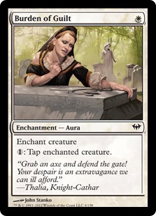
And if the Diregraf Escort picked his head up, that Innistrad Ministry of Funny Hats assigned headgear might look the same as Grandpa's. Plus apparently some of our gamers who feel the need to point out that the card is anachronistic seem to think she's dressed like a modern kid.
Nope - Not unless they're dressing like their dolls. The blond with the lamb there is the future of Innistrad. She's not wearing a blue sweatsuit. *
OK? Just say that you disagree with most of the public that likes the art. If you don't know what "Descendant" means or you have never heard of the rule of thirds try not to use either of those things to defend the fact that this type of art isn't your cup of tea.
Hell, maybe you think Craterhoof Behemoth is the apex of giant lizard art . . . it's cool. Different Strokes and all - I'll agree about the complex use of gray and the quite excellent late afternoon heading-towards-dusk sky and we'll call it a day.
* Disclaimer - all of the incidents cited in this rant actually happened to me - I am still surprised, no identifying characteristics have been changed to protect the guilty, since none of them read this sort of blog anyway
* Disclaimer - all of the incidents cited in this rant actually happened to me - I am still surprised, no identifying characteristics have been changed to protect the guilty, since none of them read this sort of blog anyway
\END ENTITLED ELITIST RANT
-------------------------------------------------------------------------
This is the promised text in blue so you know when you've successfully skipped my rant! Thank you for scrolling : )
Diregraf Escort
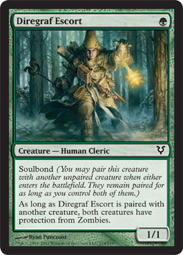
First Impression: I see so green guys trek through the forest directly alone with glowy bits, centered and very, very serious.
Why so serious?
Oh it might be all the zombies - this is Diregraf territory.
Second Impression - The Innistrad Funny Hats Brigade is in full force here.
Serviceable art.
Why so serious?
Oh it might be all the zombies - this is Diregraf territory.
Second Impression - The Innistrad Funny Hats Brigade is in full force here.
Serviceable art.
Druid's Familiar
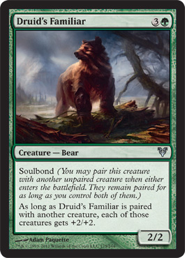
First Impression: Da Bears.
Druid's Repository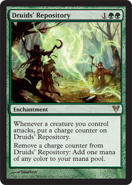
First Impression: Well I like the use of color but tiny figures are tiny, and I can't really tell what is going on.
Eaten By Spiders
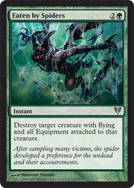
Also I like the positioning and image even if it doesn't make that much sense - although maybe we're seeing the Demon Zombie at the point it's being entangled so then it would be OK
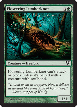
Flowering Lumberknot
Geist Trappers
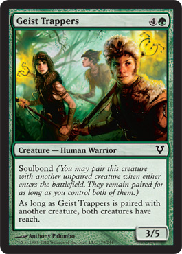
First Impression - It totally looks like all the Village Survivors are employed as Ghostbusters now.

Hmmn now why does this remind me of Peter Pan?


OH that's why
Gloomwidow
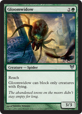
Almost all of the more generic art seems to be perked up by the inclusion of Innistrad Architecture. I like the late afternoon style light behind the Gloomwidow. The size of the creature is conveyed without banging us over the head because of the figure of the bird in the lower viewer's right corner. I like the fact that the webs are colored differently because different light is hitting it.
I like the little bit of contrast green on the carapace ( or maybe just under the carapace it's hard to see at card scale)
Magic is Green.
Grounded
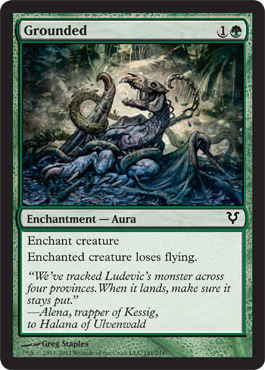
Part of it is that my copies were old and had the grays printed in a saturation that seemed very blue to me.
It's also got very strong thematic associations with the actual text and subtext of Farthest shore for me so I am predisposed to like it.
As you can see from the cover below there are some similarities in shading and the types of S curves both artists used. I'm sure it's coincidental, but my reaction is absolutely influenced by sentiment.

Howlgeist
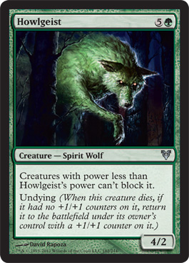
Alright it's green and glowing, but dude, glowing eyes on a wolf is a basic description not a "scary" or "spooky" thing. And the angle and inflated mane into the shoulder just sort of make it look disproportionate.
Plus it looks like it's giving you it's paw to shake.
It would have been more interesting and more dramatic to just go for a straight depiction of a wolf and make it ghostly.
Taking up the entire center column of the compositional frame and isolating it might have added to the idea that it was apparating, but the darkness of the columns on either side means the eye is assuming that the already distorted wolf might just be turned oddly and therefore it's just a green wolf with glowy eyes missing the majesty and command of real wolves.
Next time be as interesting to look at as nature.

This Actual Wolf Frowns on Your Unnecessary Shenanigans
Joint Assault
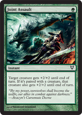
For a change that circular swirly dynamic that clearly means something to Magic's art director is working for the subject matter instead of just making everything look the same.
Lair Delve
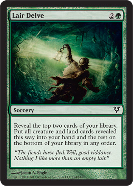
First Impression. I like the textured walls of the lair and the directional light from the lantern. The Lair Delver looks like he/she/it hangs out with the Village Survivors turned Geist Trappers.
I also really like the very deep saturated greens being used on this card making it slightly different than everything else, but cannot help but notice that circular framing that has made Scars and Innistrad look so similar.
Natural End
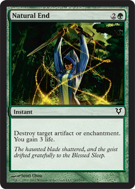
It simultaneously reminds me of Pulp Novel Covers, some of my favorite comic books and a little bit of the Jack Chick D&D warning things.
And the flavor text is a little pulpy.

And I am a huge fan of Matt Wagner's Mage - Magic is GREEN!

Nettle Swine
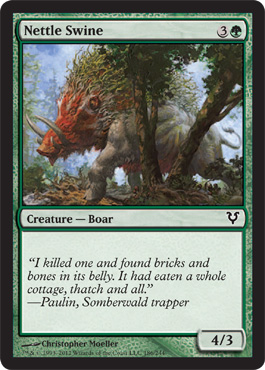
Second Impression - I wonder what real boars look like. Let me look them up - Oh they mostly look like tree bark that you want to be bacon but they want to be boars, so they'll kill you first.

I'm not sure what will fix the meh problem on the swine but this isn't doing it for me.
Maybe we could have watched it grazing on cottage roof thatch instead while the tiny humans were running from it screaming in their underclothing.
That would have been more interesting. And I would have gotten to critique Innistrad underclothing.
Nightshade Peddler
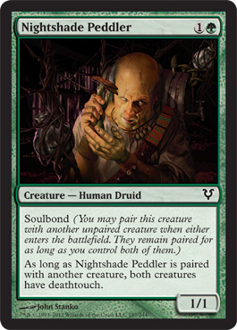
First Impression: "He's only Mostly Dead"
And I can't look at him without thinking of Tom Lehrer's "The Old Dope Peddler"
Audio of Tom Lehrer singing "The Old Dope Peddler" is below. Because I"m generous like that.
Pathbreaker Wurm
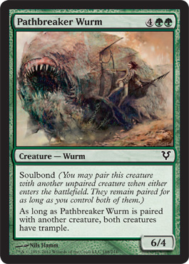
First Impression - Maud'dib rides side saddle.
Showoff.
Is it even possible to have a giant worm anywhere without thinking of Dune?
No. No it is not.
 |
Dune Sticker
Design by https://www.teepublic.com/sticker/239110-pet-sandworm
|
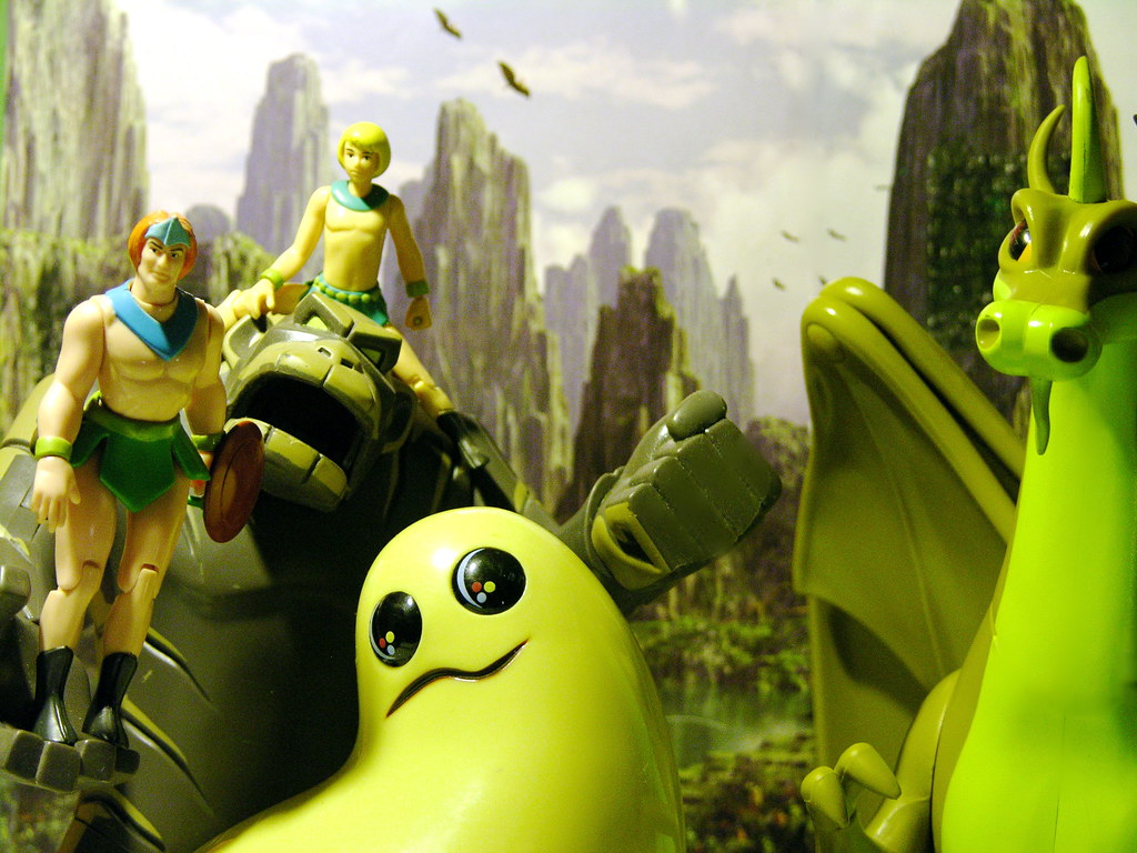
Primal Surge
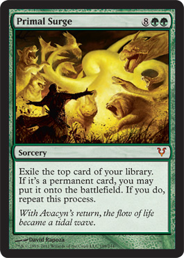
I KNOW
It's GLOOP!
Now here's the thing about doing this review - I actually remembered the names Gloop and Gleep and probably made little baby fan-art about them, but for the life of me I could not remember the name of the show they were on. But I have the Internet and MAD RESEARCH SKILLZ . . . Bwahhahahha . . .
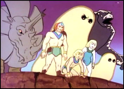
It was the Herculoids - which I'm sure was perfectly awful compared to my memories and imaginary versions.
So there you go - Primal Surge and the card art reminds me of the Herculoids
I am not ashamed.
Rain of Thorns
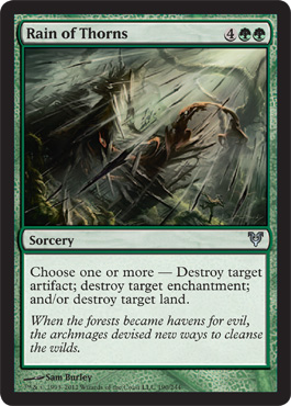
I do entertain myself by pretending that the thing being rained on is actually a Bird of Paradise that belongs to all the Green Acceleration Aggro decks I'm not good enough to beat yet. So there's that.
Revenge of the Hunted
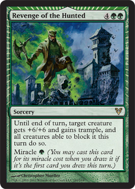
If that had happened then we could have hit two old school movies at the same time for resonance; Godzilla AND Attack of the 50ft woman.
It's a lost opportunity for tying the art between the releases together. More depressing since apparently they were done by the same artist and it didn't occur to him.
Sheltering Word
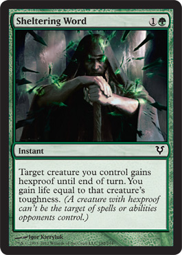
First Impression: You shall not Pass

Errr I mean this:

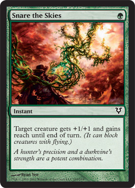
Snare the Skies
Too much trying to fit into a small frame perspective wise - yet another piece that is probably really cool at larger than card art sized that doesn't quite communicate what it at card size.
Somberwald Sage
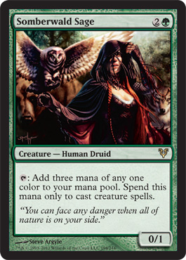
NOW THAT"S A female positive sexy card. Much better than Stripper Lilly.

Cool Story Sis:
Hey look it's a Steve Argyle.
Cool.
Now I met Steve at GPBalt and we had a nice conversation about what the hell happened to Lillian's hip. And it ends up that two things happened to make Lilliana's hip look broken, one was a draping error

I know this is hard to see - but if you click on it to see it at full size you'll be able to see how awful the feet are. I'm so happy he didn't paint them, however it really is not fair that he's getting saddled with that as something he did.
And he is a total sweetie who signed a playmat for me even after we had that conversation.
When we were discussing the perception of empowered vs. objectified female sexuality I noticed he did amazing architectural and texture work on other pieces. And told him that really it was the lack of texture that made Lilly look like an airbrushed objectified thing instead of a woman owning it. That adding the textile would not alleviate the issue, but would mitigate the snap judgements. Airbrushing makes Lilly look fake whereas everything about Somberwald Sage looks real and sensual and a kind of sexy I don't mind seeing (It's not sexy for me) but also a kind of sexy I wouldn't mind being.
So I'm very happy that I've got Somberwald Sage to judge Steve Argyle by instead of just Liliana of the veil, because I mostly get the sense that his art assignment for Lilly was done with a lot of "direction" and on a very tight turnaround.
Soul of the Harvest
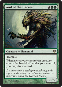
First Impression: I think we covered this earlier don't you?
Need a reminder? I know I do ramble on . . . .

Terrifying Presence
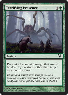
First Impression - The flavor text is what makes this one work
Timberland Guide

So let me clarify that - this card is what I would consider an excellent character study. It's done by the same artist and I really like his technique for expressing dimensionality and tangibility of his subjects. Also his Mandatory Ministry of Funny Hat issued funny hat is to scale and practical. All of the pieces that make up what's in frame look real and solid, but this dude isn't sexy like Borderland Ranger because he's wearing way, way, way too much cloak so his shoulders look way too bulky.
Not unrealistic, not Johnny Bravo syndrome, maybe if he weren't wearing the cloak he'd have the same effect, but it shows how fleeting "sexy" can be in the eye of a beholder when there's no "code" to follow.
Fan of the artist though. I'll be looking forward to more of his work where men might be less covered in giant collars and four layered caplets.
Triumph of Ferocity
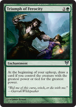
Second Impression - why does every damn thing in the picture end up drawing the eye to her tits.
No seriously guys, everything in the picture - composed around the tits - look:

OK I stand corrected - there are the other lines of focus that point to her crotch.
The rain which is hard to see at this size is actually angled in such a way that it intersects with the apex of her breasts.
In fairness Garruk's hand is just making the line to her chest because that's probably where he's going to impale her and also in fairness his eye tracks directly to her cleavage because he's looking at the hand he's choking her with.
I have written about the card at length elsewhere in the blog but as for the social commentary I'll just leave this here:

Trusted Forcemage
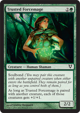
Because they look natural not pushed up or hanging about impractically.
Because she's actually doing something that just happens to be under lighting them
Because they look like real boobs not fantasy basketballs.
Also I like the overall character design and this feels "empowered sexy" through competence, like she and Borderland Ranger might work on the same team.
Ulvenwald Tracker
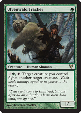
First Impression - In Soviet Russia Bear Hunt YOU.
Vorstclaw
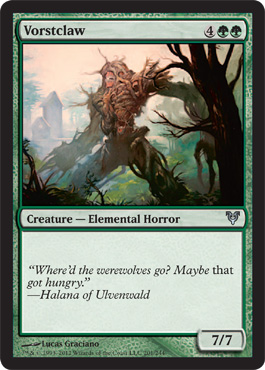
Another Godzilla like hominid. OK I suppose
Wandering Wolf
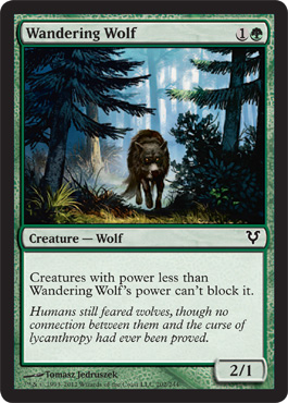
First Impression - LESS FOREST !! MOAR WOLF PLEASE.
See, see how real wolves look when photographed?
See how much more interesting this would look on a card then a distance shot.
Please stop with the full frame distance shots. We have the lands for landscape art.

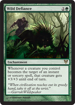
Wlid Defiance
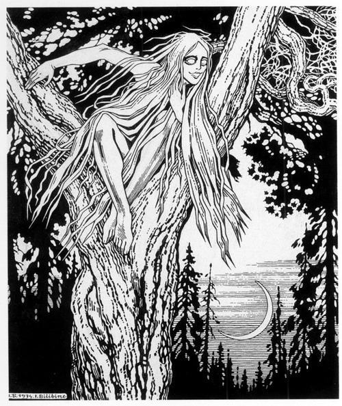
Wildwood Geist
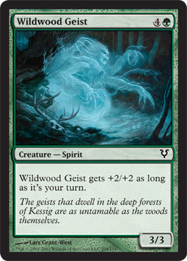
Rusalka are a really good fit for Innistrad. They're a part of the Russo/Slavic folklore traditions.
I like the projection of both the woman and the Geist overlaying each other
You can read more about them on the Wikipedia article which is actually pretty good.
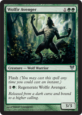
Wolfir Avenger
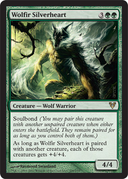
Wolfir Silverheart

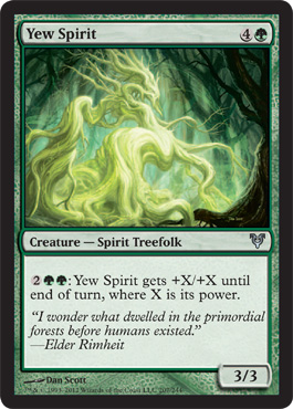
Yew Spirit
HERCULOIDS!
A Light at the End of the Bower Passage?
There is some hope in the dismal dark darkling times of Green however. The 2013 Core set is being spoiled as I write this and there are some positive signs.

Look- She's in Daylight!!!
And this giant worm isn't grey or Boring Beige TM!


So this is the end of the Green Review - I do find it interesting that the art in it has caused the most discussion - Triumph of Ferocity is such mediocre art that "loving the art for it" as I've seen defenders of it proclaim, isn't really a statement of misogyny as much as it is a statement of Garruk fangirling (fanboying). Which is OK some people have been rooting for Garruk to take down Lilly so they just see the story point not the art.
I hate them both so I just see the art.
Descendant's Path is meaningful in a way that happens very rarely as the art direction seems very erm . . . . hands on in a way that discourages that level of resonance and gives us a lot of giant hominids with spikes or on fire. So disliking it is a higher percentage chance because the meaningful thing might not resonate with everyone but it did kind of create something I'd never seen before, a sort of art -based backlash. I'm familiar with the syndrome - I've done it myself. I've just never seen it in a crowd of people who don't really engage with art on a regular basis. So I was careful when I did this review to make sure that my impressions were actually my first impressions and not the ones influenced by controversy.
But perhaps what really made me careful is that more than the other cards in the set Green made me nostalgic. Maybe with 2013 and Ravinica I will feel what I used to feel when I saw green cards and then I'll have to face the facts that art can turn me off a whole color. That's bad for a competitive player. And it's expensive to get alters for every card you want to play with card art you don't like. I'll have to work on that.
Also I thought about moving the critique rant to a separate page like I did for the uncomfortable sexy Borderland Ranger thing. I'm still thinking about it - if anyone actually reads this and has an opinion either way feel free to share it. I stand behind the rant, but it might just be a rant and not entertaining.
This is the end of Green
I first read these color-coordinated blogs about a week ago, and I've given them so much thought since then I thought I owed you some of my thoughtful comments.
ReplyDeleteFirst and foremost, I am one of the "average players" you've mentioned - 27, single, male, and like you rather recently returned to the game. Unlike you, I hadn't noticed much sexual content of cards recently. In fact, I spent more time staring at the breasts in the art in the course of reading your articles than I ever have elsewhere. What's more, my local group is also mostly male and we're usually in unmixed company, and I don't think anyone else has noticed either. I think it would've come up in conversation by now if anyone had. I don't know if it's just you, or just us, but I was struck by the enormous difference between how much you noticed it when a bunch of single men had not.
The second thing I've given a lot of thought to is your explanation of why the art was sexist, which was something I've never heard before. I get called a chauvanist a lot (particularly by my mother) and I can't say it's had a lot of influence. When someone flat out tells you you're wrong, your instinct is to fight back. You're the first person who's ever taken the trouble to explain why something was sexist instead of just insisting it was against all opposition, and I've been able to re-evaluate some of my opinions in a useful way as a consequence.
Finally, tying the two together, I read somewhere that when men look at people and crowds, we see outlines where women see features. A man looking at a crowd can tell you where the tallest people are, the fattest people, etc. but not where the blondes are. If you look at Triumph of Ferocity's art again with that understanding, all wee see is Garruk's head and upraised fist, because they're all that stand out and delineate the foreground from the background. All those lines you pointed out flew over my head until I saw them, and, as already mentioned, I'd never paid Liliana's breasts any attention to start with. She's merely a "background" figure, same as the rock she's fallen on, without an art expert pointing out why she's not. I'm not sure I was even aware Liliana was in the art for Killing Wave until you mentioned it. Now that I have your perspective on the art, and a bit more understanding of how women think (or you specifically at least) I see what you're saying. But without all of that, I never would have seen it on my own.