When I'm done I will put a full Table of Contents with the intro and link but for right now the review with all of the appropriate warnings and an explanation of who I am and the data for you to pre-judge me is here in the Review for White. and if you read that but missed Blue Blue is here if you read those and missed Black, Black is here and of course red is here. The entry right before this one is green and it is here
Warning - LOTS of VICTORIA'S SECRET IN THIS REVIEW
& a DISSERTATION ON GRAVE MARKER STATUARY
So for the newbs among us "Other" means multiple colored cards, which are gold cards. Uncolored cards are usually artifacts and lands which produce mana that has a color but doesn't count as a spell are also considered "other".
( My next project when I'm done with this will be an instructional piece for absolute beginners explaining Mana and Mana cost in an instructionally designed way)
But Avacyn Restored's gold cards are special because the main theme of the deck is ANGELS and every color gets an ANGEL but ANGELS are based in white. So how do you solve that? They get to be white plus colors.
This is not the first time that people mix things together when angels are involved for instance Victoria's Secret pretty much specializes in mixing up angels and underwear. But they can't find actual angels so they have to use models instead. Let me just explain that it is difficult to pick on the costume design for mostly male artists in Magic the Gathering when what they are really being exposed to as "angels" In popular media is this:

See this is the angel of Winter Blasts and her wings are a giant snowflake ( no seriously those are her wings)
And I'm pretty sure that Magic's style guide uses the high heeled gladiator sandal as an homage to VS in the stylebooks for each angel design

And frankly Adrianna Lima is one of my favorite models of all time so I can see why the whole B&D Angel thing is reflected in Magic when they have seen this in something resembling real life:


But a lot of the crazy footgear in Magic reminds me of this
You realize the only part of that outfit above that VS sells is the panties right?
Which is the part that pisses me off, because sometimes the stuff they put around the underwear is the thing I would buy. And I'd sell someone else's left nut to be able to own a pair of these wings.
Even though some of the other wings are a little questionable

But as much as I see and accept this , you have to remember that the Angel I know best was Doug Shurs' Serra
So when I saw this
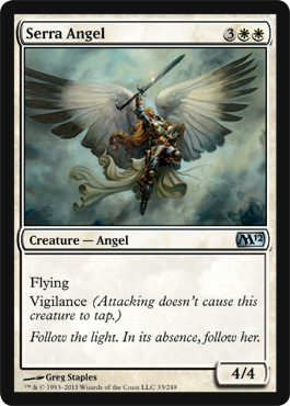
I was all"Meh". I couldn't understand why you were going to have Glissa's ass on Glissa's Scorn but take out the most realistic and prettiest cleavage in the set. I could understand that the Ride of the Valkyries version with the tripping hazard skirt at least looked more like someone who would be swinging around a sword.
Maybe Magic was trying to get away from angels being cheesecake? But I prefer pretty cheesecake to boring but well executed art.
Then my consciousness was raised and I understood that redesigned Serra was just a phase when I saw this :
Because honestly the first thing I thought of was this:

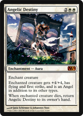
Angelic Destiny meant that you got to be in the finale!
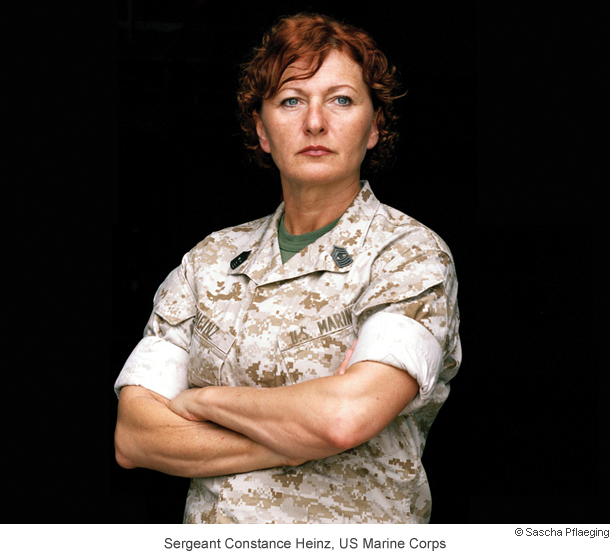
Don't get me wrong - it's a pretty card and I love it and it makes me happy, but I keep wondering if some warrior woman who looked like U.S. Marine Corps Master Gunnery Sgt. Constance Heinz, II Marine Expeditionary Force spokeswoman:
Gets enchanted with Angelic Destiny so she turns into this:

When the original way Angelic Destiny might have been portrayed was here:
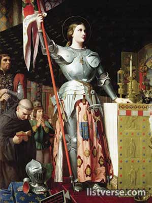 |
| This is a version of Joan of Arc back when pants were the racy thing. |
But I'm not mad bro. Angels or winged divine beings in the history of art have pretty much looked like this:

So there's a long history of sexy angels and winged folk even while they're being holy - the top left is Byzantine Christian and you can tell they are sexy because they have hips and waists instead of being formless drapes. The seriously hot angelic bod next to them is the remnants of a Greek statue of the goddess Nike who was a goddess of Victory, then there's the very naked vase painting of a Hellenistic angel where I have strategically covered up his ancient uncircumcised genitalia with some nice demure Romantic Era angels playing music, underneath is a kind of freaky pre- Renaissance Annunciation - the naked chick is Mary (pre- pregnancy), the angels are the little cherub guys bringing her up to the Holy Spirt - SEE MAGIC LOVERS THERE HAS ALWAYS BEEN ART THAT'S TROUBLESOME FOR A BRAND! The two sculptures are by my guy Bernini who actually has a lot of influence on all the sexy draping and exposed limbs of the angels in Magic art whether they know it or not, and the angel guy with his green calves is Middle Ages ( not a real term anymore -it's been demoted much like Pluto.)
Most people don't realize that pump and D'Orsay style shoes were originally designed to make men's calves sexier. The focus on his green hose is like pinup kind of stuff. And then the tiny red guy is literally the angel of Love from the Pre Raphaelite era.
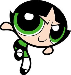
This history that informs both Victoria's Secret and Magic the Gathering Angels but it's kind of clear what more artists are thinking about when design their things for WotC. They're thinking of the PowerPuff Girls:
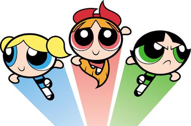
Bruna Light of Alabaster
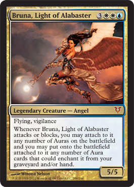
So Blue and White make her Bubbles right? Like the kind of power bubble where she's collecting auras at the bottom of her Avacyn Spear. First Impression: She's not the first angel we've seen from the Alabaster flight there was this one:
Bruna is the head general for Alabaster but not the same as that angel. So lets take a closer look

There we go - Angel with East or Southeast Asian Background - Coolness. Boots are not spiked heels and decorative arm and leg wear is actually pretty and decorative. This is one of the neater pinup style angels I've seen when the art gets close up. I also think the enchantment/aura angle is pretty interesting because she is blue and white.
So How does Bruna actually relate to Bubbles?
_Pic.jpg/260px-Bubbles_(Origional)_Pic.jpg)
Bubbles is apparently the "Sugar" in "Sugar Spice and Everything Nice and is described as "The Joy and Laughter" in the title song/ Well Bruna is probably going to get a little more interesting as more enchantments become useful in standard but right now she's the only one of the "Powerpuff" girls who's ability won't kill you outright.
Gisela Blade of Goldnight
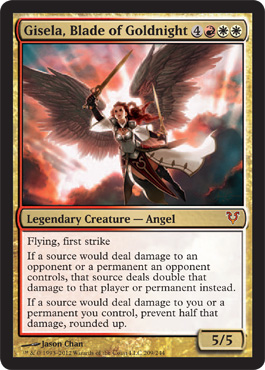
First Impression: Blade of Goldnight, Mistress of Math, same dressmaker as Thraben Valiant
I love Thraben Valiant's outfit so I'm really happy her coat has an angelic callout
Of course Gisela has an angel that is part of her flight
Their abilities aren't as connected to each other as the Alabaster Girls who both bring things out of graveyards but there is one thing they have in common - multiplier based effects.
Redeemer is pretty simple in programming logic terms:
On enterBattlefield lifeTotal = (currentLife + 2x)
x=numcreaturesOnField
But Giselea is running around with all sorts of math: (And it would be pretty long in pseudocode so I'll pass on sharing it)
- On her first strike she deals 2x the amount of damage If anything survives 10 points of damage then the return damage is damage/2 rounded up
- All damage caused by the player controlling Gisella is *2
- All damage received by player controlling Gisela is damage/2 rounded up
- And of course she flies
So basically she's got 4 card based abilities. You are doomed to lose track of one of them. It really won't matter unless you can get her the heck off the board. At least she's not hexproof.
Lets take a closer look. I absolutely adore the renaissance era pinks and rays of light, the saturation on the background is very impressionists meet Michelangelo. I also really like the way that the clothes aren't "filmy" but the light is so strong behind her that you can see through the sleeves.

Red and White make pink so Gisela is Blossom

Her title is "the Smart One" so the love of complex interaction math sort of makes sense there but Blossom as the leader and commander of the PowerPuff Girls is supposedly made out of "Everything Nice" + Ingredient X", so if Gisela is Blossom Ingredient X = mathematic whoop ass.
I would wear that outfit even though the hip belt looks a little uncomfortable. I'm sure it's a completely subconscious accident that that symbol of Avacyn keeps getting placed right over women's crotches. It's cool, it's visual, I get why it happens but I find it amusing as hell.
Sigarda Host of Herons
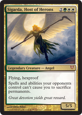
Ok she's flying and she's hexproof and she makes Lilliana stop doing bad things. She's Green so that makes her Buttercup. But here's what I don't get. Not only does she not have any "helper angels" her name isn't mentioned anywhere else in the Innistrad Block and the only actual heron in the set is Moon Heron which is blue
Moon Heron extending
Real Heron contracting

But that does lead to one of the prettiest things about Sigarda, Her wings are gorgeous and heron like.
Completely loving the staff that is actually a Heron, and unlike Gisela and Bruna she doesn't seem to be carrying any Avacyn insignia, so apparently by the flavor text she's glad Avacyn is back but she's not a brand name groupie. There's also excellent subtle angel wing detailing in the hard leather armour she's wearing that looks more sensible than a lot of the other angels in flight. She'd never be wearing Chanel with the logo on it. But how is she like Buttercup?
Well Buttercup " doesn't seem to have any special superpower different from her sisters, she is physically the strongest of the three girls" according to the PowerPuff Wiki and you can't take her out with spells so she seems like kind of a loner.
I also find it interesting that she is the least Victoria's Angels inspired of the angels and I would totally wear her outfit.
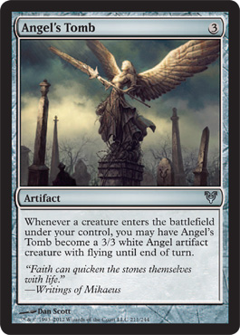
Angel's Tomb
First Impression: the Angels on top of the gravesite is a really Victorian era thing. They were a little death obsessed back then in ways that would seem emo or goth now.
That's actually the reason that the goth and emo movements have so much Victorian influence that would naturally expand out into the harijuku lolita fashion movement and the more positive maker/steampunk movement.
There was a reason for all the death obsession though, people died incredibly easily. There was enough technology that there was enough leisure time to feel the losses instead of having to move on to subsistence level survival the next day. That's pretty consistent with the background and resonance of Innistrad Block.
In the real world Victorian era income distribution was bad, but the middle class was growing so they were actually able to mark their loss in ways that hadn't been able to be recorded before. It wasn't simply the very rich or patron based artists that could channel their grief into mausoleums and grave markers, now it was regular people with a little bit of money.
The other reason that we know more Victorians' death rituals is because it's "recent" so some of it - like hair jewlery - hasn't disintegrated yet and was able to be passed down with some context. All of this information is background for my first impression because this is the way my mind works when I see things - all that sort of flashes through and then puts:
IN MEMORIAM OF ANGRY SPEAR ANGEL
into my head.
My brain is a dangerous and complicated place.
Here is what is commonly used for modern memorial markers
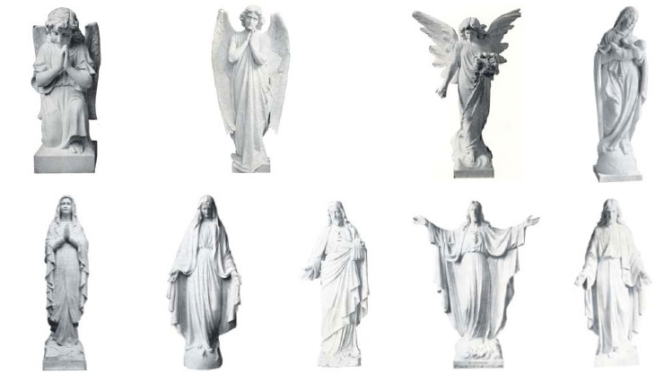 |
| Avaialble at http://www.italian-memorial-products.com/carrara_marble_statues.html |
And here is some of the examples of true Victorian mourning. For instance you may have seen bad copies of this original piece made by William Wetmore Story for his wife.
 |
| L.S Moore novelist and aficionado of cemeteries could provide you with cool cemetery info here http://lsmoore.com/2012/03/ |
And this is a memorial for a doctor's 30 year old wife who died in childbirth

So I find the Angel's Tomb card to be a really interesting take on the Victoriana styled memorial Angel. Of all of the angel based cards it makes the most "sense" to me

This is the angel that is on Queen Victoria's Memorial.
And here is a large view of the Memorials of Angry Spear Angel
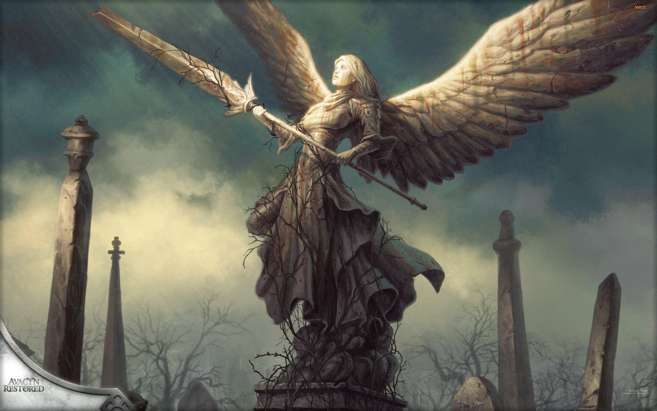
Here's the part that works - in Victorian mourning there are defending angels, weeping angels, angels who escort, angels who bear witness. In Innistrad, which has a lot of Victorian elements because of the Hammer Film horror influence. it strikes me as perfectly understandable that an angel in a cemetery would be an actual warrior type to either mark a fallen angel or to defend the deceased from the very real disturbances that would keep a loved one from resting in eternal peace. The small things in the art really speak to all of the things that I wrote about so far. The very renaissance influenced sky but with light lifting up. The implication that the cemetery has been unable to be kept up because of the dangers inherent in being in cemeteries in Innistrad in general. The fact that the light hitting the angel sculpture is interrupted, so even though dawn is breaking the light is neither full nor complete is strongly symbolic, and the title of the card "Angel's Tomb", making it clear that though her body was defeated in Battle when she hears the call she will break free of the brambles, of death and of incorporeality, and take what body she can to continue the fight.
In some ways to me this is the most resonant art in the set about the costs of the struggle on Innistrad because I know so much about grave art and the costs of surviving the history being made around us all the time.

Every graveyard has stories of the fallen. Every statue is something that means a choice was made to communicate further than a simple place marker. Every marker is it's own struggle for memory fighting the bitter anonymity of time and history.
Sometimes my first impression is all of that information running through my head at the same time. This is why I don't do drugs. Seems redundant to me.
Angelic Armaments
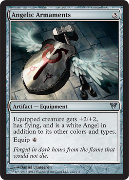
First Impression:
Red Bull gives you wings. Avacyn gives you a hammer.

Bladed Bracers
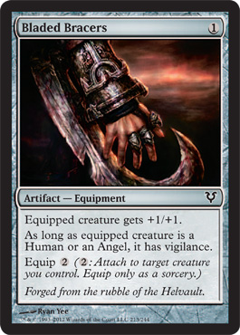
First Impression - Neat, it's like the switchblade/pocketknife version of a bat'leth

How big of a nerd am I? SOOOO BIG!!!!
Conjurer's Closet
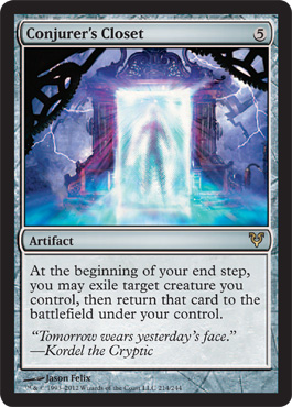
First Impression: I had a friend, Lisa, whom I am positive does not read this blog. Lisa was a Styx fan. Lisa was also another person with a Double X Chromosome who played Dungeons and Dragons because she played, not because of a boyfriend so I could forgive her for this. Part of friendship is loving your friends even if they make you listen to waaay more Styx than any human being should have to listen to.
This card reminds me of Lisa and some godforsaken Styx album of hers like this one:


Or these
Or pretty much anything Styx like
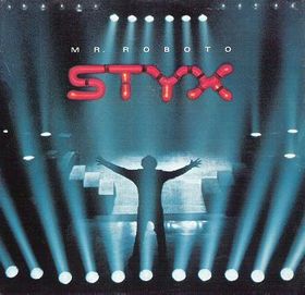
Also the card seems kind of expensive for the effect, not bad or anything just sort of like "wow that's a lot of presentation for a really expensive artifact that does what Cloudshift does."
However I liked Styx artistic striving more than I actually like Styx so the cover's not bothersome to me, I actually find it sort of endearing, but the card seems kind of like filler. Maybe a better player can explain it's value to me.
Gallows at Willow Hill
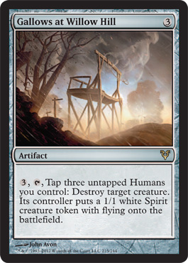
First Impression: This immediately reminds me of "An Occurance at Owl Creek Bridge" by Ambrose Bierce.
Haunted Guardian
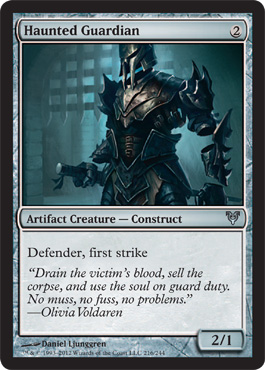
First Impression: I really like the way the portcullis is being used to create a geometric contrast to the organic armor shapes in the background, even though it's using nothing but era appropriate elements it still has real futuristic sense and you slowly realize that there are no connections to the floating armor bits.
Moonsilver Spear
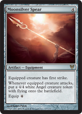
First Impression - Look!! Bruna gave me her spear!
I call this the poor man's Geist of St Traft. But it has actually helped me out in some late games.
Note the subtle angel wings in the bottom and the reddish gold light, sort of makes me think this would have been really nice art for Battle Hymn instead of the Zombie Pirates
Narstad Scrapper
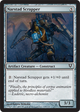
First Impression: So this is what you do with Newt Spittle and Snapcaster Juice?
Otherworld Atlas
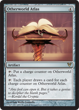
I adore this card. It's happy. It feels like fun. I don't know how to use this card in an effective way but I'm sure someone out there can tell me.
I want him to illustrate ALL THE THINGS
I like his use of light, shape form and composition. I like the way he gives things weight but doesn't have them have to substitute for photographs and whimsy- he's got whimsy. MOAR WHIMSY.
Scroll of Avacyn
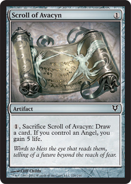
First Impression: Actually I get to see this sort of thing a lot

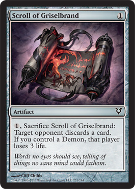
Scroll of Griselbrand
So I'm glad that they gave it to Cliff Childs who is winning my overall respect for always creating something that seems easily recognizable but always stays short of trite. At this point he's been such a consistent performer that I wonder if he's the goto person when they know it could go cheesey and they don't want it to.

Scrolls - I knows 'em.
Tormenter's Trident
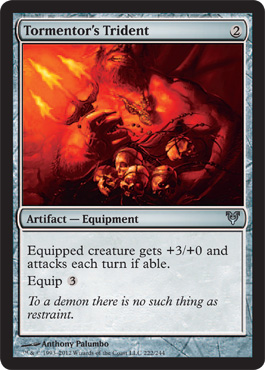
First Impression: I think it's trying a little to hard to be cinematic. This is one where the angle of the subject is compelling and the light off the tiny trident is correct, but it ends up just looking like bulbous blobs of red on the card because it's so small. While I think a lot of the subject concepts and the composition are alright, a less straightforward and more stylistic approach would have made the art more effective.
I'd like to see Connelly's take on it or Childs'.
The realistic teeth and mouth kind of throw the whole picture off for me as my brain tries to fill in the rest of the face. If the head had also been at a diagonal I think it would be less disruptive visually.
Vanguard's Shield
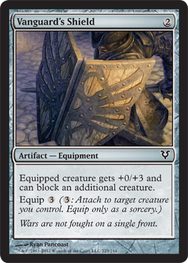
First Impression: I actually like this a lot. It's in Innstrad, it's focused on the actual item that is the piece in game play. I like the way the person blends into the shield with just a tiny bit of the requisite tricorn showing and the GIANT COLLAR OF INNSTRAD FASHION implied but working to make the person and the shield integrate as one object.
Vessel of Endless Rest
First Impression
Artifacts by Ethan Allen Fine Furniture.

Alchemist's Refuge
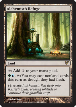
First Impression: It reminded me most of everything in the bayou scenes in Princess and the Frog - except more green and less blue. That's a good thing
You should see it if you haven't and you like art even in a passing way. It's one of the last hand drawn animated movies that isn't coming from Miyazaki and it is truly, truly a visual pleasure.


Cavern Of Souls
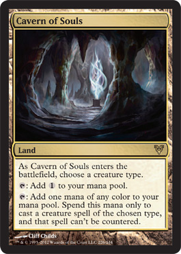
First Impression: Look it's a cavern with niblis.
So Avacyn Restored came out and released when I happened to be visiting some actual caverns.


I like the real caverns better. Actually I'm kind of relieved because this is a Cliff Childs piece and while it's entirely possible that he'll have something way more interesting going on in the full art at the card size this is just pretty generic and it's kind of nice to see he isn't perfect within his Magic niche.
That said it's still good, just generic.
That said it's still good, just generic.
Desolate Lighthouse

First Impression: This is awesome, it's exactly the way things look in daylight on the New England coast and I'm so glad he just used desolate as a descriptor but kept things bright.
Also I have a sister-in-law who collects lighthouses. As a result I get to see a lot of light house art because she has pretty good taste so they aren't kitschy, but she does have a whole bunch of things that are "lighthouse" .
Seraph Sanctuary
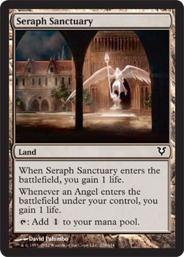
First Impression: I have a Kaalia deck and therefore you have a home. However you are a common and I'm not sure how many of you I can give a home .
I'm sure it will come as no surprise that I was an odd child and long before I participated in any kind of blatantly "nerdy" or "counterculture" activities, when I was just a wee little bookish kid with a bus pass I spent a ridiculous amount of time at The Cloisters in NYC. So this reminds grown-up me of this

And that's always good as my first impression, but my second impression is this:
If that's a sculpture of an angel how the hell haven't it's wings snapped off?
Stone is very brittle as compared to say . . . interwoven metal
I am open to an engineering type telling me I'm wrong but the physics of the sculpture's wingspan has been bothering me since I noticed it.
The Basic Lands
They're lands. I'm not a huge fan of European style landscapes having been force fed a lot of them growing up ( My mother is an artist, we did a LOT of museums when I was a kid). A bunch of art history classes didn't help. I only like them when they're subversive in some way or background for action/still life/people so it's my party and I'm not gonna review them.
This is the end of Other
So remember that the goal of these reviews is that ALL of the art gets reviewed by one woman who actually plays magic so that when people (men) are talking about the art and gender the issues up, they don't have to think about a hypothetical woman or ask their friends who already conform to their in-group. They have one real live actual Magic Playing woman's opinion on every card in the set.
But it ends up that I skipped one card, and it also ends up that I did this project pretty honestly and did most of my reacting as I was writing ( or wrote down my reactions when they were happening), so what I don't have until now is data.
So the very last entry will be the Wrap Up and I'll show you the one card I accidentally skipped and posit why, and I'll see if there's any pattern to my reactions and we'll close out the project.
The blog was, and still is, my competitive journal. I'll be working on some instructional design pieces for absolute newbs to start thinking about how best to break things down for an interactive tutorial after this. I'm not sure what I'm going to do about the core set coming out.
but in the meantime: