Ah Red. It's the color I always want to play and rarely do.
It's Time for the Red Cards
When I'm done I will put a full Table of Contents with the intro and link but for right now the review with all of the appropriate warnings and an explanation of who I am and the data for you to pre-judge me is here in the Review for White. and if you read that but missed Blue Blue is here if you read those and missed Black, Black is here.
The problem with Red
It's Time for the Red Cards
When I'm done I will put a full Table of Contents with the intro and link but for right now the review with all of the appropriate warnings and an explanation of who I am and the data for you to pre-judge me is here in the Review for White. and if you read that but missed Blue Blue is here if you read those and missed Black, Black is here.
So here's the thing about red in the color pie. Red is supposed to be the color of passion, "freedom, fire and impulse" at least according to the official Wizards shpiel.
However "passion" and "impulse" seem to exclusively indicate
"anger and burning things down" and occasionally "blowing things up" and "nature hates you"
also "freedom" to me equals "choice" not " so-stupid-I-only-do-random-shit-that-might-screw-up-any-incremental-advantage-I-might-get-because-of-random-luck"
Senseless risk taking does not equal " freedom" or "impulse" mistaking risk taking for "freedom of choice" explains an awful lot of political and corporate decisions made in the last 20 years and perhaps bears some explanation of the extremely limited imagination applied to the interpretations of red.
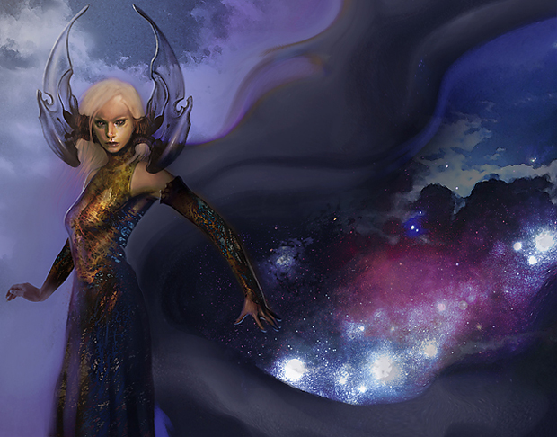
For instance I personally hate the "angry fiery amoral redhead" trope of Chandra and infinitely prefer the witty, shrewd and powerful dark haired Jaya Ballard as a representative of red.
In mechanical flavor I would like to see things that are more "freedom" or "choice" based like red spells that break enchantments OR cause 2 points of damage.
In "impulse" I'd rather see things that look like they would be fun or pranksterish instead of having a "damage you"burn your hands" downside. Like a boring effect or a crazy effect, the boring strategic effect burns you but the "fun' chaos effect doesn't.
Red should also be the color of intense joy, not just unfocused anger.
Red should be the color of impassioned love ( you can do that without sex honest - Call me WoTC ) Red is where you go on the quest because of the joy of ADVENTURE!! Not just the sense of Duty that makes all the good Zealots go white.
There have been mothers in Magic and those mothers have been red:


Sooo . . . right from this we can gather that only Goblins have babies? Quick let's do a search on the word "mother" in the Gatherer and see what we get?

So Old women damage you, Actual Moms taunt the dying and Dragon Moms spawn and sacrifice each other to make bigger spawn. Because other than Phyrexian Vatmother this is all you get.
 Oh wait . . . here's one more actual mother doing exactly what "actual mothers" do - dutifully protect you from all the big bad stuff . . . . but she's a wuss at 1/1.
So why do I bring this up = because when I think of passion, impulse and I'M GOING TO BURN DOWN THE FUCKING WORLD AND START WITH YOU!!!! It's never something I see depicted that would turn an otherwise normal civil human being into a fire filled rage machine. Hurt me dude and I'll be all Blue on your ass. I'll wait until you sleep. I'll plan and screw with your life goals. If you're hurting or going after me I've got time.
Try to destroy a country group or law that I feel is necessary and I'll be hanging around in white with Duty and Righteousness and all of the angels ( or the angry mob that I've incited) on my side. Hurt or oppress something I think needs protecting and most likely I'll turn Black with a little Royal Assassin or easily sacrificing things I value less than the things I am trying to protect ( and by the way a little more positive portrayal of "ends justifies the means but without crawling bloody guts" would be nice in Black too).
BUT . .. you want impulse, passion and hardcore sexy I DO NOT CARE WHAT ELSE AROUND YOU BURNS . . . .
Go after one of my kids. I only have two and frankly they've both been raised so they can protect themselves for the most part, which means if you hurt them and they didn't deserve it, or you found some soft underbelly of theirs there will be no part of the earth that will let you rest if my anger towards you had the power of plane walkers behind it.
If you actually killed my children ( or sacrificed them for a bonus) I would then get all Ming the Merciless on your ass. My whole life ( and if I were a card my whole battlefield existence) would be dedicated to destroying everything you loved.
That's how you transform a perfectly average mother of two

Into the person who sets up an entire Empire in underground caverns just to destroy you. And maybe the planet you are standing on.

Yeah that's right - they're both really me. Those kids are my spawn. I've got a whole Evil Overlord wardrobe just waiting in case someone tries to mess with my kids.
How would an actual passionate protectiveness or rage work:
How about - the maternal card creates spawn tokens at 1/1 it's maybe a 2/2 or a 1/3 while it's doing that - if you destroy one of it's babies it goes from what it is to something that will grow each time you hurt it's offspring.
Or if you kill some full grown creature on the board that has the same type as it it will destroy all your creatures or destroy all your artifacts and get plus counters.
Or if you damage it's offspring it causes double that damage directly to you
Or it gives it's offspring protection from planeswalkers specifically because planeswalkers are outsiders trying to take her children.
And BTW I will be sexy as hell while I'm destroying you. If you really understood motherhood, you'd understand that sex was needed in most cases to change non-moms to moms. We don't roll up and die or become sloppy goblins or monsters just because we reproduced.
I realize that the target demographic of Magic is the supposed 15-34 group of males but I don't think most of them experience their own mothers as breeding pits or careless goblins or that the only point of a maternally based card is to create things to sacrifice. And also I happen to notice a lot of Magic Writers are writing while they are getting married and starting families and perhaps some kick ass mom portrayal in red and green where it belongs instead of White ( motherhood stopped being a "duty" in this country around 1978) kicking some ass would be appropriate here. When I think of the big impulse emotions they come from two places being in love ( the positive and negative sides) and being responsible for the life of something that almost killed you bringing it into the world.
And as for the other kind of Passion - you know the love someone kind - You guys watch Dr.Who? I didn't until last year. I watched because of River Song. You know that part at the very end where River stopped the entire f*cking space time continuum because she wanted the guy she loved just to know that he wasn't really alone?
Yeah.
And because she didn't want to be the one to kill the guy she loved.
The Doctor: But I have to die!
River: Shut up! I can't let you without knowing you are loved. By so many and so much. And by no one more than me.
The Doctor: River, you and I, we know what this means. We are ground zero of an explosion that will engulf all reality. Billions and billions will suffer and die.
River: I'll suffer if I have to kill you.
The Doctor: More than everything living thing in the universe?!
River: Yes.
That's hardcore red impulse and passion right there WoTC how about we explore that space?
Or just bring me back Jaya and some Wit - Ok? I miss the pithy . . .

Inferno
"Some have said there is no subtlety to destruction. You know what? They're dead." - Jaya Ballard
Also WoTC Artists - I should probably point out that I've spawned and I look a lot more like Jaya than either Mother of Runes or any of the other Red Moms.

(Just a reality check - I was wearing that outfit before I ever knew there was such a card as Jaya Ballard - someone else pointed it out to me when I started playing in September. I do admire her general sense of style
: P )
Ok now that my suggestions for Red are over lets see what WotC brought to the table for Avacyn Restored
However "passion" and "impulse" seem to exclusively indicate
"anger and burning things down" and occasionally "blowing things up" and "nature hates you"
also "freedom" to me equals "choice" not " so-stupid-I-only-do-random-shit-that-might-screw-up-any-incremental-advantage-I-might-get-because-of-random-luck"
Senseless risk taking does not equal " freedom" or "impulse" mistaking risk taking for "freedom of choice" explains an awful lot of political and corporate decisions made in the last 20 years and perhaps bears some explanation of the extremely limited imagination applied to the interpretations of red.
For instance I personally hate the "angry fiery amoral redhead" trope of Chandra and infinitely prefer the witty, shrewd and powerful dark haired Jaya Ballard as a representative of red.
In mechanical flavor I would like to see things that are more "freedom" or "choice" based like red spells that break enchantments OR cause 2 points of damage.
In "impulse" I'd rather see things that look like they would be fun or pranksterish instead of having a "damage you"burn your hands" downside. Like a boring effect or a crazy effect, the boring strategic effect burns you but the "fun' chaos effect doesn't.
Red should also be the color of intense joy, not just unfocused anger.
Red should be the color of impassioned love ( you can do that without sex honest - Call me WoTC ) Red is where you go on the quest because of the joy of ADVENTURE!! Not just the sense of Duty that makes all the good Zealots go white.
There have been mothers in Magic and those mothers have been red:
Sooo . . . right from this we can gather that only Goblins have babies? Quick let's do a search on the word "mother" in the Gatherer and see what we get?
So Old women damage you, Actual Moms taunt the dying and Dragon Moms spawn and sacrifice each other to make bigger spawn. Because other than Phyrexian Vatmother this is all you get.
So why do I bring this up = because when I think of passion, impulse and I'M GOING TO BURN DOWN THE FUCKING WORLD AND START WITH YOU!!!! It's never something I see depicted that would turn an otherwise normal civil human being into a fire filled rage machine. Hurt me dude and I'll be all Blue on your ass. I'll wait until you sleep. I'll plan and screw with your life goals. If you're hurting or going after me I've got time.
Try to destroy a country group or law that I feel is necessary and I'll be hanging around in white with Duty and Righteousness and all of the angels ( or the angry mob that I've incited) on my side. Hurt or oppress something I think needs protecting and most likely I'll turn Black with a little Royal Assassin or easily sacrificing things I value less than the things I am trying to protect ( and by the way a little more positive portrayal of "ends justifies the means but without crawling bloody guts" would be nice in Black too).
BUT . .. you want impulse, passion and hardcore sexy I DO NOT CARE WHAT ELSE AROUND YOU BURNS . . . .
Go after one of my kids. I only have two and frankly they've both been raised so they can protect themselves for the most part, which means if you hurt them and they didn't deserve it, or you found some soft underbelly of theirs there will be no part of the earth that will let you rest if my anger towards you had the power of plane walkers behind it.
If you actually killed my children ( or sacrificed them for a bonus) I would then get all Ming the Merciless on your ass. My whole life ( and if I were a card my whole battlefield existence) would be dedicated to destroying everything you loved.
That's how you transform a perfectly average mother of two

Into the person who sets up an entire Empire in underground caverns just to destroy you. And maybe the planet you are standing on.

Yeah that's right - they're both really me. Those kids are my spawn. I've got a whole Evil Overlord wardrobe just waiting in case someone tries to mess with my kids.
How would an actual passionate protectiveness or rage work:
How about - the maternal card creates spawn tokens at 1/1 it's maybe a 2/2 or a 1/3 while it's doing that - if you destroy one of it's babies it goes from what it is to something that will grow each time you hurt it's offspring.
Or if you kill some full grown creature on the board that has the same type as it it will destroy all your creatures or destroy all your artifacts and get plus counters.
Or if you damage it's offspring it causes double that damage directly to you
Or it gives it's offspring protection from planeswalkers specifically because planeswalkers are outsiders trying to take her children.
And BTW I will be sexy as hell while I'm destroying you. If you really understood motherhood, you'd understand that sex was needed in most cases to change non-moms to moms. We don't roll up and die or become sloppy goblins or monsters just because we reproduced.
I realize that the target demographic of Magic is the supposed 15-34 group of males but I don't think most of them experience their own mothers as breeding pits or careless goblins or that the only point of a maternally based card is to create things to sacrifice. And also I happen to notice a lot of Magic Writers are writing while they are getting married and starting families and perhaps some kick ass mom portrayal in red and green where it belongs instead of White ( motherhood stopped being a "duty" in this country around 1978) kicking some ass would be appropriate here. When I think of the big impulse emotions they come from two places being in love ( the positive and negative sides) and being responsible for the life of something that almost killed you bringing it into the world.
And as for the other kind of Passion - you know the love someone kind - You guys watch Dr.Who? I didn't until last year. I watched because of River Song. You know that part at the very end where River stopped the entire f*cking space time continuum because she wanted the guy she loved just to know that he wasn't really alone?
Yeah.
And because she didn't want to be the one to kill the guy she loved.
The Doctor: But I have to die!
River: Shut up! I can't let you without knowing you are loved. By so many and so much. And by no one more than me.
The Doctor: River, you and I, we know what this means. We are ground zero of an explosion that will engulf all reality. Billions and billions will suffer and die.
River: I'll suffer if I have to kill you.
The Doctor: More than everything living thing in the universe?!
River: Yes.
Or just bring me back Jaya and some Wit - Ok? I miss the pithy . . .
Inferno
"Some have said there is no subtlety to destruction. You know what? They're dead." - Jaya Ballard
Also WoTC Artists - I should probably point out that I've spawned and I look a lot more like Jaya than either Mother of Runes or any of the other Red Moms.

(Just a reality check - I was wearing that outfit before I ever knew there was such a card as Jaya Ballard - someone else pointed it out to me when I started playing in September. I do admire her general sense of style
: P )
Ok now that my suggestions for Red are over lets see what WotC brought to the table for Avacyn Restored
Aggravate
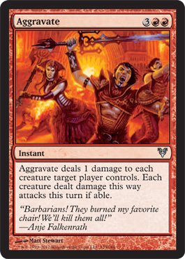
OK so when I first saw this card I thought wussy vampires were attacking bigger things and then I saw that maybe the artist was showing the aftereffects of the poking when you poked at the vampires and they were coming to get your little Thatcher Revolt bits.
It's a pretty good board sweeper but this just looks like angry vampire horde art and doesn't make much sense if you don't read the flavor text.
I would also like to take this opportunity to once again point out that some of these vampire chicks are like the ultimate fashion victims.
"Oh well I couldn't decide between Jersey shore club wear and Rococo period farthingales so I split the difference and enslaved my dressmaker to make sure she did it."
I do realize that I just used a bunch of insider terms that people who pay no attention to the history and mechanics of fashion will not recognize so "clubwear" is specifically worn to night clubs. It's meant to be trendy, sexy and disposable

And the Rococo period is kind of Baroque on Steroids which brought us things for women to wear like this:
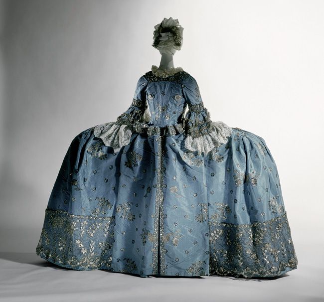
I figured it was better to show the real things than drawings of the things. In any case that seems to be the cross influence of the Innistrad Vampires - Jersey Shore Nightclubs and the court of Louis XIV.


I don't have a problem with it and the art and texture and consistency of the clothing is good - it's also painted in oils because it Matthew Stewart. I'm just saying a lot of vampires are really, really tacky.
I would not wear it.
I would not wear it.
Archwing Dragon
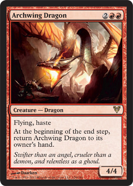
First Impression - It's a dragon. It's red. I like the pick on the Moonveil Dragon better. I like the functionality of the card on this though.
Nothing wrong with the little Thatcher's revolt style blinking dragon here.
But if you're wondering how it's from Innistrad ( or at least if I was ) the clue is down at the bottom left of the card where you can see this:
 See the Dragon is fighting guys wearing the very important hats from the Ministry of Funny Hats that is so vital to Innistrad and their shields may well be the kind that Kruin Striker will be using later on.
Ok so they're less than 15mm on the card but HEY! INNISTRAD TRICORNS!
It's all about the hats.
Nothing wrong with the little Thatcher's revolt style blinking dragon here.
But if you're wondering how it's from Innistrad ( or at least if I was ) the clue is down at the bottom left of the card where you can see this:

Ok so they're less than 15mm on the card but HEY! INNISTRAD TRICORNS!
It's all about the hats.
Banners Raised
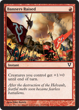
I like this card. I like the smoke in the background, I like the angles, I like the composition. I like it's relationship to the card name.
I think this is a great use of art to coordinate the card and the flavor without being showy since the flavor text sort of moves the story along ( you can read this and realize that the silly humans weren't rioting mobs forever) but doesn't really give the artist anything to focus on.
I think this is a great use of art to coordinate the card and the flavor without being showy since the flavor text sort of moves the story along ( you can read this and realize that the silly humans weren't rioting mobs forever) but doesn't really give the artist anything to focus on.
Battle Hymn
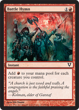
First Impression - Really, you came up with bedraggled looking pirates for a red card where Angles are all over the place AND the flavor text represents angels AND there's an angel that has red as a color and you bring me zombie pirates shaded in blue for BATTLE HYMN?
WTF? Did they buy this art for something else?
I hope so or Imagination Fail.
WTF? Did they buy this art for something else?
I hope so or Imagination Fail.
Bonfire of the Damned
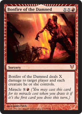
Everyone loves this card to the tune of making it over 17.00 on the secondary market at instant speed. However the Miracle frame is the most interesting thing about the art, although I do like the biblical pillar of fire creating the Bonfire. Once again there is nothing specifically wrong with the art except for the fact that every single burny red card is a red wash with come fire and some burning hominids. So there's nothing to really recommend or detract from it.
Burn at the Stake
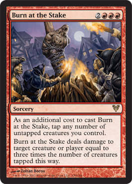
First Impression - which creature is that? Oh you know what I think it's the thing the Dungeon Geists were trucking down the stairs.
I wonder if that thing is the new Stuffy Doll in "Serious Magic Art World"
Second Impression - Excellent use of Innistrad Tricorns
This card did well for me in Sealed
I wonder if that thing is the new Stuffy Doll in "Serious Magic Art World"
Second Impression - Excellent use of Innistrad Tricorns
This card did well for me in Sealed
Dangerous Wager
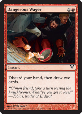
First Impression - Well it's about time!
Love the color and composition. It's got a little "meant-to-be-on-a-card -but-still-a-little-Caravaggio" influence going on :

Fun Fact - this painting by Michelangelo Merisi de Caravaggio is called the Cardsharps.
 Also the picture in Dangerous Wager looks a little like John Corpora to me who's column 52 FNMs has been something that I really enjoy reading.
I really like that this is small everyday impulse, freedom, choice without anything being set on fire and destroyed.
My Innistrad Tricorn's off to you Drew Baker, for following in the footsteps of Carravagio himself and using everyday life to illustrate larger themes.
Love the color and composition. It's got a little "meant-to-be-on-a-card -but-still-a-little-Caravaggio" influence going on :
Fun Fact - this painting by Michelangelo Merisi de Caravaggio is called the Cardsharps.
I really like that this is small everyday impulse, freedom, choice without anything being set on fire and destroyed.
My Innistrad Tricorn's off to you Drew Baker, for following in the footsteps of Carravagio himself and using everyday life to illustrate larger themes.
Demolish
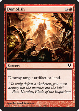
First Impression - Is that the Mad Prophet Demolishing things? It would be so awesome if that was the Mad Prophet.
Second Impression - Read the flavor text - meh with a side of meh.
It's still the Mad Prophet to me. I want to believe . . .
Second Impression - Read the flavor text - meh with a side of meh.
It's still the Mad Prophet to me. I want to believe . . .
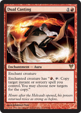
Dual Casting
So spoiler alert - there were only three cards who's art I found "offensive" as a female and thought were in bad taste for the game of Magic and focused on boobs to the disruption of the actual art - there are 244 cards in the set so that meant that 241 cards didn't offend me at all as a proud carrier of a uterus.
What surprised me was when the full art was spoiled I noticed some similarities in composition that made the focus go to the point were it was exploitive and was surprised when I found out it was the same artist for all three pieces of art. So I searched the set to find a piece of art by that artist that wasn't boob centric to the detriment of the artwork itself, and found one piece of an old guy casting a spell. And I said - well OK at least this shows some originality but the outfit is kind new and different and I'm not sure how it fits in Innistrad but at least it's not more queasy making boobage. So I gave him points for that at least. Until I found the same old guy done much better on this card. Then I realized cool asian styled old mage must be a character in the stylebook.
I would like to point out that 3 out of 244 cards is .012 percent of the total art of Innistrad which isn't bad for a game that has to commission that much art and exists on Fantasy tropes and a limited view of what it's target market is. The fact that you can get rid of the art I find actually uncomfortable by either re-educating or not hiring a single artist is pretty impressive. Johanness Voss unfortunately proved that that particular artist wasn't really adding anything to the set as far as I'm concerned. I'll ID him - or you'll figure out who he is during the wrap up.
So - First Impression - Oh Sh*t, there goes the originality points for artist X, and How MUCH do I LOVE Voss's use of form and color?
Lots.
Now I'm kinda curious about asian robes guy. Did he study with Tamiyo? Did he come here with her and go native?
Falkenrath Exterminator
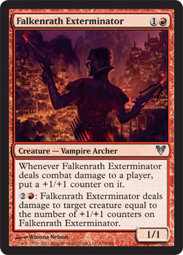
First Impression - My Name is Falkenrath, James Falkenrath
Second Impression - I know red cards have to be red but can maybe some stuff NOT be bathed in red light all the time?
Fervent Cathar

First Impression - I've never been so happy to see gray green in my life, Also looks like Cliff Claven became a paladin.

"Did you know that buttons on a man's jacket sleeve have absolutely no purpose. They originated on the uniforms of Napoleon's army when he discovered that his soldiers were using their sleeves to wipe their noses." - Cliff Clavin, Cheers.
Gang of Devils
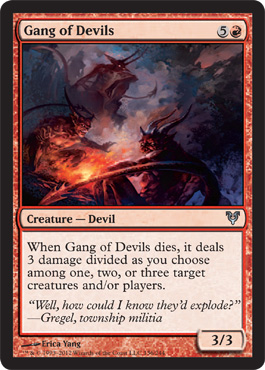
This card makes me happy. It's not Demonic Horde but it's still playful and works with the flavor text. plus it didn't swath everything in red.
Guise of Fire
First Impression - Pretty, technically excellent - especially the buildings although there could have been a bit more play of light from the burning guy, but boring.
Hanweir Lancer

This has a very asian style to me I think its the curve of the lines and the shapes where the color is used in a simple form for visual impact along with the style of the helmet.
Not boring. Not exciting either.
Not boring. Not exciting either.
Heirs of Stromkirk

First Impression - so this is what the more tasteful vampires are wearing.
The costumes actually have a real sense of opulence and seem to actually be made out of fabric. The body proportions are really people sized body proportions and I'm going to have to assume that all of the vampires are wearing the open squared show your mammaries corset because of a style book suggestion by the art director.
The French Hood style with the neck wrap still looks kind of dumb if you're going for the "I'm practically topless - see my inner cleavage" look on top.
What I really like about this though is that these vampires look like they are headed to Vampire Court to talk nasty gossip about the Blood Connoisseur's attachment to feathers and how far that poor bloke has fallen that's been reduced to taking the Hearse driving job just to get near "recently live" blood, and congratulate themselves for staying low enough not to piss off Sorin when he decided to Barter in Blood.
Avacyn and Sorin and Lilliana made a difference, but they restored an eco-system. they didn't eradicate the vampires at least. Werewolves are a different story.
I would also like to point out why the skin shown by this vamp isn't exploitive even though there's lots of boob and leg on display.
She's not posing for the male gaze - she's on her way somewhere, she's on display but it's for action not for consumption.
Her proportions are realistic and the clothing she is wearing looks like clothing, not a color-in-the-lines afterthought. Also while exposing bunches of everything it's not fetishistic or relevant to real-life memes other than perhaps the red carpet, but actually it's even less reference to that because she is not stopping to pose.
She's not indicating any sexual invitation whatsoever - she dressed that way to impress Olivia, not her date, for social status, not for sex. Dressing that way is a method of showing power "We still survive, we are not prey, we have not fallen, we have not compromised there is no risk for us in exposing skin or wealth . . . can you say the same?"
Hound of Grislebrand
So Grislebrand has a two headed pet. OK what'evs I guess it makes sense with the Double Strike
Kessig Malcontents
First Impression -
"Do you hear the people sing?
Singing a song of angry men?
It is the music of a people
Who will not be slaves again!
When the beating of your heart
Echoes the beating of the drums
There is a life about to start
When tomorrow comes! "
"Do you hear the people sing?
Singing a song of angry men?
It is the music of a people
Who will not be slaves again!
When the beating of your heart
Echoes the beating of the drums
There is a life about to start
When tomorrow comes! "
Second Impression - OOH look a red card with direct sunlight - neat.
Kruin Striker
First Impression - I'm sad that such an awesome card is depicting a vengeful bigot. If it's good enough for actual angels it's should be good enough for you. It's not like you live somewhere where you have to guess as to whether or not there are divine beings.
I'm going to have to go with the flavor text being the weird part here since they're all carrying shields by Avacyn so you'd think that Avacyn might kinda directly take umbrage at having her miracle undermined.
I'm going to have to go with the flavor text being the weird part here since they're all carrying shields by Avacyn so you'd think that Avacyn might kinda directly take umbrage at having her miracle undermined.
Lightning Mauler
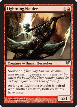
Perfectly serviceable yet boring thing. It's like yet another dragon or yet another zombie
Lightning Prowess
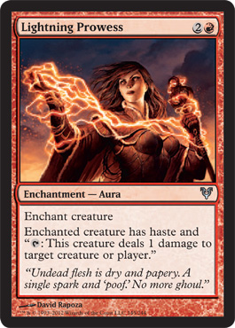
First Impression - what the hell is wrong with her boobs. It's like she stuck oranges in her bra. Why are they so far away from her face? How are they both small and too big at the same time?
Wow these boobs while not offensive or exploitive are really distracting from everything else that's happening in the picture which would have been much better if he'd just let the hood of that costume fall below the breast line.
Wow these boobs while not offensive or exploitive are really distracting from everything else that's happening in the picture which would have been much better if he'd just let the hood of that costume fall below the breast line.
Boobs - not always a good thing.
Also the flavor text is stupid.
Ok it wouldn't be stupid if say, Alex Kingston were saying it, but as stand alone text it's stupid.
Mad Prophet
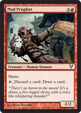
First Impression - I think the Mad Prophet should be an anime show. He's adorable.
Malicious Intent
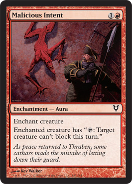
First Impression - He sort of reminds me of a skinny red Tick from the Tick


Malingus
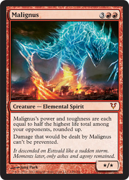
Ok this is kind of cool if completely abstract and unrelated to practically everything. Actually it kind of reminds me of a snowcone.
Electrical Fiery Sentient Snow Cone . . . . . of RED DEATH
Electrical Fiery Sentient Snow Cone . . . . . of RED DEATH

Pillar Of Flame
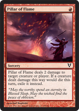
First Impression - Isn't that really more of a Bonfire than a Pillar?
Second Impression - Could that be the Mad Prophet too? The Mad Prophet raining fire on everything totally makes sense to me.
I also like this art because I can easily distinguish it on the table. It's not overdone.
Second Impression - Could that be the Mad Prophet too? The Mad Prophet raining fire on everything totally makes sense to me.
I also like this art because I can easily distinguish it on the table. It's not overdone.
Raging Poltergeist
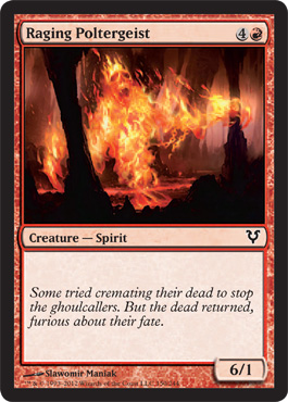
First Impression - h looks it's a fiery thing in a cave. This differentiates it from all the other fiery things in mountain settings how?
It's a red spirit creature type. It's in Innistrad - shouldn't it have been causing some indoor domestic havoc or some horror based spooky battlefield havoc or something?
It's a red spirit creature type. It's in Innistrad - shouldn't it have been causing some indoor domestic havoc or some horror based spooky battlefield havoc or something?
Conclusion - incredibly generic.
Reforge the Soul
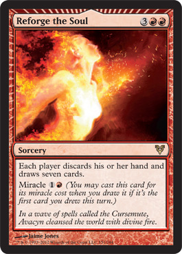
First Impression - This card is beautiful - here's another red thing that's about fire that should happen - it should be about fire as cleansing and transforming.
Now I do find the fact that the person who is on fire is specifically painted in such a way as to indicate that she is wearing some sort of top sort of entertaining.
And that it's super subtle so that it's not actually calling back to this :

Now I do find the fact that the person who is on fire is specifically painted in such a way as to indicate that she is wearing some sort of top sort of entertaining.
And that it's super subtle so that it's not actually calling back to this :
Now I never had a problem with this card - she's a fire elemental, her clothes are not going to really survive contact and this is a card that made me feel like a strong empowered female (5/4 no less) was in the game. Her nakedness isn't that big a deal even though it's a little male gazey she really looks more like she's enjoying the cracking apart of volcano more than looking to impress a guy.
But the reason that Reforge the Soul has successfully managed to kind of skirt the naked breasts with something that looks like a sports top issue is that the artist did not paint her breasts individually.
You'll remember in the Black review where I was ranting about Lilliana's dress in Killing Wave not actually looking like cloth, I linked to a site that makes latex clothing, and earlier in this review I linked to a site that made skin tight clubwear -- Heck, in my first rant about Triumph of Ferocity I linked to a site that actually makes costumes for strippers. If you clicked through to any of those you might have noticed something about skin tight clothing and women's breasts. There are NO fabrics that individually outline each individual breast, even Bikini's create some sort of smoothing connection or fabric gathering or something. So reasonably sized realistic breasted Reforge Soul Sister up there looks like she's wearing a shirt specifically because we don't see the individual breasts. Unlike this lovely new Planechase card:
You see how somehow her "top" covers each breast individually without seams and somehow becomes a single smooth dress against the rest of her body? Yeah NO FABRIC DOES THIS EVAR. Not even latex.
Artist guy - it looks like you drew naked breasts and painted them colors. Three points for making them large, elongated and with gravity though. I'm not reviewing Planechase so I won't go on for long here unless I find out that you're the one artist who made the three other cards that actually offended me. I'm not looking this up right now.
But yeah - Reforge breasts aren't porny and look covered, Fire Elemental's breasts are kind of 80's porny but happy and not looking like she's come hithering or doing anything besides enjoying some nice chaos and this planechase card would have done better to paint some fabric onto the dress instead of just painting some color onto the tits and then highlighting them with gold light.
Riot Ringleader
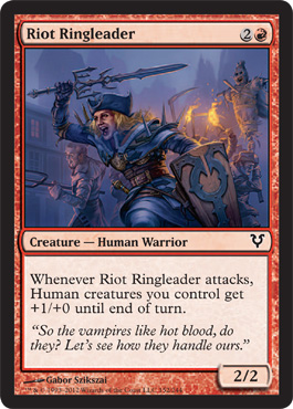
First Impression- Why does that sword look like a candelabra?
Do you think when they're done with the vampires they're going after the Archwing Dragon? They look like what he was about to snack on.
This feels like it's connected to Innistrad I like that the artist just didn't throw everything out.
Do you think when they're done with the vampires they're going after the Archwing Dragon? They look like what he was about to snack on.
This feels like it's connected to Innistrad I like that the artist just didn't throw everything out.
Right of Ruin
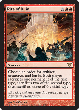
First Impression - I feel like I should recognize that building from somewhere else in the set but I don't.
The color choices make yet another angry mob burning yet another thing look distinct. I like the triangular composition so it's pretty. I like the intermix of the geometric and organic as well and the light almost pastel quality of the yellow in the flame.
The color choices make yet another angry mob burning yet another thing look distinct. I like the triangular composition so it's pretty. I like the intermix of the geometric and organic as well and the light almost pastel quality of the yellow in the flame.
So this is very pretty but not spectacular, I will recognize it as distinct from the other pictures of angry mobs and fire though.
Rush of blood
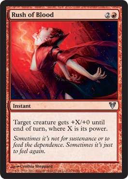
First Impressions - long boob is long and where the heck are her nipples?
I wonder if guys ever think about these things when they see the breasts on pictures? Are they just like " whoo breasts" or are they more like "well it looks a little off but I don't know why?"
Most of the time something is supposed to "look sexy" but just kind of pisses me off instead is because it looks either actively painful ( almost every outfit involving metal in fantasy illustration and video games), or it looks somehow deformed . So here's the thing in real life that corset is either cutting across her nipples or she's wearing some sort of form fitting white shirt which is why we don't see her aureola,or the artist used a real life model with a photo and got one of those super weird angles that happen in still shots when the model is actually moving.
That's actually why people look a little weird in screen caps when they don't during the film.
This is another one of those cases where if the artist wasn't using the low cut square neckline at the super low setting the angle around the breasts wouldn't have been distracting.
And to be fair looking at the level of detail that shows even in the card I'm willing to bet what's bothering my eye might make more visual sense in the full scale art, but the cut of the corset and the general firmness of the vampire chick indicates that her corset at that angle isn't really holding up or covering anything and if she's got her cleavage covered that makes her the first vampire in Innistrad to do so. On the other hand her hair rocks and she's not sporting that weird french hood.
And yet I still wonder - where the hell are her nipples? Even if that is a blouse/shirt non exposed cleavage thing.
Scalding Devil
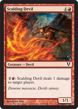
First Impression - I wish this were the bright red devil from Fleeting Distraction or Malicious Intent giving the Mad Prophet a hot foot instead of this picture.
There is nothing wrong with this picture - I just wish the other one was real.
There is nothing wrong with this picture - I just wish the other one was real.
Somberwald Vigilante
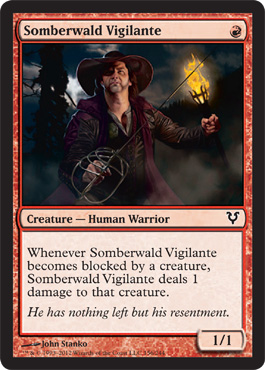
First Impression - Cool he looks exactly like the kind of guy I used to hang out with at the Renaissance festival that made his own weapons and would go vigilante in a world made by Hammer.
Second impression - that Nicola Telsa inspired basket hilt guard must be a massive pain to wear sheathed.
Second impression - that Nicola Telsa inspired basket hilt guard must be a massive pain to wear sheathed.
I do like it. It has personality.
Would it be petty of me to point out that the gentleman being portrayed is not young, not muscular or trim and not overtly sexy but yet still apparently worthy of being portrayed front and center as a badass?
Could one imagine a female subject being portrayed in exactly the same way instead of being the Mother of Runes What Protects You from Others?
Just sayin'.
Stonewright
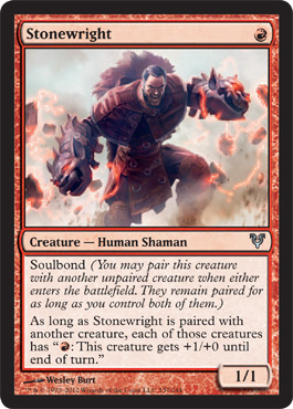
First Impression - there is no way the guy in this picture is a 1/1. The dude is wearing stone fire dragon gloves on his arms. He misses Johnny Bravo Syndrome because his legs are the size of small trees.
THIS, this is a fun card with fun art that is not doing the same damn thing every other damn red card is doing.
I love this card - I wish I were better at using mana activated effects ( timing on that and instants is still a very weak area in play for me - remember I'm doing this review but it's still my competitive journal . . . oh and flash. I'm not great with when I use flash) however, this card is so much fun to see I'm going to use him to work on getting better at that.
Plus he's a shaman. I keep wanting to make a Kitchen Table deck with Mondarin Shaman
Thatcher Revolt
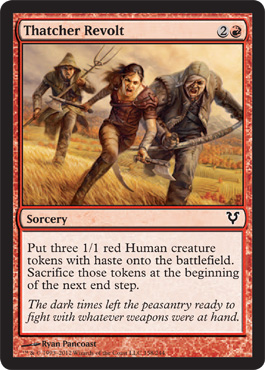
First Impression- I sort of picture this card like a Monty Python skit. Three people sitting around BSing about how they are being oppressed and working themselves up into running out and declaring a revolution, then realizing no one is behind them:
Three things can happen:
1: They attack get to the other side say "Well then" and trudge home leaving the raging battle behind them
2: They run into battle get picked up by a local cultist or demon or vamp for a light snack and a buff effect
3: They run into battle and right smack dab in the middle of a holy war they turn the tide because of Honor of the Pure and Intangible virtue and everyone celebrates by carrying off the Champion of the Parrish on their shoulders leaving them alone in an empty field with the dead and they still shrug their shoulders and go home because they need to patch the roof before the next war.
I just wish they hadn't used the economy sized Igor thatcher to be the red human token. He's both bland and uninterestingly ugly, he didn't need a callout.
Thunderbolt
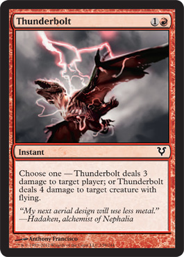
First Impression - I like the use of grays and the cherry-vanillia colored lightning.
I like this card very much for practical reasons.
Red is about freedom of choice *** evil grin ****
I like this card very much for practical reasons.
Red is about freedom of choice *** evil grin ****
Thunderous Wrath
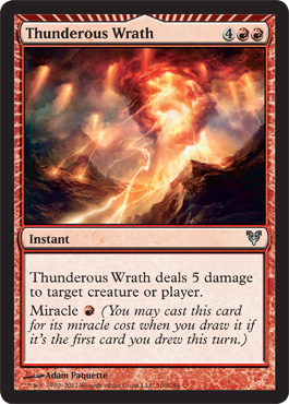
Oh Look - it's another pillar of flame moving through a mountain range.
Is fire the art world's boobs? When they tell you to do something in red is that all you can think of?
Thunder, just for the record, isn't combustable. Just sayin'
Is fire the art world's boobs? When they tell you to do something in red is that all you can think of?
Thunder, just for the record, isn't combustable. Just sayin'
Tibalt the Fiend Blooded
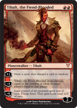
First Impression - Neat! And I got to play him in the pre-release. So now is the time for a little competitive journal stuff again - I like really random effects. I like inversion of systems but one of the reasons I want to be a really good player is so that I can play randomness in a knowing way like a puck style character instead of in a "what the hell? Why not?" way.
And I did think he was pretty, I'm a little disappointed with his backstory because it feels more black than red.
I kind of feel like the humor has been squashed out of Magic and with it some of the playfulness that would also perhaps keep people from taking the game so seriously that they do things like tilt.
I think his backstory might only be in the fatpack book so far. But bottom line I would have liked to see more actual humor in the devils and a devil based planeswalker and less gross-out malice. I get it, humor is hard, but the overdesign of devils is another symptom of crushing the charm out of the bad guys and lowering the mass appeal of the game.
The interpretation of devils as written is very, very limited in both design and execution, and choosing to make Tibalt's story so bleak reinforces a kind of cognitive dissonance "you're telling me this is humor but it just reads like a really dark story of someone succumbing to a gambling addiction and pathological insecurity instead."
The interpretation of devils as written is very, very limited in both design and execution, and choosing to make Tibalt's story so bleak reinforces a kind of cognitive dissonance "you're telling me this is humor but it just reads like a really dark story of someone succumbing to a gambling addiction and pathological insecurity instead."
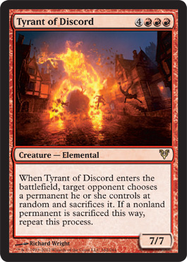
First Impression - Giant Burning thing in a town.
Well we've only seen this three or four times in this set, I guess we can stand another one.
Well we've only seen this three or four times in this set, I guess we can stand another one.
Uncanny Speed
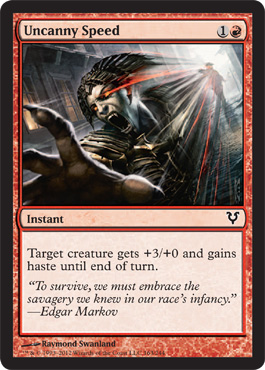
First Impression - Is this the vamp from Predator's Gambit having thrown on a shirt because that corset really didn't cover her tits when she was bouncing around on rooftops?
Gentleman I cannot explain to you how obnoxious sore nipples from a corset are, unless you've ever had to wear something constricting with a seam that cuts across your testicles all day. And to be honest not owning any, I'm not really sure how sensitive the skin around testicles themselves are. So maybe it's not comparable, but I'm hoping that it's close so that perhaps you'll understand. Also cheap lace is itchy and irritating too and therefore not sexy. Please stop thinking cheap lace is sexy and therefore they will stop making it.
Now back to the card - if this isn't the Predator's Gambit vamp then it begs the question - who is in charge of enforcing the code of funny hats in Innistrad, because EVERYONE is wearing the Ming the Merciless TM french hood if they're a vampire and the tricorn if they're a human. Are there sumptuary laws that define these things? If there are I'll bet the Bloodflow Connoisseur is on the committee. Those hats are NOT flattering.
Vexing Devil
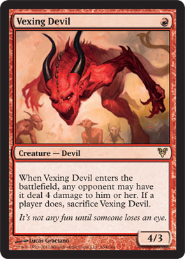
I've got one, It's great in limited, I'm not sure it's a 10.00+ card. It feels more like it should be 4 or 5 but whatever.
On a design level it's effective because I can recognize the card right away it doesn't blend in and it can't be confused with other cards easily.
Also I do like the flavor text on this one.
On a design level it's effective because I can recognize the card right away it doesn't blend in and it can't be confused with other cards easily.
Also I do like the flavor text on this one.
Vigilante Justice
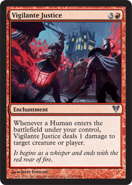
Oh look an angry mob in red. There are only six other ones in this set so yeah, this was totally the only way to express this concept.
The art's fine, I just don't care. I'm at least happy that they used high contrast red and blue so it doesn't look like all the other cards.
The Avacyn symbol lantern is a nice touch.
But this sort of limited visual thinking - this is where I start envying the Melvin types, if you don't care about anything other than the card text you can't be disappointed by the subjects illustrated.
Zealous Conscripts
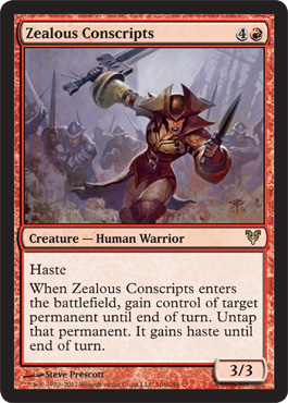
Love this card, she's so badass she'll take you over to her side by force if necessary, even though she's obviously a tight lacing fetishist, hardcore waist training corset wearer.
I do not say that mockingly. I've said to many a young ingenue being laced into a corset for the first time - "this is the theater, breathing is optional".
I do not say that mockingly. I've said to many a young ingenue being laced into a corset for the first time - "this is the theater, breathing is optional".
They still have to sing dance and belt out arias wearing a corset and they manage to do all that stuff.
So go Zealous Conscription Lady, because I love that your waist is in an underbust corset, your tits aren't hanging out but still look awesome and your thighs look like they both hold up the body that has tits that size and that they can power you into battle to go get recruits.
Zealous Conscripts is a sexy, sexy card. ( I also love playing effects where I can steal my opponents stuff. It might be a thing with me . . .).
This is the end of Red
If you missed White it's here.
If you missed Blue it's here.
If you missed Black it's here.
Green is next after this and it's here
If you missed White it's here.
If you missed Blue it's here.
If you missed Black it's here.
Green is next after this and it's here
the end
No comments:
Post a Comment