GIANT NOTE: - This is unfinished and going live so that someone in particular can see the review of Captain of the Watch and Captain's Call. I had started it just for myself and figured I could finish it for myself for card learnin' purposes - I'm starting a different smaller project about Planeswalkers but if anyone really want's me to publish the rest of a 2013 review just drop a comment and I'll work to make that happen. We'll be playing the cards for a year after all : )
Magic Core Set 2013
Magic Core Set 2013
One Woman’s Reaction to the Card Art for Magic 2013
ALL the things ( maybe )
Here’s what I learned doing the Avacyn Art Review: it helped
me competitively. I was able to read board states better because looking at the
art and all the cards made me take into account cards I had avoided or would
not play.
It also became a great bonding experience with other
players. I’m not that good at Magic but I’m really good at critique and
interpretation, just discussing it and the circumstances around the art helped
build a community where higher level players were able to find topics to talk
about with me and it broke down some social barriers that were holding me
back. I’m the crazy magic player that
does the snarky art reviews. I have a tribal identity now.
Also – art reviews are cool.
I have written an explanation of who I am and why I’m
writing, so you can pre-judge my opinions before you read them here: On the first Avacyn Restored White review.
Feel free to read the introductory part and then pop back.
Now let’s talk about Core Sets.
Wizards of the Coast did a whole bunch of things at one
time, they introduced Planeswalkers, and realized that they were playing too
much inside baseball with the expansions, and created the “New World Order” and created
a cludgey but still better than anything they had before Intro computer game
Duels of the Plansewalkers, and created a Core Set that tried to get back to
the things that made the original Alpha set work. Oh and the Duel Decks and the
Deckmaster kit also happened too.
That’s why when any of the WotC folk talk about any one
specific thing that improved sales or lowered Barriers to Entry, the actual
Operations/Project Manager in me kind of blinks. I know that they can’t
actually isolate it because they don’t do follow through numbers, because no
one in the toy industry tracks anything past point of sale and while they are
interested in retention there has to be a certain level of willingness or
ability to find and engage with the community to be able to be identified. They
introduced too many things to pin their current success on any one of them and
all of them had positives, but the question is whether or not they have long
term positivity as they mature.
The Planeswalkers’
stranglehold on the flavor has some positives but a lot of potential
long term negatives if the wrong “lessons” are taken from it.
I love WotC but they seem to have some problems with
managing the “soft” side of Magic
This will be my first Core Set.
Here’s the thing that’s right about it – it’s not fancy
tricks to make long term players happy, it separates things out from the rabid
screaming expert fanbase so that there is a concept of the basic game with the
actual idea that YOU are the one casting spells bringing in your resources from
multiple planes and the “story” of the Core Set is your story with you as the
Planeswalker. Wizards then proceeds to screw that up massively but at least it
starts out with you getting to be the one who the story is about.
It’s less about pushing one look/feel so it allows players
especially new ones to experience a sampling of all the things magic can be
look and feelwise.
They didn’t take out ALL the hard stuff they reasonably keep
the complexity at higher levels but the higher levels aren’t targeting the dark
desires of experts so they don’t overwhelm things and usually work best in
standard by pairing up with the more targeted expansions.
So really, the thing that core set does best is remember what
Magic was supposed to be at the beginning, travelling planes, collecting spells
and then using them to challenge your nearby Planeswalker friend to a duel.
I’m kinda old school. I don’t see the whole “20 life” thing
as kill-you-dead, I see it more like a fencing duel, you’ll live to fight
another day – you just ran out of Vancian Magic Energy for this fight before your dueling partner did.
Heck, I even see it as sports practice or study partner kind
of stuff. I don’t need to hate you or be at war with you to want to see how my
spells that I’m studying stack up against yours. That’s one of the things
Pokemon got right and seems to get swept away with the “OH I’M SO SERIOUS AND
MATURE” testosterone laden bull that seems to have taken over the game. It’s
fun to challenge your friends and test how your training is going, it doesn’t
always have to be all life or death. When you get beaten and your pets move on
they go to the Pokemon spa and get all better and groomed and come back for the
next fight.
Core set lets you play with all the toys but you don’t get
nearly as much forced seriousness and someone else’s insecure masculinity or
storyline agenda to deal with. You
only get some problematic Planeswalkers tropes and quick, tourist-like visits to
historic spots. Like one of those three week All Europe tours you might take
your first time overseas to decide the next time you have three weeks free you really liked Prague and you’ll spend a month there
next time.
Core set Magic is like the Grand Tour of the planes. All
artists and young ladies of breeding are expected to go on the Grand Tour:

Very little would make me happier than an Expansion Set based on Edwardian Political and Brutal Colonization of Indigenous cultures fighting back with magic as long as it used actual Edwardian Clothing. Emil Brack "Planning the Tour" sourced from the wonderful "time to eat the dogs" website http://timetoeatthedogs.com/2008/08/12/the-birth-of-exploration/
So I'm expecting some Art Diversity here, I'm also expecting to see less problematic art because it's an entry level product they are expecting 10-12 year olds to play. - lets see if Core Set Art lives up to my hopes.
Starting, like we did last time with White:
Ajani, Caller of the Pride
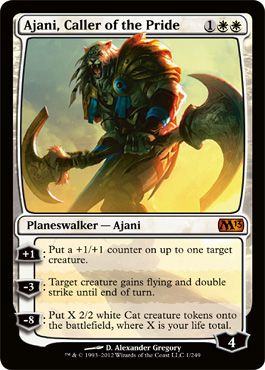
First Impression He looks like a pinwheel. A really sharp pinwheel.
You can barely tell that he's supposed to be a lion. And he looks a little top heavy, but the double headed double axed twirling baton looks cool.
I'm not sure why a giant lion gives your guy flying? Is it his magic whirlygig power?
I don't really know what his story is - but I did figure that the pre-gen character trope he fills is cat people and he's the Aslan figure from Narnia. But mostly I suspect he's an excuse to justify drawing some Cat Girls for WotC.

Ajani Sunstriker
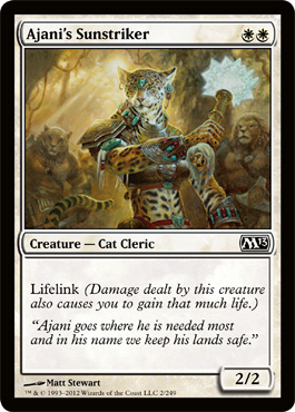
First Impression - Hey Cool! Actually cat like cat girl you drew there letting her arm cover up the antrhopomorphic single set of mammary glands preventing her from being over-sexualized, but yet still tropey enough for the "I want to believe" fanboys.
I think she's a cheeta. I love the turquoise and silver vestments.
So if she's a cleric and she's Ajani's Sunstriker does that mean he's worshipped like a god? ( Aslan?)
And if lifelink is his gig do I get to do an Aslan/LionKing circle of life mashup?

I think she's a cheetah.
Angel's Mercy
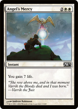
First Impression: The colors are good but it looks kind of like the top of a trophy. Why are they using this when the one from Avacyn Restored is
a: so incredibly good
&
b: going to be legal in standard for as long as 2013 is?
Angelic Benediction
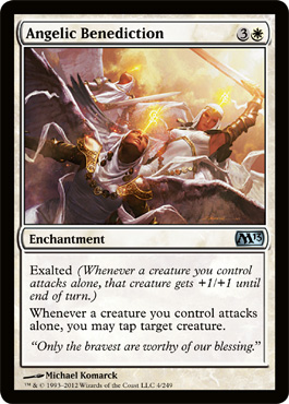
First Impression - OK now this is Awesome and full of awesomeness.
The angels look like some kind of cross between desert warriors and nuns which is fantastic for an original take on an overwrought overly done subject and refers back to the fact that the monotheistic religions we're referencing were all basically different eras of desert/Mediterranean culture.
And the composition and color with the diagnoal giving height and the light going down to the darker earth where the battle is happening are really elegant.
These angels are all beautiful perfect bodies and faces without being exploitive or oddly weak or young looking.
Michael Komarck - I guess I'm going to have to look out for you.
Second Impression: They remind me a little of some of the Avacyn Restored clergy outfits, but no funny hats.
Attended Knight
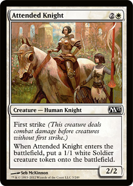
First Impression - Cute but either she's got the world's most deformed tits, the armorer was wall eyed or she was really, really insecure about being flat chested and had the armorer add on those bolt ons because she saw it in some sort of Hotties in Armor woodcut that her boyfriend was looking at.
What's weird is that the artist absolutely knowns how to draw a feminine character without giant tits but still having short hair because the squire totally looks girly ( waist to hip ratio y'all).
This isn't up there with super creepy focus on tits. It's more like - dude not only did you add them where actual tits have no business being, let alone extending out that far to need their own individual protection, you made them a lighter color and have the light hit them high. They're so distracting I almost didn't notice the medieval porta-potty looking building you painted in the background.
Second Impression - I love using this card - whoo hoo, yes I do. I wish the little squire girl were her own solider token.
Really dude, it looks like she's compensatin' for somthin'
Aven Squire
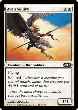
First Impression - I'm an art nerd. This looks like an homage to a Maxfield Parrish sky.
You guys are going to have to trust me on this - none of the Parrish colors are as intense on the web as they are in real life. Seeing his art/painting technique up close is like being a blue player and topdecking Jace the Mindscultper just when you need it.
But yeah - Aven squire, dynamic, good lines, excellent anatomy and draping, but the cloud work and color composition are what move this up a notch.
Battleflight Eagle
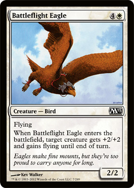
First Impression: OK it's an eagle. I guess. It looks like it's been hitting the hunting grounds pretty frequently but I guess if it's an eagle and its flying, that it must still be at the right weight.
I guess I don't want to body shame it or anything.
Captain of the Watch
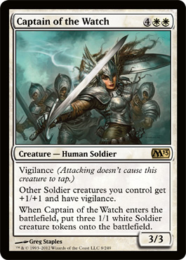
First Impression: Why yes I will indeed accept your shameless pandering . . .
It's a WOMAN BABY!
I FORGIVE THE TIT ARMOR CAUSE SHE'S ROCKIN' THE 80'S DRAGON COVER BAD ASSNESS with 2013 STYLE!!
Plus she's a useful card, and at least her ridiculous tit cups are where her tits might actually be. I'm beginning to think maybe they all store extra rations or something in them.
But I don't care. She's joyous and dynamic and looking to lead her troops and kill the other guys and come back with her really awesome hair metal hand worthy helmet.
The Captain up there is awesome compared to the cover she reminded me of from waaay back in the day. She leads, she leads well and her troops follow.
Ladies and gentleman Dragon cover #147. Love the imp, infinitely prefer the modern warrior take and career choices that let you wear pants into battle. I do have to point out that when 80's artists painted large breasted women they at least seemed to have seen actual large breasted women and painted them correctly. This lady leads by subsitituting for a semi-naked masthead. All points go to the Captain!
Ladies and gentleman Dragon cover #147. Love the imp, infinitely prefer the modern warrior take and career choices that let you wear pants into battle. I do have to point out that when 80's artists painted large breasted women they at least seemed to have seen actual large breasted women and painted them correctly. This lady leads by subsitituting for a semi-naked masthead. All points go to the Captain!

Captain's Call
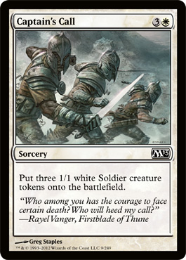
And when the Captain tells you to get your ass in gear this happens.
First impression - this is perfectly good, perfectly serviceable art. It shows the card, there are actually three soldiers for the three tokens it creates, they're the same armor that the troops the captain is commanding in the previous card are wearing so we know they are her soldiers and now we know that the Captain of the Watch is named Rayel Vanger, Firstblade of Thune.
Do I know what Thune is? Hell no, do I want to be on their side? Hell yeah!
RayEL! RayEL!
Note to Wizards - if I find out they are referencing anyone else besides the Captain in Captain of the Watch I will simply ignore you because you will be wrong. OK? We're good.
Crusader of Odric
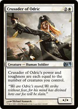
First Impression That hat. I cannot resist, the hat compels me.
No seriously - that looks like one of the official Funny Hats from Innistrad's Ministry of Funny Hats
Which would be really cool because as far as I'm concerned Avacyn Restored dropped the ball in Flavorland telling me way too much ( and then showing me WAY too much) of Garruck and Lilliana's story and we didn't get any cool stories about humans rising up to beat back the monsters, or the resistance pockets that had lost hope to be brought into the light because THEY held in the final hour as opposed to Angels coming in and cleaning up in a jif.
Aaand could it be . . . YES! that's an Avacyn hat pin she's wearing there - Innstrad's story gets some face time in 2013.
Now later I would find out that there was a whole story
but I got to see it in the art first.
Oh and BTW the art is awesome. Grete here ( click on the link and you'll find out how I know her name now) actually looks like a real person in real space wearing practical clothes ( with the exception of the hat, but you cannot deny the Innistrad Ministry of Funny Hats) and now writing this review I see that it's Michael Komarck. Hmmn didn't I just tell myself to keep a lookout for him?
So far he's 2 for 2.
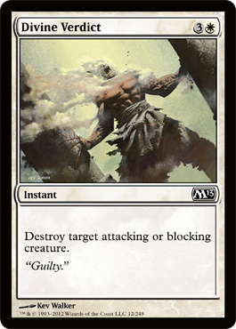
Divine Verdict
First Impression: Pretty, it looks a little like she's hatching from a sheild egg or some kind of armoured flower thought.
Still nice. Perfectly scaled for being on a card too.
Oh she's a squire according to the flavor text. It seems like core sets are very pro-squire.
Divine Verdict
First Impression: "So Boss, do you want me to go with a Sampson reference, or a Lot's Wife kinda thing for resonance?"
"I don't care, get them both if you want but make sure it's yet another dutch tilt angled disintegrating male"
"But you know we could . . ."
"Nope, dutch tilt, disintegration . . . not up for discussion - needs to look like it belongs in Magic, everything else is up to you. "
" . . . "

Erase
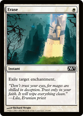
First Impression: Don't f*ck with the Disney Fairies. They have Goth days at Disneyworld and aren't going to tolerate your poser shenanigans.
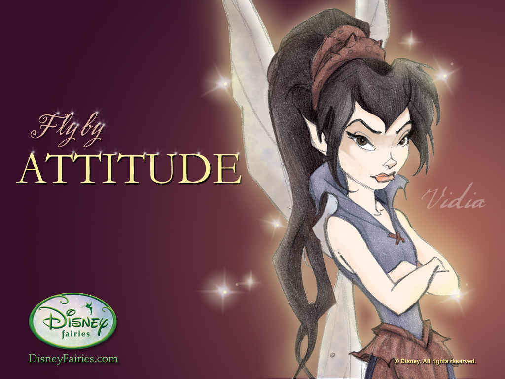
Now just take your mess outa here:
Faiths' Reward

First Impression: Faith's Reward is stabby?
Second Impression: Faith's reward is stabbing the Cthulu like things rising out of the corpses and living to write the flavor text!
Er maybe that's wind, based on said flavor text,
I got it - Faith's Reward is the glowy target parasite that's glommed on to your chest while you fight.
Maybe it's a symbiote or something, or you're a pod slave and don't know it.
Ok now I've got it, Faith's reward is coming back without having to be a zombie.
Glorious Charge
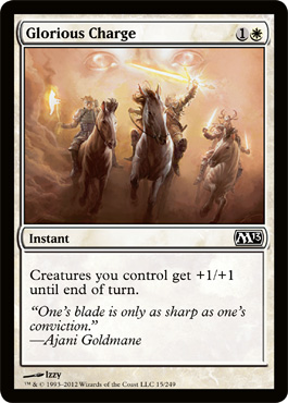
First Impression: I can tell there is more going on here than I can see clearly at card art size.
Maybe it's like desert raiders all got their weapons temporarily enchanted?
It's probably pretty good, but there's a lot of detail lost here. At least it doesn't look like a generic hominid. I like that there's an actual calvalry or raider style charge happening.
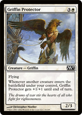
Griffin Protector
Great analysis, I really enjoyed it
ReplyDelete