Did you miss it? You might want to read it first:
Sometimes, going over the art again, my first responses might change or my evaluation of the art would be modified as I saw the larger picture or spent time with the physical card. I had promised at the end that I would gather up the three cards that actually offended me as a woman and I realized I didn't include one of the three when I posted. That got complicated and I'll address it at the end of this wrap up.
So when I was getting ready to close up shop I realized that I could actually quantify my reactions to the cards creating something I had never seen anywhere else:
Statistics for Vorthos! All percentages are rounded!
I made a spreadsheet with criteria and sorted the information in each reaction according to the critera:
Criteria for Review Reactions
|
Liked
Art
|
Bored
By Art
|
Subject
Unclear
|
Pop Culture
Reference
|
Art History
Reference
|
Offended
Me
|
Made
Me Think Of Breasts
|
Liked
Outfit
|
Impractical
Outfit
|
Realistic
Proportion
|
More
Excited By Using Card Than Card Art
|
Loved
Art
|
Some
Good Elements But Problems
|
Declared
Willingness To Wear Outfit
|
Amused
Me
|
Looks
Like Someone I Know
|
Half
Naked Male Thing
|
Made
Me Think Of Other Elements Of The Story
|
Funny
Hats
|
Wrong
Subject Matter
|
80's
Cover Art
|
Johnny
Bravo Syndrome
|
Creeped
Me Out
|
Made
Me Make Up My Own Story
|
There are 244 Cards in Avacyn Restored
I did not review the tokens, emblems or lands- I know there are 15 Lands, I know that Slayer's Stronghold stops the card numbering at 229 and the highest number on Gatherer's checklist is 244 which is a forest.


Cards I loved Broke down this way
I loved the art on 18 cards or 7.86% of all the cards reviewed.
4 of those cards made me think of breasts
12 of those cards had realistic proportions
7 of those cards had outfits I liked

Card Art that Missed the Mark
There were 10 cards that I was more excited about using the card than the card art
There were cards that were unclear or had the wrong subject matter for the card name - those broke down like this:

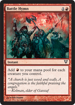
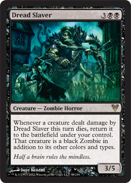
Only 2 cards: Dread Slayer and Battle Hymn, were both unclear and looked like the wrong subject matter
Only 10% of the Breasts !
23 cards made me think of breasts
Of the cards that made me think of breasts only
4
offended me
I
liked the art on 10 of them
The
only 1 that made me think of breasts and left me bored by the art was one
that offended me, that was Triumph.
When a female friend scored a foil Triumph of Ferocity we all realized that it was now a badge of honor to have and keep that foil. We're all sardonic like that.
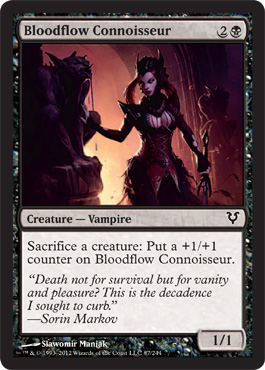
Remember folks that bad hair can keep me from focusing on boobcages so our Connoisseur here did not make the offensive list.
When a female friend scored a foil Triumph of Ferocity we all realized that it was now a badge of honor to have and keep that foil. We're all sardonic like that.
Remember folks that bad hair can keep me from focusing on boobcages so our Connoisseur here did not make the offensive list.
Fashion and Flavor!
There were
16 cards where I declared my willingness to wear the outfit
16 cards where I declared my willingness to wear the outfit
12 where I felt the outfit was impractical
and 5
outfits I actively would like to wear and volunteered to do so directly in the review
Of the 12 with impractical outfits I actually liked 4 of the
outfits and 6 of those outfits were portrayed using realistic proportions. But apparently I liked the impractical
outfits more than I actually liked card art with impractical outfits in it because only three of 3 cards got
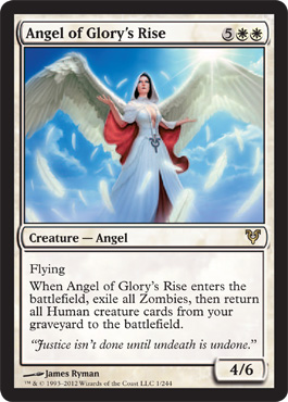
positive art reviews. Only Angel of Glory’s Rise ( better known as Our Lady of
Breastfeeding ) actually offended me BECAUSE of the impractical outfit.
7 cards had the half-naked male thing going as opposed to 23
cards that made me think of breasts and none of them actually qualified as
equal opportunity for oogling – there was a grand total of 1 actually sexy guy
in the entire set and he was fully clothed ( Hey Borderland Ranger, that’s
right I’m looking at you) and 1 card, Spirited Away where I did notice the
victim had good thighs.
57 Cards actually made me think of the story being told in
Avacyn Restored but 16 cards made me prefer to come up with my own story either
to fill in a blank or because I didn’t agree with some combination of
art/flavortext/plot point
Funny Hats vs Breasts
There were 23 cards that made me think of the Innistrad
Sumptuary Laws and the Minisistry of Funny Hats.
This means that I notice Innistrad Funny Hats exactly as many times as I noticed breasts because of the art.
However 5 of those cards both made me notice breasts AND funny hast – mostly because of the vampires - and I did actually like the art on 2 of those cards that had both prominent breasts and funny hats.
Of the 23 Funny Hat pieces of art I actively liked 12 of them which is two more than the total of cards I liked that reminded me of breasts.
Therefore I must conclude I am marginally more in favor of noticing hats in art than noticing breasts. I should probably go back and do a control for overall art quality but frankly this is already a little on the OCD side so lets not go there
Problem Cards
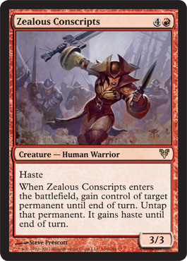
Ok Now we're at the tricky part. Only 4 cards actually offended me.
There are 244 cards in the set, that means 1.63% of the cards in the WHOLE SET were offensive in a fantasy property unnecessarily catering to 15-20 year old males as remembered by the 30-40 something males currently in charge of designing and promoting the game and almost exclusively recruited on their ability to thrive in the tournament defined pro tour environment.
I cannot say this enough - THAT"S PRETTY DAMN GOOD.
Really, I have trouble watching more than 3 minutes of commercials without getting offended more than that, and I think we have established that I am not exactly quick to offense.
Here are the cards that offended me in Avacyn Restored:
Name
|
Bored By Art
|
Pop Culture Reference
|
Art History Reference
|
Offended Me
|
Made Me Think Of Breasts
|
Impractical Outfit
|
Realistic Proportion
|
Killing Wave
|
1
|
1
|
1
|
||||
Triumph of Ferocity
|
1
|
1
|
1
|
1
|
1
|
||
Havengul Vampire
|
1
|
1
|
1
|
1
|
|||
Angel of Glory’s Rise
|
1
|
1
|
1
|
1
|
That said, I've been trying to find a way to write this wrap up for about 2 months by "softening" up the end effect, and I've gone back and forth about it alot.
I went back and forth so much that I actually ended up having dinner with the WotC staff and showing them this issue directly and I'm still a little concerned about putting the reality out there. But it's a kind of cowardice and frankly the work is public.
I went back and forth so much that I actually ended up having dinner with the WotC staff and showing them this issue directly and I'm still a little concerned about putting the reality out there. But it's a kind of cowardice and frankly the work is public.
Here is the card I missed in the review -
Triumph of Ferocity is a rapey card, but frankly it's not as disturbing as this card getting through, because Triumph is actually a fight, but this card is actually rape and a clear violation of the WotC art direction standards stated by Elaine Chase. And no one caught it, and it didn't make a blog to be offended about it.
I didn't want to be the one pointing it out because the reality is that while everyone was focused on the mediaeval stripper this one was in the corner quietly drugging it's target and making sure everyone would ignore it because "well she was someplace she shouldn't be and obviously asking for it" or "Well it's just a vampire what did you expect".
Ladies and gentleman this is the rapeyist card in Avacyn Restored. Chances are you never even looked at it twice. While Triumph offends me because the art is mediocre and focused on her tits, this actually offended me because the thing that tips it over into "offensive" is completely unnecessary. It isn't on the stats list because I didn't review it in the full review.
Havengul Vampire
|
First Impression - Holy shit that's a violation of the WotC standard. Why the hell does that vampire have his hand on her naked thigh while she's wearing a long dress when he's already drunk her blood?
Only vampires have been wearing the square corset with the square plunge, that's a human. Why does he have her legs all up around his midsection?
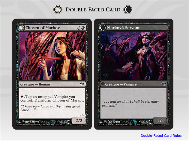 Triumph looks like a domestic violence leading to rape scenario when you don't know the MTG story. Or even when you do. This just looks like sexual exploitation of an unconscious woman who is going to get " used" for anything the vampire wants. You can argue that other cards imply subservience but Chosen of Markov implies consent.
And eventually sexy power tripping.
Havengul Vampire looks like some girl got drunk or drugged or spelled and is being assaulted for blood and sex while unconscious.
And no one noticed.
The story behind why I noticed:
So Triumph of Ferocity is a thing, we actually call it " The Rapey Card" amongst some of my friends and people who play with me at my local game store. A fellow competitor was teasing/testing me when he pulled Unhallowed Pact out in his sealed pool and said " This is rapey-er than Triumph" and I looked at the card and said " Yeah I could totally see that, men get raped too, and it could be triggering in the exact same way." He was a little surprised. Possibly because I said it without histrionics.
In case you don't remember here is Unhallowed Pact:
In case you don't remember here is Unhallowed Pact:
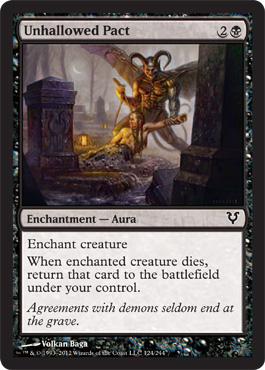
So I said it happily and lightly not with my I-disapprove-of-these-shennangins TM voice, and he was still pretty surprised when I ran Triumph in my deck and later won with that deck. I'm not going to avoid using the card, it's just rapey. That's all. But when I started doing this review I questioned why I didn't care enough to be more offended by implied sexual threat than the overt unnecessary focus on secondary sexual characteristics an realized it was because I EXPECT to see rapey art in fantasy properties, because . . . well, artists and art editors don't realize what they're looking at, and half the fantasy tropes in the world are suppressed sexual fantasies sneaking past social censors or moralistic metaphors dressed up as folklore or fantasy anyway.
I was pretty sure that Triumph wouldn't be the rapiest card in the set so I looked through the card image gallery to see what would win and was pleasantly surprised to see so few cards competing. I came across good ol Havengul Vampire and declared an immediate visceral winner.
The worst part of Havengul Vampire is that it looks like the kind of rape that is WAAAYY more likely to happen on an everyday basis: girl goes someplace people warn her not to, someone drugs her or keeps giving her drinks, no one believes that she didn't consent and then she is either dead or told she asked for it by being so stupid. Chances are she'll never tell anyone anyway.
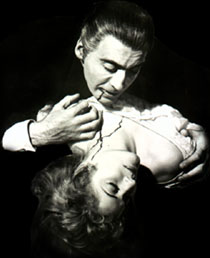
So as long as you don't notice the hand on the thigh, you won't question the art, it's just vampires being vampires. Dude's gotta eat right? Cleavage on the victim is just fanservice. However just like the problem with Triumph is the focus on the breasts and the knee in the groin, the problem with Havengul is the naked thigh and the hand on the unconscious victim. So yeah, it offended me, because it could have stuck to the trope without the implied sexual violation, it still would have violated the art standard but it would have been every Hammer Film vampire movie poster ever:

 |
| Where's his hand moving? |
 |
| This last one really doesn't have much sub-text, does it? |
But understand that the whole sexy vampire thing is pretty much everyone's projections about dangerous monsters stealing our wimmenz and poor nice mortal boys that don't dress well finishing last.
But Aren't Vampires Rapey in General?
Here's the reason vampires got all equated with sex instead of blood and death - they're generally nibbling on the victims neck, which means that frankly it's pretty much the only depiction of something that equals pleasurable foreplay for most women instead of "scoring". As far as I can tell in western sexual writing particularly, foreplay is pretty much out of the picture except for "gaze", so women probably just manage to ignore all the bad writing and romanticize even the most half assed vampires because it's the only place they get to read about something other than "throbbing manhood." Which is nice and all that but I could see where they are thrilled with the idea that something could represent a non-home base approach to sensuality.
It's probably also the reason that people keep writing emotional soap operas with vampires as the main protagonist, because the werewolf is going to tear you apart, the vampire is still trying to keep the blood in you, for their enjoyment. Vampires (and werewolves) signify the dangers of female desire being fulfilled.
They just edit out the "dangerous" part as "morality play where desire for sex = death" and change it into " bad relationship".
Since you couldn't really admit that women HAD sexual desires if you were a woman in the eras these stories really took off and not part of the free love counterculture or the intellectual salon movement, vampires and unconsciousness made it OK. Pretty much the second culture let women be sexual ( somewhere around the 1920s and shorter skirts) vampire stories also became about class, cool clothes and romance. Sex you could get anywhere ( 1920s and cars were the first real sexual revolution- look it up - they could party) but class, clothes and being desired as opposed to acquired - those were the big fantasies in the new culture. Vampires and the supernatural provided the same excuse/escape.
Not Nowadays - Not Really-
So here's the problem with a rapey vampire, you shouldn't make the implicit explicit. It moves it from female based fantasy to threat.
This game is still sold to children as young as 10, There are kids who play it when they're five.
And even Fifty Shades of Chartruse and Twilight Sparkle Bella the Blank apparently give consent and willingly enter dysfunctional powergames with literal and metaphoric vampires fully conscious. This card visually makes a fairly common escapist, sexualized fantasy trope that women have some control over into a scenario that happens in real life that women fear.
For absolutely no story reason, art reason, and inappropriately for the product.
Killing Wave offended me because frankly the draping is wrong and I can see clearly that the artist can do better but the other three cards are the ones that inappropriately sexualized or implied sexual violation that was completely uncessary to the card or the story. These are the three cards:
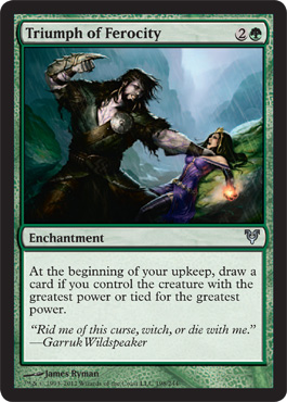
Unnecessary focus on breasts and unoriginal interpretation of subject matter would have put all three of these cards in the boring category. Ironically, the most interesting and best artwork in composition terms is the card that is the tropiest and rapiest. The most offensive of the three is the one that has a single subject because of the design of the boob window and the use of the Avacyn symbol over the genitals - I don't know if the artist thinks that's sexy but a number of Magic Playing women looked at it and thought it looked like an iron uterus or the type of symbol used to brand feminine products when put in the female genital region.
There is nothing on these three card names or flavor text that lends itself to sexualized, stereotypical poses for instance and actually making a picture that depicted a waltz instead of an in process rape ( hint to apologists - the last thing you do when being "dipped" in a waltz is close your eyes and have your dress hiked up, you'll fall before the next step) or just having both of the participants in Triumph be upright, or simply not painting the nipples on your Angel of Glory's rise, would have prevented pretty much all the questionable art in the set.
The art director should have caught this, but the thing that freaked me out was I didn't look at the individual artists name until I did the full review. All three cards came from a single artist.
I'm not comfortable pointing that out. So uncomfortable that I waited and waffled two months figuring out how to say it.
I'm not sure it's on purpose, and frankly it's like Steve Argyle making sexy women. He likes painting sexy women, people like buying them, but I've spoken to Steve and I also know that as much as he likes it, he'd also like to be known for MORE than just the sexy magic card guy. But I haven't seem him paint any old ladies recently either. But this artist makes cards that are really undermined by their subject composition choices. Ryman, the artist chose those subjects, their composition and their actions.
All three got through an art department to print. No one, possibly not even the artist noticed there was a repeated issue. One card got bad press and created a response, including this one.
But the problems were repeated with examination, and they're correctable. But I have to wonder why no one noticed enough to check out the rest of the cards.
I need to say it again. Only three cards were sexually offensive ( Killing Wave was offensive because of bad art choice) only two of those cards were rapey, all three of them are kind of creepy when stuck together but out of 244 cards they're hardly noticeable.
Magic's much bigger problem is the 55 cards that were boring and the repetitive themes of burning hominids in red and half assed nature paintings in green.
Another problem would be whatever created and let the Boob Zombie pass through.
Ok I still cant tell why everything else atrophies but the boob like objects...
In Conclusion:
If you'd like to see the whole spreadsheet with all the data it's here
The tally per category is
Criteria for Review Reactions
|
|
Liked
Art
|
165
|
Bored
By Art
|
55
|
Subject
Unclear
|
7
|
Pop
Culture Reference
|
81
|
Art
History Reference
|
51
|
Offended
Me
|
4
|
Made
Me Think Of Breasts
|
23
|
Liked
Outfit
|
31
|
Impractical
Outfit
|
12
|
Realistic
Proportion
|
54
|
More
Excited By Using Card Than Card Art
|
10
|
Loved
Art
|
18
|
Some
Good Elements But Problems
|
31
|
Declared
Willingness To Wear Outfit
|
16
|
Amused
Me
|
23
|
Looks
Like Someone I Know
|
5
|
Half
Naked Male Thing
|
7
|
Made
Me Think Of Other Elements Of The Story
|
57
|
Funny
Hats
|
23
|
Wrong
Subject Matter
|
6
|
80's
Cover Art
|
6
|
Johnny
Bravo Syndrome
|
1
|
Creeped
Me Out
|
3
|
Made
Me Make Up My Own Story
|
16
|
57 Cards out of 244 is 23% of the set that actually conveyed the story elements of the set itself. That's pretty good, enough so that many of the rest of the cards could be universal. I'm actually going to do the review of M13 Cards so that will be an interesting compare and contrast.
Finally I need to reiterate that I LOVED 18 pieces of card art - I will close this out with those cards, because problems aside I do love and care about the art in this game, it's the face that the game presents to the world and we should celebrate the things we love.
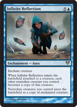
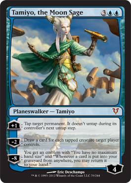
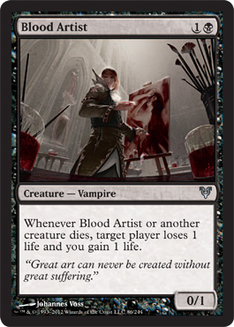
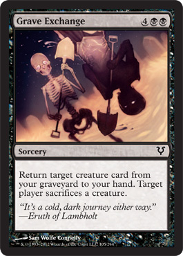
These are 18 of My Favorite Things
And remember that just because I love these cards doesn't mean anyone else has to love them. Just because I hated a piece of art that you like doesn't mean that piece of art is bad. As far as I'm concerned the worst sin in art is to be unimaginative.
Everyone's milage may vary:
Everyone's milage may vary:
No comments:
Post a Comment